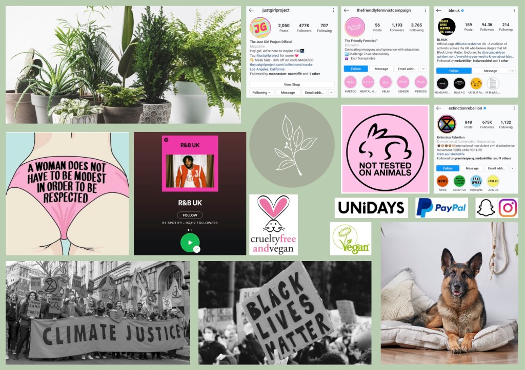
Lives near her University in private student accommodation
Training to be a paramedic
Vegan
Likes R&B music
Usually wakes up at 9am to start her day, and late nights are part of her daily routine.
Revises during the day, messages her room mates to go for a cigarette break and a chat during the day, nights are spent in bed with Netflix or video calling friends.
Very easy going in general, but cares very much about social issues.
Room is usually quite messy, but is sorted and cleaned as procrastination on work or when she is feeling down.
Doesn’t go out very much.
FINANCES:
Relies on student loan and parents, but is always looking for part time work
Conscious of what she spends her money on, but will treat herself once a month
Only uses her debit card (Due to COVID she will not carry or use cash)
Has lots of membership cards, and always asks for student discount in shops.
Looks for clothes online, adds them to Wishlist and never buys them.
ONLINE BEHAVIOURS:
Active on snapchat, Instagram and WhatsApp
Always looks for deals and coupons on food, clothing and home decor (particularly house plants)
Shares posts on her Instagram about veganism, feminism and BLM.
WHAT SHE IS LOOKING FOR:
A cute little apartment with a balcony that she can share with a close friend or two
A place to study and relax where she’s not distracted by the mess in her room
A good deal to make her feel less guilty about purchases
A career where she can make a positive difference to someone’s life
INFLUENCES:
Instagram accounts about social issues & empowerment
Friends
BRAND AFFINITIES:
Aldi
IKEA
QUORN
Oatley
HOPES AND DREAMS
Become a paramedic
Travel the world
Not worry about finances
Flexibility to move around and do what she wants
WORRIES:
Low income
Being tied down
Debt
MAKE HER LIFE EASIER:
Cute, cosy atmosphere, with lots of green
Deals, discounts and coupons
An App that shows vegan restaurants in the area
Instagram ads
WHAT WILL CHANGE?
Things that will impact or change the future Gen Z:
Technology will advance, Gen Z’s will be more up to date on this progression:
Currently, gen Zs are the generation most up to date and interested in technology. As technology advances, future gen Z’s will be the first to find out through online articles and educational courses.
COVID – This will change the way Gen Z’s will interact
Your Super Hero needs a POEM campaign to promote their new product – an App that seeks truth & justice by eradicating ‘fake-news’.
This App is free and accessible to all (mobile & online) and easy to use. You upload any news article to it and it filters it and separates the truths from the lies – ‘fake-news is trashed’ the more content / articles added the closer we get to the truth and social justice.
Using POEM create a strategy to promote the offering to new audiences (& sceptics) through paid and earned whist keeping fans and ambassadors happy through owned.
What is the big stunt you can do to get some earned media? Divide how your paid and organic audience will have different Needs and Wants
Expectations:
No artwork or creative required (un less you are totally inspired) but we expect at a minimum you will have at least 2 x A4 pages detailing the following:
Superhero
Badass female in her mid-twenties. Known for her ability to detect when someone is lying, a skill used to eradicate fake news and empower people to seek justice.
Target Audience:
Young audience, in particular Millennials and Gen Z. Both groups are tech savvy and use social media often, particularly Instagram and Twitter. Said audience has easy access to information on social issues through the internet, and are generally more interested in changing the world and seeking justice than the elder generation. This audience is becoming more enlightened and take social issues very seriously, participating in social movements such as LQBTQ marches and Extinction Rebellion, including protests and petitions. This generation is passionate and driven to create change based on moral views. Many young people are involved in events about Climate change and other injustices in our legal and social systems.
AUDIENCE NEEDS AND WANTS:
They value individual expression, diversity and equality
Social justice – passionate about being involved in social activism, have a high moral ground.
Internet privacy – many Gen Zs cover their laptop webcams
Selling experiences rather than products
Be updated on news and in the loop of what is going on.
WHAT SPECIFICALLY WILL APPEAL TO MILLENNIALS AND GEN Z:
Transparency and honesty
Empowerment
Selling an experience rather than the product
Try to reach:
Boomers and Gen x, who are less likely to see fake news due to being less active on social media accounts where fake news can be found. Older people check their phones less often than younger people and only check their phones when something is specifically directed at them, for example a text message or email. Said audience is less likely to care or act upon social/environmental issues due to thinking it will not have a big effect or impact on them. An example is Extinction Rebellion, a movement mostly Gen Z and Millennials are involved with.
PAID MEDIA
How to reach people who will be interested in the brand: Millennials and Gen Z
Instagram Adverts – Widely and often used by said audience. Bright colours will be used to grasp their attention and stop them scrolling. Using 4:5 ratio as Instagram is mostly viewed on mobile devices.
Partnership with BBC Three – BBC Three is a channel aimed at teenagers and young adults, with over 225K followers on Instagram alone. BBC Three’s content on Instagram and Facebook focuses on relevant social issues, misconceptions and humorous videos.
Posters on public transport such as buses, the tube and underground – Will see the campaign on their commute. The underground has no wifi or 4G so people tend to look at what is around them more.
Boomers and Gen x
Less likely to see fake news due to being less active on social media accounts where fake news can be found. Older people use their phones less often than younger people.
Partner with a celebrity – Working with a big celebrity will guarantee an audience of millions that will watch almost anything the celebrity does. Voiced by famous animal lover; David Attenborough is a celebrity people of all interests and age groups like. He loves animals which makes him the perfect celebrity to voice Frank the Frog. The celebrity will have to be linked to fake news or the superhero somehow, otherwise it will be random and forced. They will also have to be world famous in order to increase following and audience.
Digital Billboards in central London – They will see the campaign on their commute to work
Posters on public transport such as buses, the tube and underground – Will see the campaign on their commute to work. The underground has no wifi or 4G so people tend to look at what is around them more.
OWNED MEDIA
Instagram – Social media platform which is used widely and regularly used by said audience.
YouTube – Featuring updates on fake news, videos of tips and trick to seek justice and help combat fake news.
Facebook – Platform which is mainly used for sharing content onto your personal feed. Videos of tips and tricks and how to identify fake news. In terms of reaching the Boomer & Gen X audience, it will be difficult to use owned media to reach to them. Facebook would be the best option as it is the most common form of social media this audience has.
PUBLICITY STUNT:
The stunt will include several large installations around London of Celebrities. The Celebrities will be doing silly and obscure things which would very obviously not happen, such as Brois Johnson hoolahooping, Lady GaGa going into space, David Attenborough break dancing. Next to the celebrities will be Frank the Frog holding the fake news article. Behind the installation will be a poster with “Fake News. Sometimes it’s obvious”, or “Fake news can be innocent. Others can be damaging”
UNIQUE SELLING POINT:
To keep the current brand fans happy through owned media, the Super App will be on Instagram and Snapchat. The app will use the superhero as the main selling point, releasing exclusive snapchat filters fans can use and share. On Instagram, fans will be offered a “Super Pack” which will contain a detective kit so they can solve a make news scandal. The users can also use the app to partner up with other app users to solve the mystery and share their detective research.
Through owned media, the Super App will post fan’s theories to create almost a murder-mystery game, but centred around fake news.
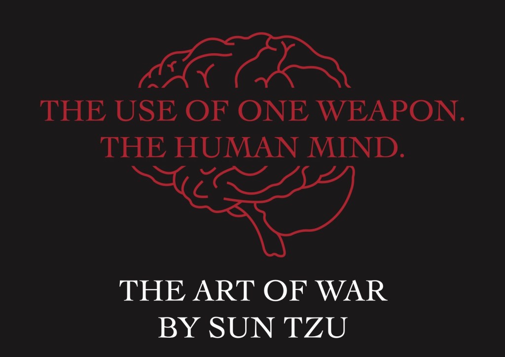
First published in 1910, Sun Tzu’s The Art Of War is the oldest military treatise in the world. The book itself is about military strategy and tactics.
Task: Promote the book in three billboards which are to be displayed in Mozilla Hubs.
First Billboard:
For my first billboard, I have focused on what I feel is the most powerful message in the book. For me, this was the use of the human mind. Sun Tzu doesn’t mention the use of military weapons, instead, he explains how the human mind is the best tool to defeat your enemy. I found the thought process behind the book fascinating and wanted to work with the idea that you need strategy and tactics, not just aggression and weapons to be successful. I kept the visual quite simple as a billboard typically shouldn’t have complex or detailed designs, as they are usually made to be seen from a distance.
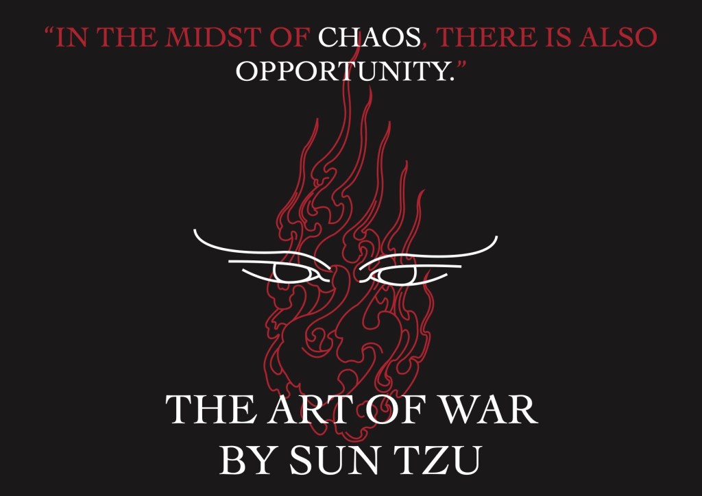
Second billboard:
For my second billboard, I chose a direct quote from the book, “In the midst of chaos, there is also opportunity”. This quote particularly stood out to me as it is very relevant in everyday life. As a creative, the idea that you can find opportunity in something chaotic and overwhelming resinated with me. For the visual, I chose to draw fire to represent chaos, and determined eyes looking for opportunity. I drew the design in a traditional Chinese style of illustration and kept the colours to black, white and red. I felt that these colours are quite bold and have a mysterious, serious feel to them when used together.
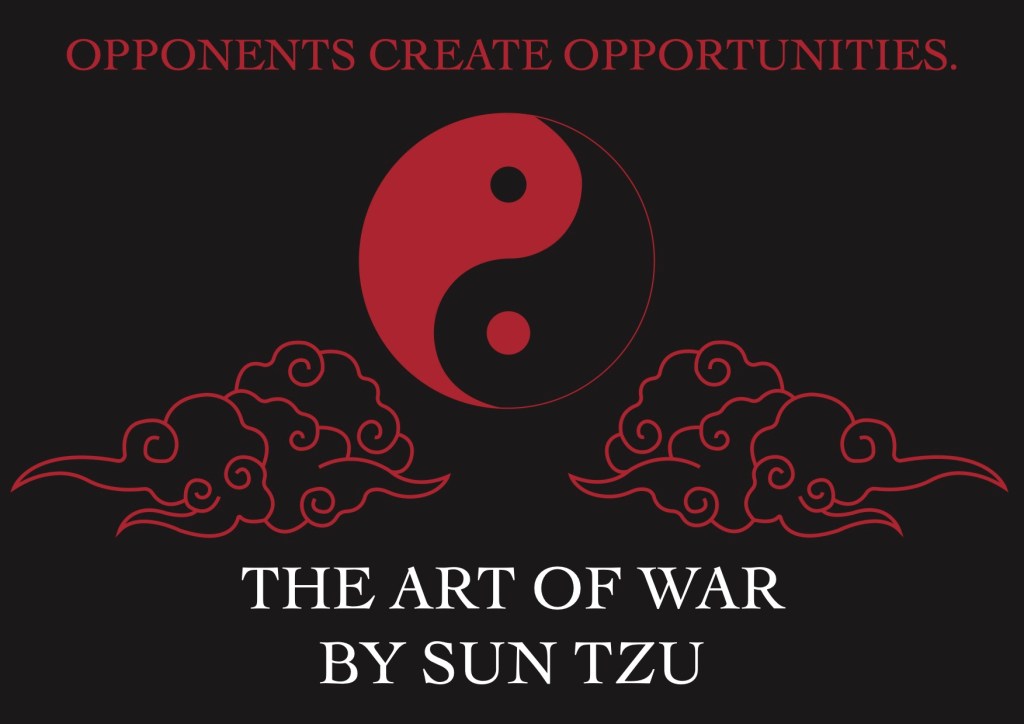
Third billboard:
For my third and final billboard, I deconstructed some lines from the book to create a short statement. I liked the idea that opponents create opportunities, and as a creative, I feel that this is a good statement to remember. The creative industries are very competitive, and it is easy to feel overwhelmed and, a lot of the time, defeated by others who may be better than you. There are so many different creative styles and techniques and the idea behind opponents create opportunities makes me think of using competitors as starting points for creative practice. For example, “steal like an artist”; use other artists ideas and develop them further, make them better and make them your own.
This group project was incredibly difficult due to current circumstances involving COVID-19. By working in a group, we could not meet up to discuss plans or work together in a face to face environment. Due to this, we were unable to share the work load evenly and communication was difficult. We overcame the issue of communication by starting a WhatsApp chat, where we shared photos and videos of what each team mate was doing and working on. We used the chat as our only source of communication and, despite the circumstances, I feel we all did well to achieve the final outcome.
Due to communication being limited, I feel my blog post explaining the process of this project is of lower quality than the rest of my work. I have tried my best to ask teammates questions but it is difficult to grasp everything through messages rather than a conversation, especially since we had to work on different aspects of this brief individually.
Despite all the setbacks, this has been a fun project and I have gained knowledge and understanding of Arduino and coding. I feel that Sam, Millie and I worked effectively together and were able to produce our work to a high standard.
I have enjoyed this brief very much due to the amount I have learnt. I decided to do this brief on my own rather in a group to push myself and learn new skills.
I felt very out of my depth to begin with and working on something so challenging with a deadline panicked me a bit, however, I set myself a plan of what I was going to focus on and complete each week. This helped me plan my time wisely. Due to having no previous experience with the softwares sed in this Brief, the majority of my time was spent watching tutorials and reading articles on Adobe software. This was an incredibly long and draining process however I have learnt a lot from it.
I have experienced a few set backs during the process of creating my video such as struggling to use the software and doubting my abilities, however, I was able to overcome these problems by planning and managing my time. Although not perfect, I am very happy with my final outcomes and feel that I have completed the brief to a high standard. There are a few things I would like to change, such as the videos playing in sequence. I would like to revisit this brief in the future and make new micro stories that make sense on their own, not just when played in sequence.
New skills I have learnt include:
Time Management
Problem Solving
Increased knowledge and skills using Adobe Animate, Adobe Illustrator, Adobe After Effects and Adobe Audition
Overall, I feel that the mugshot brief went well. Despite a few set backs, I think me and my team mate produced a good final outcome. I am happy with the work I have done in all aspects of the brief, including creating an icon, art direction and post production.
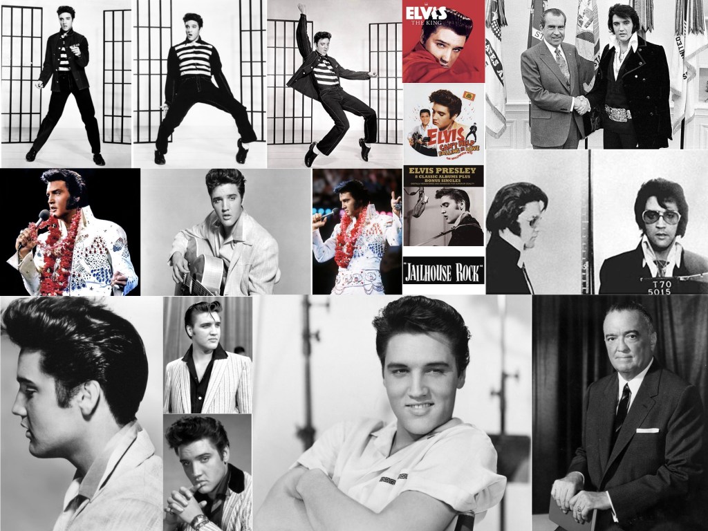
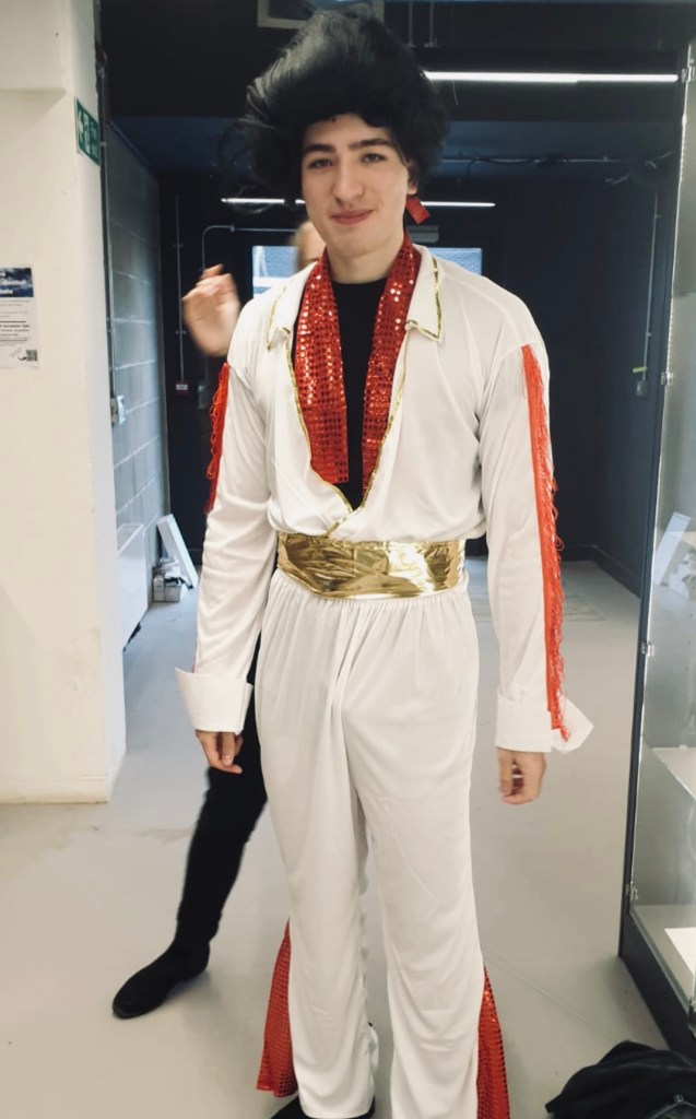
I feel that some aspects of the brief could be improved, for example, our Elvis model struggled to portray the iconic character and personality of Elvis. Given more time, to solve to this, I would have suggested finding another model and do a test photoshoot before hand to make sure the outcome of the photoshoot met the requirements. I also would have liked to use more props, however this is where me and my teammate struggled to compromise. This brief has taught me that communication with team mates is very vital in the process of creation and the next time I work in a team, I will express my opinions and thoughts mire clearly.
During this brief, I have learnt many new skills including Acid Etching, Metal work and the use of post production software. These new skills have made me more confident in experimenting outside my comfort zone and I look forward to trying more creative skills with future briefs.
For this brief, we will be working in groups of three and have been asked to create a proposal for an interactive installation to be displayed at the Winter Lights Festival 2021.
The aim is to create a presentation including the following:
– Concept
– Key visuals
– Animated video with audience interacting with the installation
– Prototype of your installation (arduino)
– Case study video with the summary of the previous points.
– Technical description (sketches, electronic diagrams, and materials involved)
To sum up: how would you convince the organisers of Winter Lights Festival to invest money in your idea?
The Festival
Our award-winning Winter Lights returns for a sixth year when Canary Wharf will be transformed by over 25 spectacular installations, leaving the dark winter evenings aglow. The spectacle will showcase light art and interactive installations by some of the most innovative artists across the globe working in light art today.
Some favourites have returned alongside pieces never before seen in the UK and some newly commissioned artworks. The exhibition features pieces that can be both admired from afar as well as those which will allow people to get up close and interact with them.
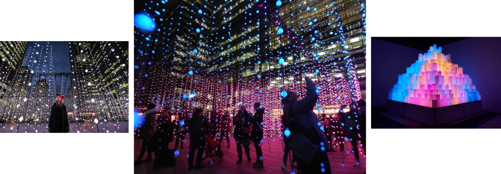
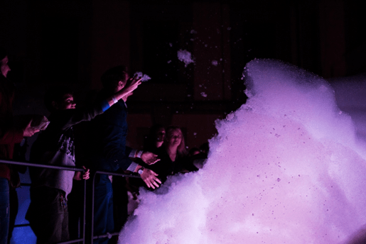
Inspiration from last years festival
SKY ON EARTH BY UAII STUDIO, COLUMBUS COURTYARD
“This atmospheric UK premiere is inspired by the experience of a night flight over storm clouds. Columbus Courtyard will be transformed into an electrifying life sized cloud made of foam. On a walkway, travel through and touch the cloud as lighting illuminates the foam to create beautiful colours accompanying the deep throb of a thunderstorm”.
Our Views: We think this is good example of an interactive installation. It engages the audience and appeals to all ages. The sensory aspect of touching the foam is exciting and is a texture which the audience won’t be able to resist, almost like bubblewrap. For Children, this installation is particularly exciting as colourful light, and touch are involved.
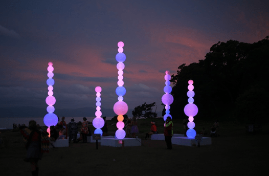
SHISH-KA-BUOY BY ANGUS MUIR DESIGN,WESTFERRY CIRCUS
“This fun installation is equally interesting by day as it is under the cover of darkness; during daylight hours, the large cluster landlocked six metre tall buoys absorb the light and give off a magical glow.
By night, thousands of LEDs inside create a whirl of colours and spherical gradients in this installation made from fully recyclable polyethylene marine buoys”.
Our Views: We have looked at this design as we like the idea of using LED lights in our own installation. We also feel that using spherical shapes will be easy to achieve and to work with.
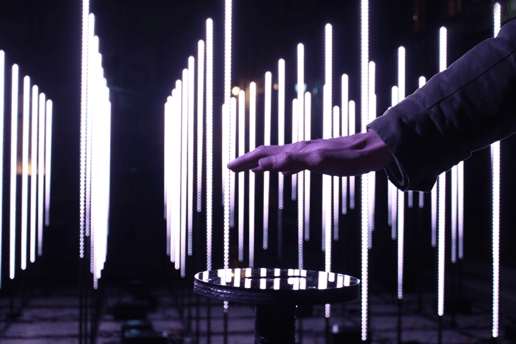
STRATUM BY STUDIO CHEVALVERT, WESTFERRY CIRCUS
Stratum is an interactive installation made up of 92 illuminated metal totems. Visitors are invited to move their hand over the sensor to trigger movement in the artwork. Sections of the installation represent different environments and elements, each with their own sound design – explore a cave, the ground, rain, lightning and the stratosphere.
Our Views: We are fond of using a sensor to trigger movement in the lights, and feel that we would be able to accomplish this using Arduino. Using sound has also appealed to us, giving us the idea to use sensors to trigger both light and sound in our installation.
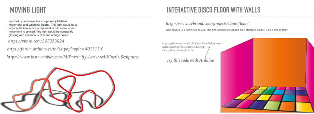
Initial Ideas
For our initial ideas, we have decided to work separately to came up with our own individual designs. We will then present our plans to other team mates, making pros and cons about each design, the pull together ideas to create a final design, concept and plan for Arduino.
My Ideas:
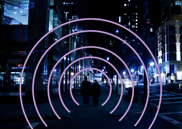
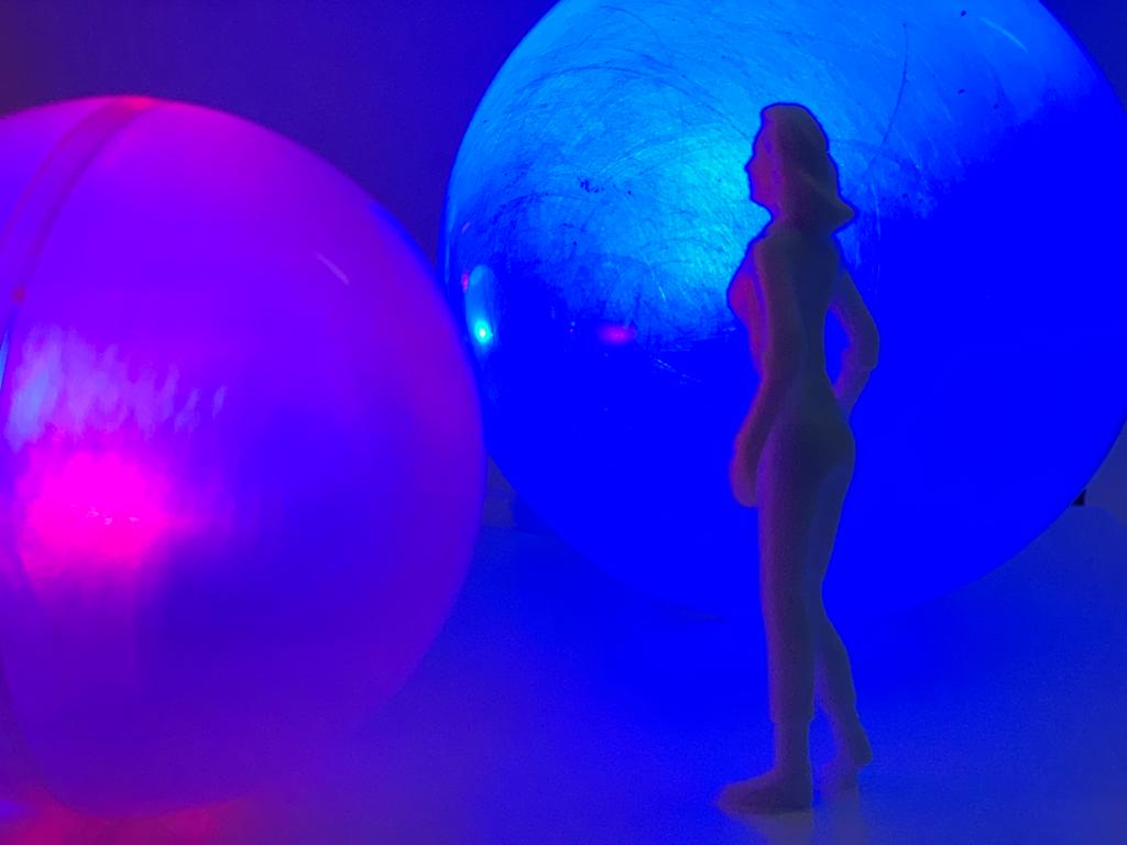
I have kept my first idea fairly simple, in order to gain a better understanding of what will be possible during the creation and use of Arduino. The idea is that sensors on the floor will trigger a change of colour in the light when people walk through. I chose a spherical shape to create a tunnel illusion and a sense of being surrounded or protected my the coloured lights.
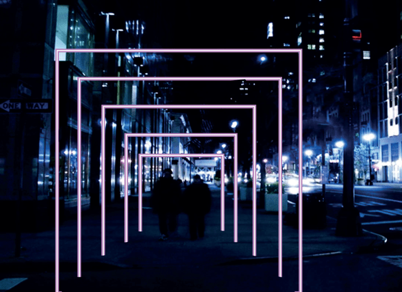
My Second idea is a bit ore complex, and has been inspired by Studio Chevalvert’s Stratum installation. When I read about the installation, the use of sensors to trigger movement and sound in the light appealed to me. I have used this concept for my first idea. The installation will be a series of individual light squares, placed in line and a small distance apart, creating a tunnel effect. As people walk through, sensors will trigger light patterns and sound. The sensors can either be placed on a flooring or on the sides and top of each square, working in a similar way to a hand dryer.
From both ideas, I prefer the concept and Arduino of the second. It is more exciting and engaging, however the square shape doesn’t add any excitement. To fix this, I will go with the spherical shape from my first idea, as the curved edges create a feeling of comfort, relaxation and intrigue of what is at the other end.
Millie’s Ideas:
Sam’s Ideas:
Review on ideas
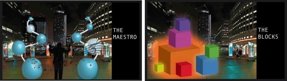
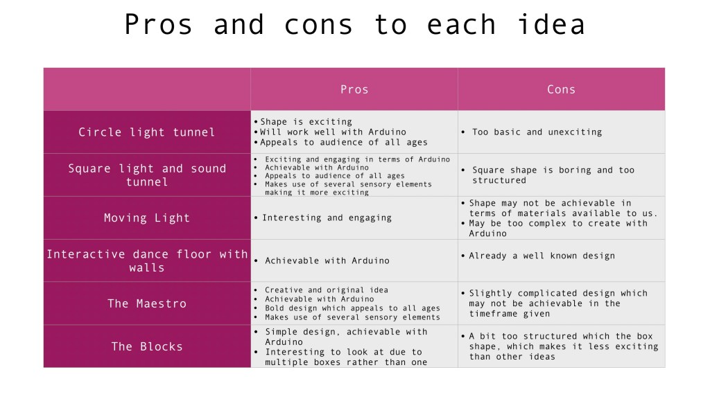
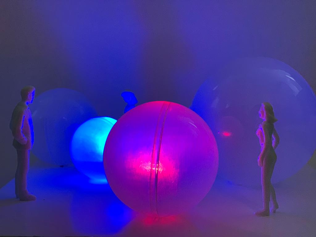
From doing a pros and cons list, we have decided that spherical/ball shapes will be the best shape to use for our design due to being able to use many materials for our prototype. After talking through all our ideas together, Sam, Millie and I decided to use Sam’s Maestro Idea. We will use spherical shapes ranging in different sizes, around three or four. Each ball will change colour when touched. We also plan to add sound which is activated by a touch sensor.
Concept
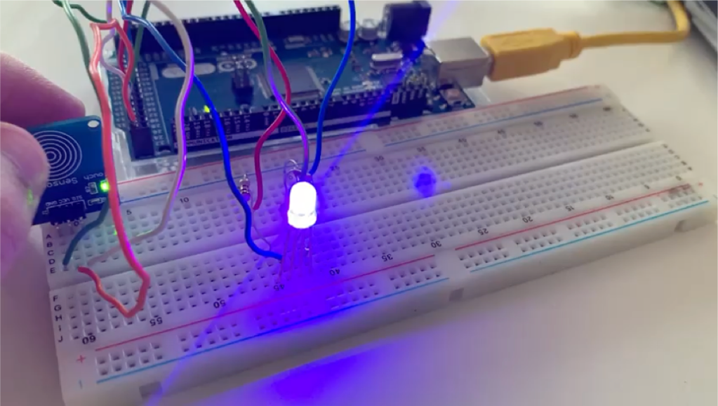
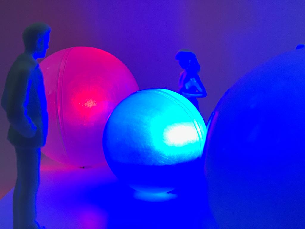
For our interactive installation, we have decided to combine the ideas of using sound and colour changes using sensors. Our installation is a bit complex, but we feel it is achievable with he materials and time frame available to us. Sensors will be used to trigger light colour changes by movement. The installation will be a series of individual balls, each ranging in sizes. When the audience touches the balls, the touch sensors will trigger LED lights inside to change colour.
For example, purple would be the default colour and when touched the balls will change colour. The reaction is instant and there is not delay between touching the sensor and the light changing. We also wanted a deep bounce or bass sound to play as the sensor is touched but we were only able to add the MP3 File to the SD card but could not find any code for the Arduino.
Our installation has been inspired by last years installation SHISH-KA-BUOY BY ANGUS MUIR DESIGN. As previously explained, this installation and design appealed to us due many different affordable material options being available to us, such as LED lights. The spherical shape is fun and easy to achieve and work with.
Arduinoand Coding:
FOR THE ARDUINO WE USED:
MP3 Sheild
Touch sensor
RGB LED Light
Arduino Mega 2560
Polythene spheres
We couldn’t figure out how to use the MP3 Shield Kit, however we put an MP3 on the SD Card but were unable to add the code.
ARDUINO CODE:
#define touchpin 25
int redPin= 29;
int greenPin = 31;
int bluePin = 33;
void setup() {
;
pinMode(redPin, OUTPUT);
pinMode(greenPin, OUTPUT);
pinMode(bluePin, OUTPUT);
pinMode(touchpin, INPUT); //sets the touch sensor as input
}
void loop() {
int touchValue = digitalRead(touchpin); //reads the touch sensor signal
if (touchValue == HIGH){ //if sensor is HIGH
digitalWrite(greenPin, HIGH); //LED will turn ON
digitalWrite(bluePin, HIGH); //LED will turn ON
digitalWrite(redPin, LOW); //LED will turn OFF
}
else{ //otherwise
digitalWrite(redPin,HIGH); //LED is turned ON
digitalWrite(bluePin,HIGH); //LED is turned ON
digitalWrite(greenPin,LOW); //LED is turned OFF
}
delay(50); //delay of 300milliseconds
}
Because it’s RGB, when the touch sensor is in “Low”, it’s doesn’t detect anything. The blue and red light turn on simultaneously to make a purple light. When the touch sensor is high and detects touch, the red light will turn off and the green and blue light will turn on simultaneously to create cyan.
This shows an example of the colour we want our touch installation to be, for example, purples as the default colour and when touched the balls change colour. The reaction is instant and there is not delay between touching the sensor and the light changing.
We also wanted a deep bounce or bass sound to play as the sensor is touched but we were only able to add the MP3 File to the SD card but could not find any code for the Arduino.
ANIMATION OF PROTOTYPE INSTALLATION AND ANIMATED VIDEO OF AUDIENCE INTERACTION:
The third and final part of this project is Postproduction. We will improve and retouch our photograph in postproduction.
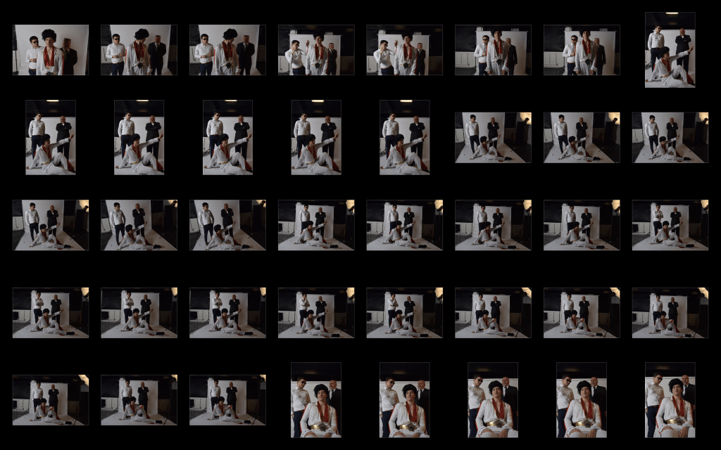
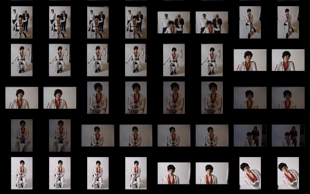
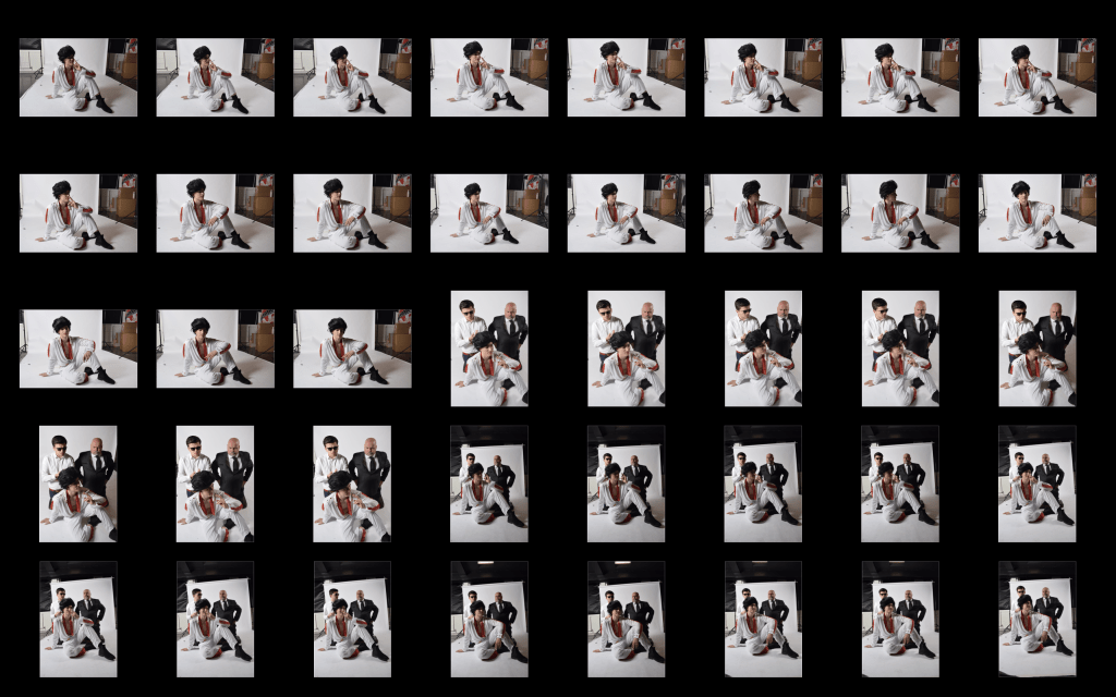
Contact sheets
Me and Katie decided to try and create one photograph each and then review them. The purpose of this was to find what worked and what didn’t to then incorporate what the best ideas into the final image.
For my edit, I focused on two different photographs (shown below) and attempted to merge them to create a stronger image.
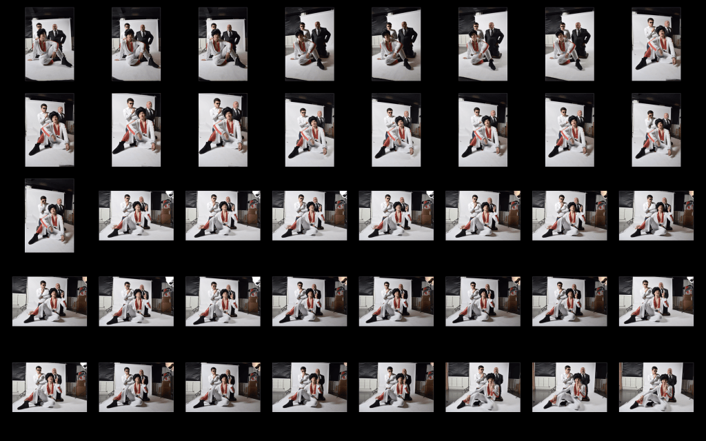
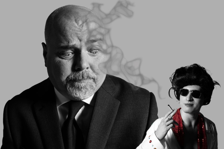
I chose the first photograph of Ben/FBI agent as it is a very strong image. I plan on adding merging the two photos together, making Elvis smaller to achieve a clear higher achy in the photo. This layout will hopefully create a sense of belittling Elvis, with the agent looking down on him. I also plan on adding our symbol somewhere in the image and smoke coming from the cigarette.
Overall, I don’t like the end product, however we purposely did this to see where to go next by highlighting what went wrong and what went right.
I still feel that both images are strong, but me and Katie have decided that they are only strong photographs on their own, not together. The eye-line of the agent does not match with that of Elvis. To fix this, we would have to put Elvis directly under the agent which we tried, but didn’t like the composition. We also feel that the smoke is too distracting so will attempt to create lighter smoke in our final image. Elvis’ overall look isn’t flamboyant enough and his expression is a little uninteresting, to solve this, we are planning to merge the top lip on Photoshop into Elvis’ iconic curled lip. Now that we have identified what went well and what didn’t, we feel refreshed and have a better idea of our final photograph.
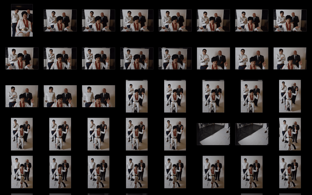
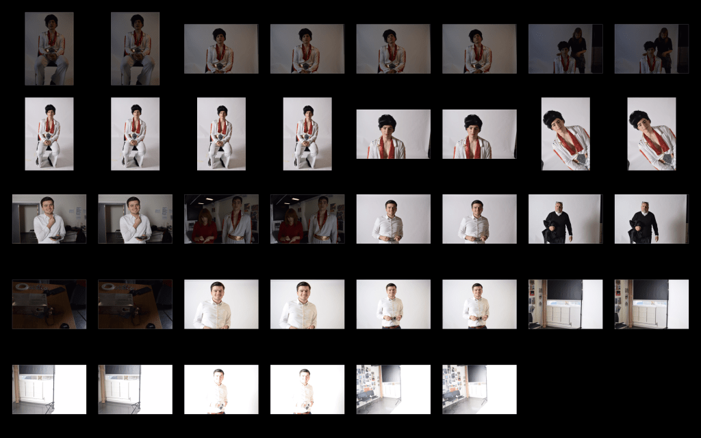
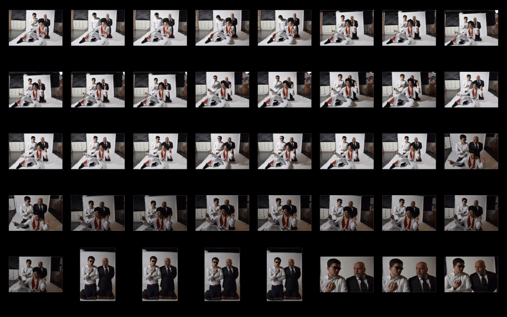
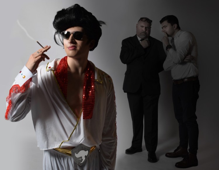
The Final Photograph
For our final image, we chose a different photo from our test image. We felt it was a stronger image due to better composition and our symbol being clearly in view. To begin with, we darkened the right side where the agents are stood, to create an eery feel and atmosphere. By having the agents in the dark, we have created a sense of dissatisfaction to Elvis and some mystery t what is being said between them. We put Elvis in the light as he is the main focus of the image. As planned, we lightened the smoke so it is not distracting. We have morphed and stretched Elvis’ lip to make his overall expression stronger and more iconic.
Overall, I have really enjoyed this brief. It has improved my digital skills and teamwork abilities. I have learn to compromise and put different ideas together while combing my own thoughts with the person I was working with.
With our final image, I am happy with it, however given more time I would do another photoshoot as we realised when reviewing our photos that most of our compositions and ideas didn’t work as well as we had imagined. While editing, we also came up with some very strong ideas but were unable to apply them with the images we had. I also enjoyed using different skills such as the metal work and acid etching we did for our symbol, which I have never done before.
The second part of this project is Art Direction. Our photograph will be taken in a studio (not outdoors). We will create an art direction for our photograph and will decide the aesthetics of the lighting, the clothing, the staging, the casting of models, their characterisation, the props. We will also design the composition of the scene, based on the story of arrest. Also, we have to include the icon we have designed somewhere in the scene.
Due to only having a two hour slot for our photoshoot, me and Katie decided it would be best to create a plan on how we want our photograph to look. We have made a list of the most important ideas and things we want to include and portray in our photograph.
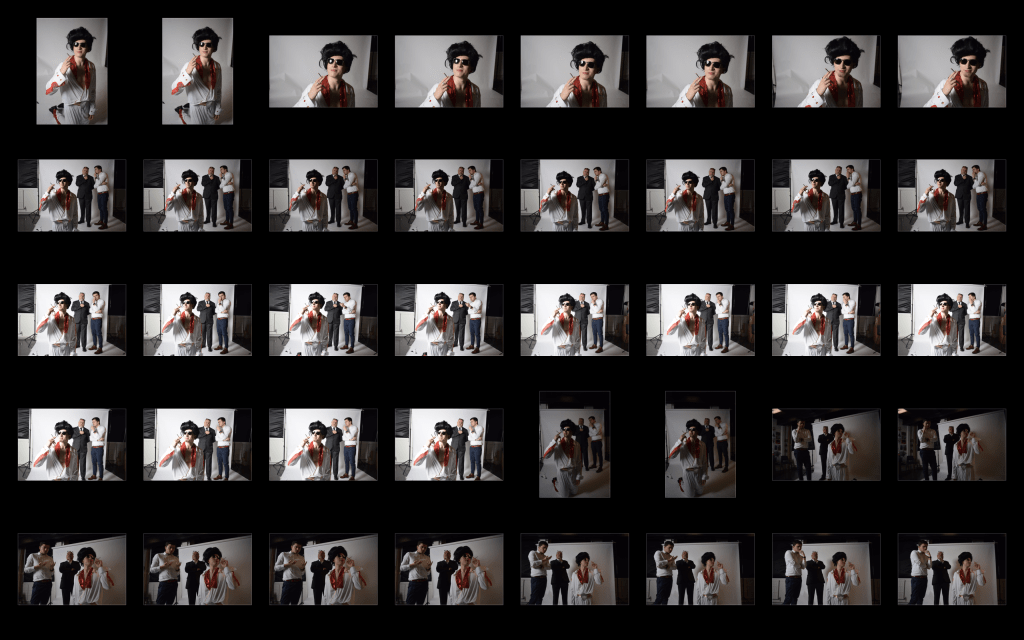
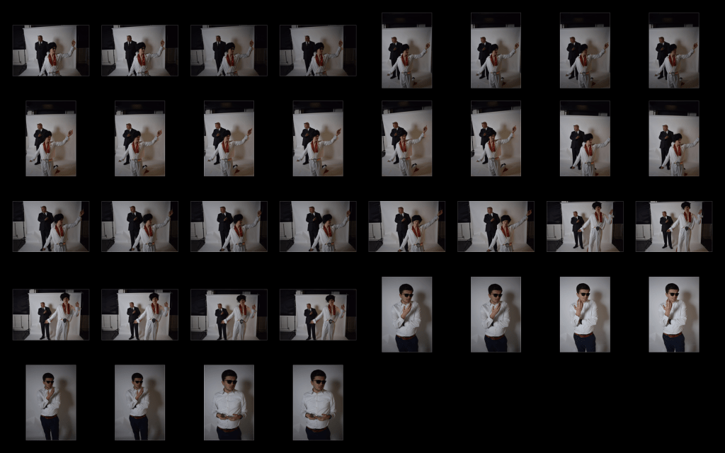
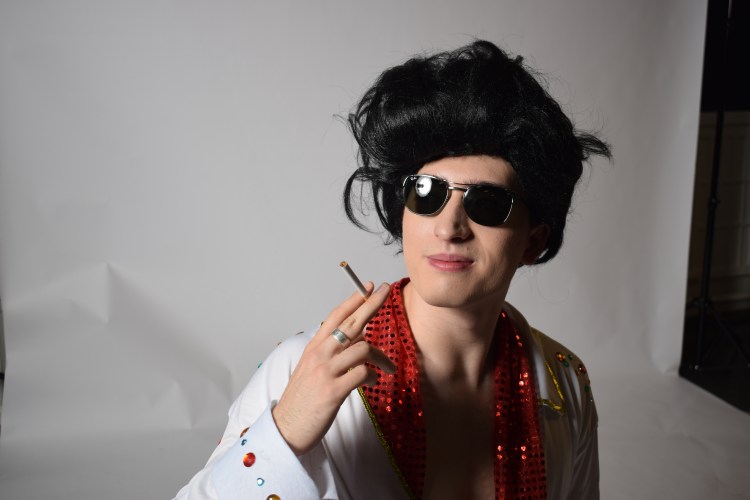
Iconography – Through our research, we have recognised the main iconography of Elvis Presley. These include his unmistakable fashion, more specifically, his glasses, belt, hair and stage costumes.
The story – Our photograph needs to tell the story behind Elvis’ mugshot, after all, that is the name of our project.
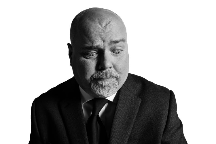
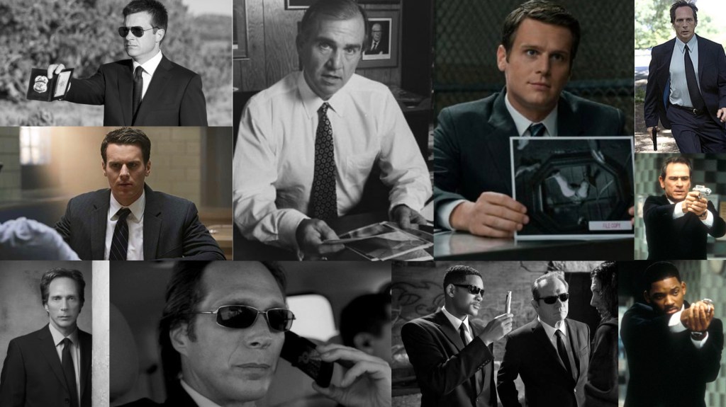
Key characters – Elvis and FBI agents will be our only characters. We are looking at using two FBI agents as we feel this would create a better composition than using only one agent.
Character expressions and attitudes – Elvis’ character needs to be flamboyant, not only in his style, but his attitude and general demeanour. We want our Elvis to convey a similar expression and attitude as the real “King of Rock and Roll”. Expressions we are thinking of are his iconic dance moves and his well known and recognised curled lip. The FBI agents need to portray a general disgust and rejection to Elvis, perhaps whispering about him or looking down on him. The hierarchy in our photograph will be difficult but very important. We need to make the agents of higher authority while being careful to not over shadow Elvis.
Composition – As previously written, the hierarchy in our photograph is very important. To exhume authority we are planning on having our agents stood behind Elvis and perhaps having Elvis laid or sat on the ground and further in front. This layout will hopefully create a sense of belittling Elvis, with the agents looking down on him. By doing this, the photograph will be able to tell the story through imagery.
Mood boards
Elvis:
Elvis’ character needs to be flamboyant, not only in his style, but his attitude and general demeanour, so we have asked our mutual friend Roland to play this part. We will be purchasing an iconic Elvis costume online to achieve the iconic clothing stye and, of course, Elvis’ iconic hair in the form of a wig.
FBI agents:
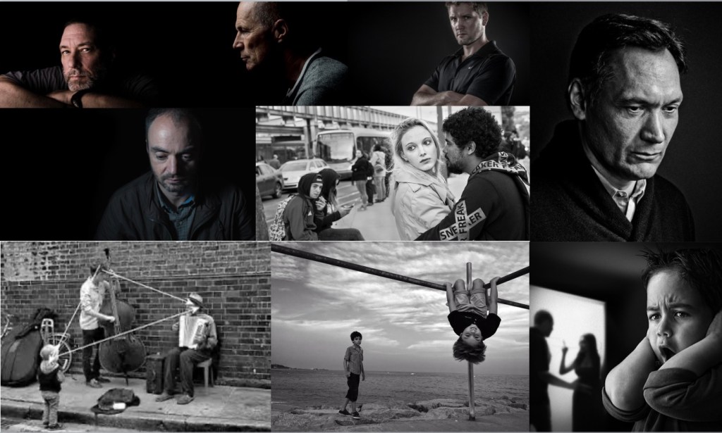
We created a mood board to help us envision how we want our agents to look. As previously explained, the FBI agents need to portray a general disgust and rejection to Elvis, perhaps whispering about him or looking down on him. The hierarchy in our photograph will be difficult but very important. We need to make the agents of higher authority while being careful to not over shadow Elvis. The overall look of our agents we be similar to the mood board below. Serious, stern facial expressions are important and they will need to be sharply dressed.
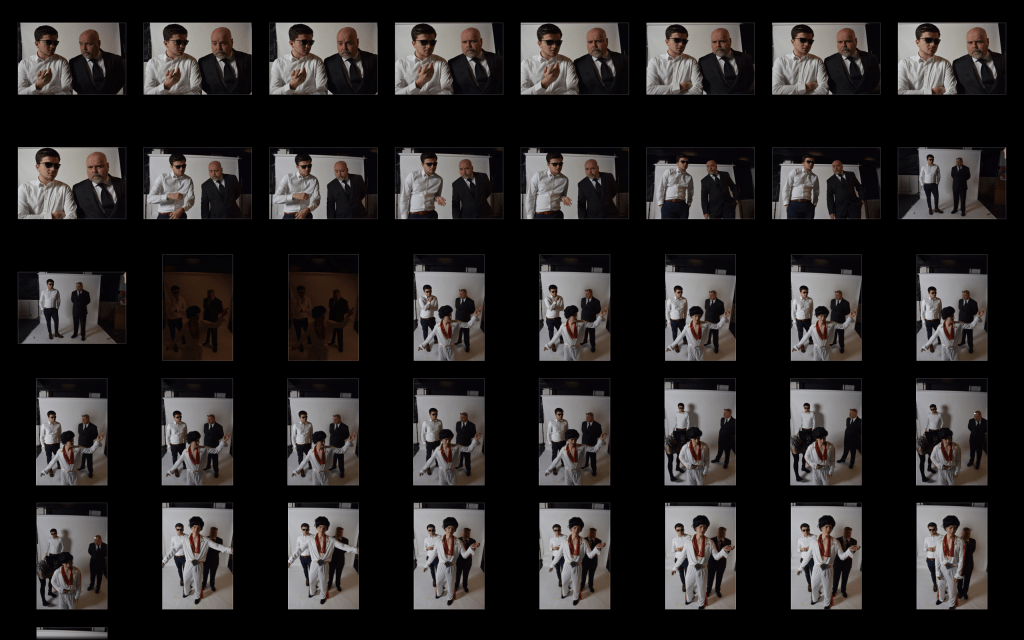
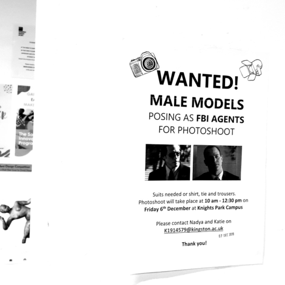
The FBI agents will need to be sharp looking, so will be dressed in suits. We have asked another member from the course, Ben, to play this part and have stuck up flyers around the University asking for volunteers to play the other agent.
Lighting and composition:
This mood board is to give us an idea of lighting and composition. We aim to keep the agents in black and white, or very saturated to add an eery atmosphere. We want Elvis in colour and to be closer to the camera with the agents in the distance whispering.
Unfortunately, nobody has responded to our posters, so we have asked a friend to model as our second agent.
Costume
Now that our costume has arrived, we have done a fitting session with Roland to see if any adjustments are needed before the shoot. The fitting is right, however we feel that the costume itself is not bold enough. To fix this, we have bought some stick on gems and have attached them onto the coat. Both of our agents own their own suits so no fitting session is need with them.
Props:
In terms of props, we don’t feel that anything is necessary apart from our symbol badge. The costume will be the main point of focus within the photograph and due to our planned composition with Elvis close up and the agents in the distance, we feel that using any props will distract from Elvis.
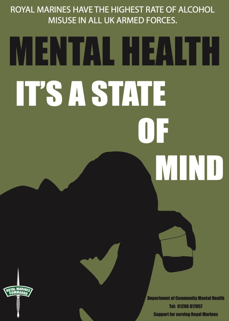
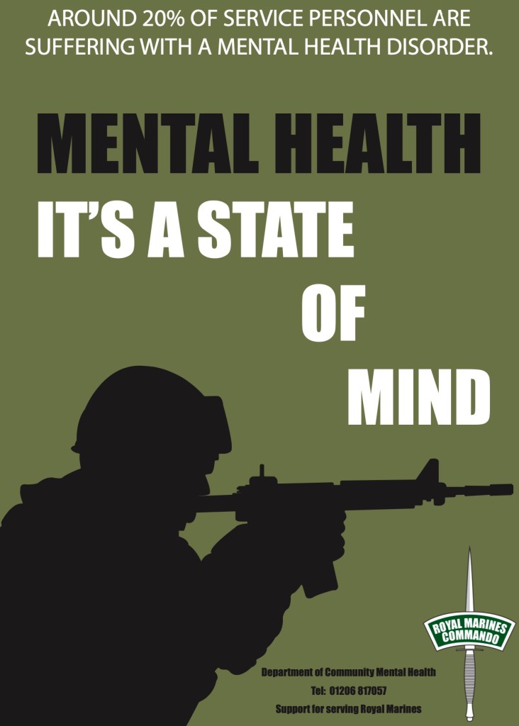
From personal insights and extensive research, it has become apparent that mental health among male Military personnel is a pressing issue, and has been since the First World War. Although my research has shown that Royal Marines have lower rates of ill mental health than other services, I believe through personal insights that it is likely mental health among Royal Marines is either the same or higher, because less personnel are seeking help.
I feel that through advertising, we can help Royal Marines seek necessary help and eradicate the stigma of mental health in military personnel. Project Regain has clearly been a huge success with Royal Marines and I will further analyse their methods and apply them to my own forms of advertising through the means of posters and magazine.
Posters
To begin with, I revisited my mood boards to refresh my mind on the general Royal Marine aesthetic. All the images featured on my mood boards consisted of a typical Military colour pallet of greens, greys, blacks and white which I have used in my poster designs. I kept the designs straight forward and bold, much like the Royal Marine lifestyle itself. I chose to add silhouettes rather than photographic imagery to enforce the idea that recruits can choose to stay anonymous when seeking help.
The statistics featured on the posters have been take from the UK Ministry of Defence statistics document and the telephone number at the bottom of each poster is the number for the Department of Community Mental Health. I have also added the Royal Marine logo to give a professional and official finish.
“It’s a state of mind” is the official slogan for the Royal Marines, and I felt that it fit well with the theme of mental health.
Magazine
Along with posters, I have designed a few pages for a possible magazine to be sold on base. The magazine includes news of deployments, new Military procedures and equipment, as well as support for personnel and general on camp news.
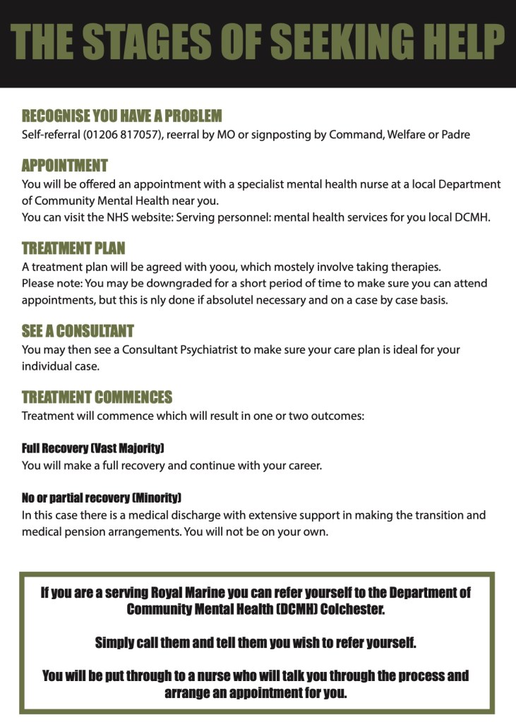
On the left hand side, I have included one of the mental health posters I have designed. As well as being displayed within the barracks, I felt that it would be effective to have mental health adds in the magazine itself. On the next page (right hand side) I have taken the stages of seeking help from the Project Regain page on the Royal Navy website.
I feel that this would be an effective way to get Royal Marines to seek help as they can read the magazine in their barracks and keep note of the steps to get necessary help without anyone else knowing. I have included these pages into the magazine as although the posters I have created will raise awareness of mental health on camp, I feel that recruits will not take note of the telephone number given in-front of their troop mates and other recruits. The magazine will be made available in the on-camp shop where recruits and other personnel can buy general cleaning products, Military accessories and food. This way the magazine will be easy to buy and personnel can get help anonymously and secretly.
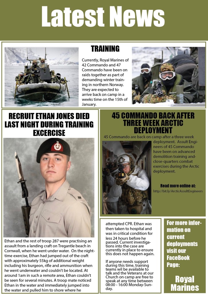
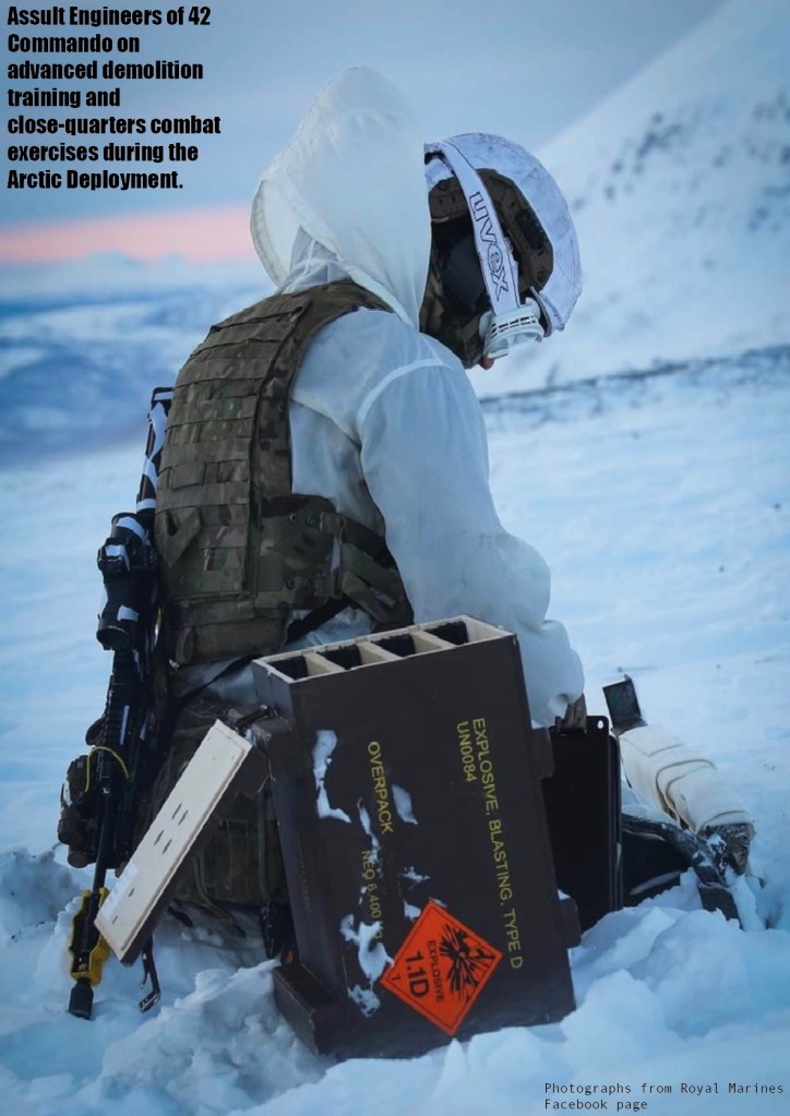
All Photographs have been taken from the Royal Marines Facebook page as my boyfriend is currently on deployment so I am unable to take my own.
These next two pages include what has been going on in the last few weeks both on an off camp. Information includes news on current deployments and training exercises as well as what is new on camp. On the left hand side I have included a short article about Ethan as an example of an important event which has affected recruits on camp. Using the Royal Marines Facebook page, I have gotten some images and information on pervious deployment exercises which other recruits may like to read about.
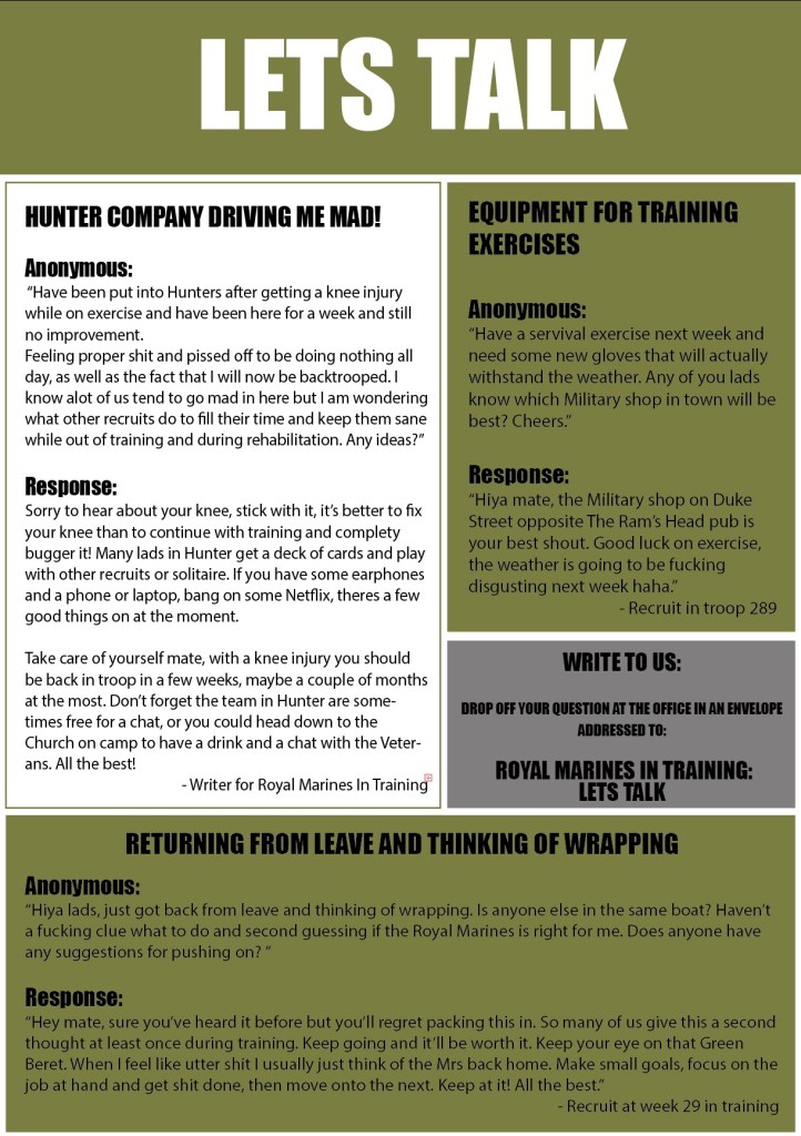
On the left, I have designed a “Let’s talk” page, inspired my advise columns found in many woman’s magazines such as Cosmopolitan. I have used the basic idea of a question answer page but have tailored it to Royal Marines in training. Recruits can write to the magazine and other recruits can write a response. The idea is to urge RMC’s to talk and ask questions openly and, if preferred, anonymously. Explicit language and Royal Marine lingo is permitted to bring comfort and informality to the magazine. I have chosen this approach to urge recruits to talk and write in to the magazine.
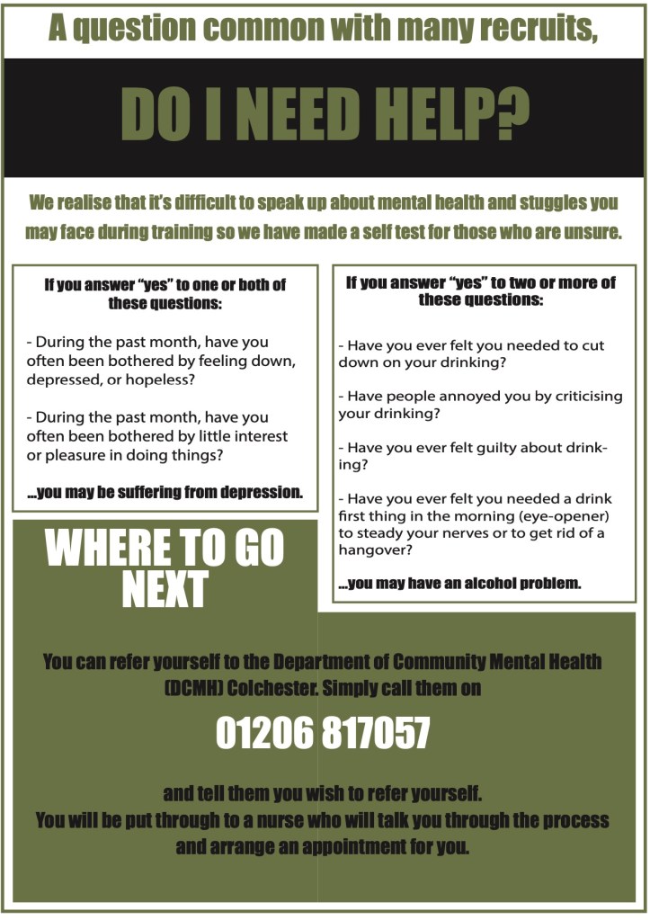
On the right hand side, I have created a page inspired by Project Regain’s self tests which can be found on their website. The page consists of quick self tests recruits can look at if they they are in need of support but unsure of what the problem is. Perhaps even through just reading, recruits who feel they are in a good psychological state may take the tests and realise they may need to seek help or support.
The Overall Idea
The overall idea of the posters and magazine was to keep it simple. Recruits like to be told exactly what they need to do and do it. By using a simplistic approach, I believe it would prompt Royal Marine recruits to speak more freely about mental health without feeling ashamed or embarrassed. I strongly feel that the magazine would do well if it was to be sold on camp, and bring a better understanding and acceptance of mens mental health in the Military.