Protected: VIRGIN ATLANTIC
MEQ Brief – From Dull To cool
Brief:
Increase MEQ participation from 50% to 75%.
Outcomes:
Problem framing, idea and prototype:
- Reflections on your problem analysis. Your conclusions. Why are you doing what you are doing.
- User journey and touchpoints
- Design and prototype your solution. It can be an installation, or a new UX/UI
- Make a case study Video (1 min)
Why MEQ’s are important:
Data is crucial to design and evaluate any product or service, however gathering user data can sometimes be challenging, particularly when gathering feedback. Kingston University Module Evaluation Questionnaires to evaluate the teaching practice and student satisfaction.
The challenge:
Currently, the response rate is around 50% for some of CCI’s modules. That means that only half the students fill in the MEQ’s with their thoughts on the module. The data therefore does not reflect the real opinion of the cohort.
The challenge is to increase participation from 50% to 75%. More data means more quality information, and therefore, better understanding of the module’s dynamics. Although the students receive email reminders, and the tutors remind the students in class to fill the questionnaire, there is still a high percentage that do not engage with giving feedback.
Idea #1 – Nadya and Angela
Insight:
A visually appealing design with earned rewards and enhanced promotion will increase the response rate from 50% to 75%.
Reflections, Problem Analysis and Conclusions:
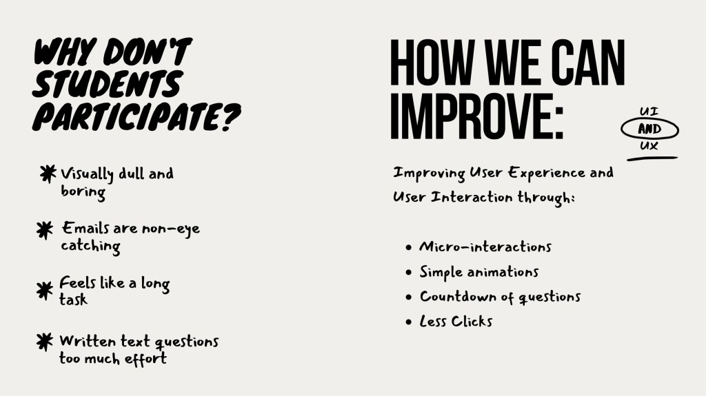
Why don’t students fill them in?
- Boring and visually dull.
The current MEQ’s look dull, boring and academic. Brighter colours and simple animations will make improve the user experience.
- Emails are not eye-catching
Emails are easily lost in the users inbox. They need to stick out and make the user want to open the email. Better subject titles will encourage students to read the email.
- 1-5 questions are easy and quick to fill out, but the written answer questions are too much effort. Students have to think of a response, and type it out.
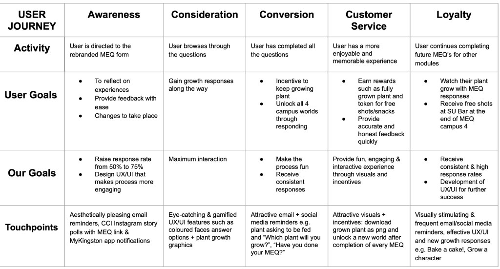
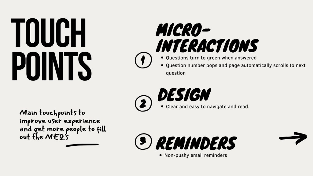
Touchpoints:
- Brighter colours and more visually appealing questionnaire
- Simple animations
- Email reminders: More attractive and interesting subject titles
- Rewards
Brainstorm and process:
Initial Ideas:
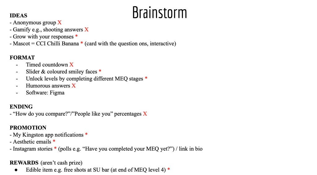
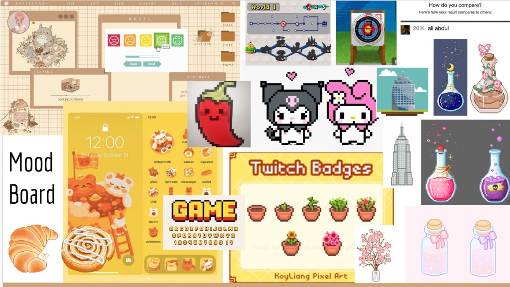
Visual Identity:
User Journey:
Mockups:
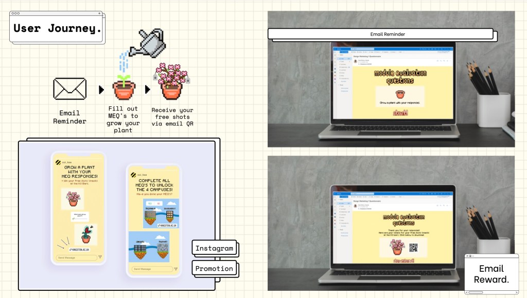
Essentially, our idea was for students to grow a plant through responding to the MEQ’s. With each MEQ, their plant would grow, and they would win a free shot at the KU Bar after completion.
Overall, I think our idea was fun, bright and eye-catching. The reward system we created, would definitely prompt more students to participate and give feedback. Our idea of growing a plant sounded good in theory, but looking back at our prototype, I feel that it doesn’t work well. As a whole, I feel that we had too many touchpoints and should have focused on one or two instead. Due to this reason, I decided to improve this brief further.
Case Study Video:
Individual Improvement:
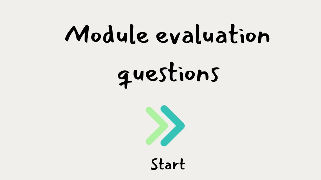
After reflecting on our previous attempt, I decided to try the brief again, individually.
Design:
I kept the design simple and clear, after all, this is an MEQ, and there is no need to complicate it. The aim during the design process was to keep the MEQ simple to navigate, clear and practical. Students want to fill it in quickly, and move on with their day.
I used a hand written font style, to give a slight academic feel, while keeping the visuals fun. I also felt that bright colours were unnecessary, so kept the background and text monochrome, adding a pop of colour to the 1-5 questions.
Instead of a numerical scale for the first 10 questions, I designed a a scale of emotion. The simple designs are a bit more fun than numbers, however don’t over complicate the process.
Interactions:
As the user navigates through the questions, they can check their progress in the top, left hand corner of the screen. This will encourage completion of the MEQ, as students can clearly see their progress and how much is left to complete. As the user completes a question, they receive a tick to signify completion, as well as a “You are here” arrow. Completed questions appear grey, with their answer highlighted with colour.
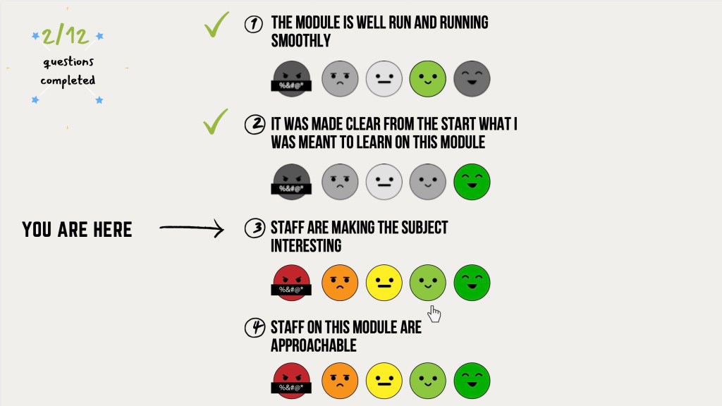
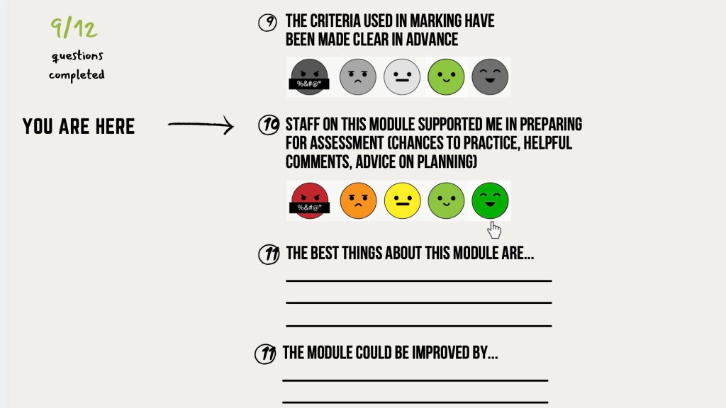
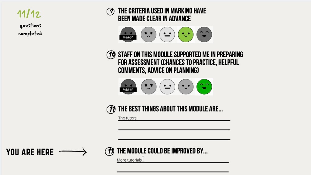
The MEQ works one a single page, with the user simply scrolling down. The action of scrolling is easier and more efficient than clicking “next” after completing a question.
Prototype:
Reflection:
After providing two completely different outcomes, I believe simple was the better approach for this brief. This was my first attempt of creating a website prototype, and although I am pleased to have created two, I would like to improve. The prototypes could show the UX/UI clearer, and a better scrolling prototype would be beneficial in explaining my concept. I also believe more assets would help show the user journey. My prototype in future would show the user journey from the email reminder, to the end of the MEQ.
Build Your Own Brief and Speculate
Brief:
- Select a topic you are interested in. Find a signal.
- “What if…” Create a speculative response (product or service).
Outcome: 1 minute video including the following:
- Present the problem based off your signal
- Present the Product or service (Introducing..) Brand it.
- How it works
- Final Slogan
Research & Speculative Design:
Think cultural, economic changes.
Speculate the ecosystems:
- What does the future environment look like?
- What are the challenges and/or rules?
- What are the states of technology?
Determine Social and Cultural changes:
- What impact will design have on society?
- How does it change our behaviour socially and/or psychologically?
- What are the good and bad knock on effects?
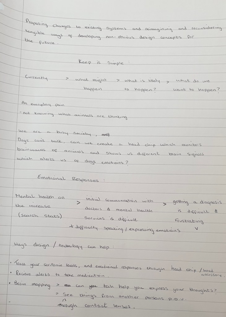
Focus on the possibilities of the future. How can emerging technology help current/future problems? What issues can my product solve and what further issues or concerns would it bring?
KEEP IT SIMPLE!
What if…
Imagine and envision possible future scenarios. Mix disciplines to speculate a design outcome and challenge social constructs.
Inspiration:
Black Mirror – ArkAngel Season 4, Episode 2
Arkangel shows the lengths a parent will/would go to to keep their child safe, away from harm, and under control. After loosing her three-year-old daughter at a park, a mother makes the decision to get Arkangel chip implanted in her daughter. This chip allows the mother to monitor her daughters whereabouts, health and emotional state and wellbeing through a digital tablet, similar to an iPad. The System also allows real life parental controls, blocking the Childs vision of whatever her mother sees fit.
Black Mirror, The Entire History of You, Season1, episode 3.
An implant that allows humans to record and replay their lives. Main character, becomes obsessed and begins to believe his wife is cheating on him. In a fit of jealously , he forces her to replay her memories with other men in front of him. Eventually cuts off his ear in an attempt to remove the chip. Take-away thought- Sometimes, ignorance is bliss!
Brainstorm – Notes:
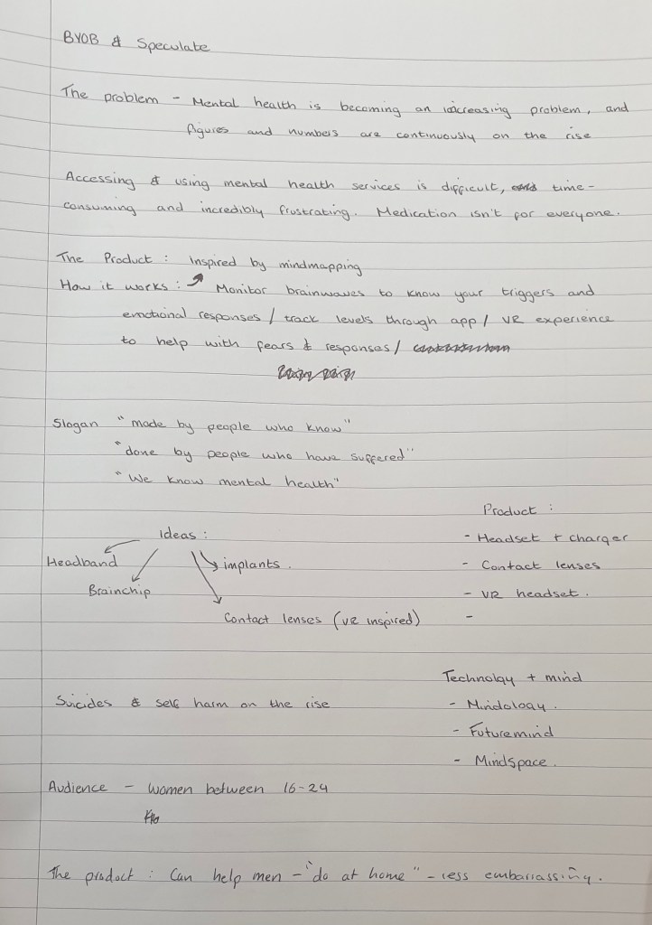
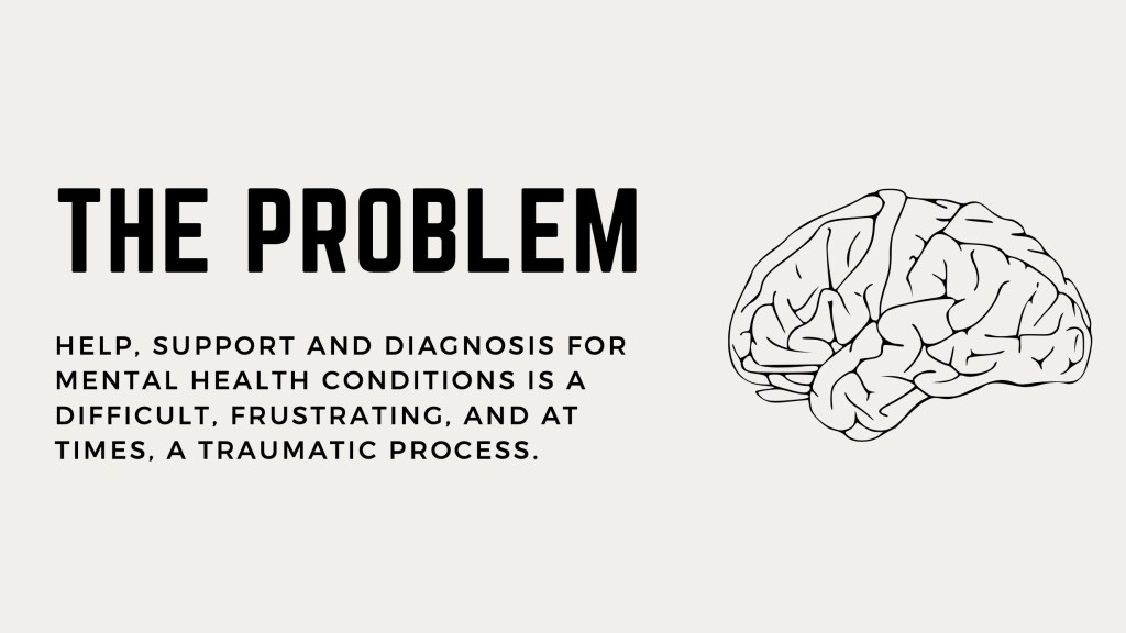
The Problem
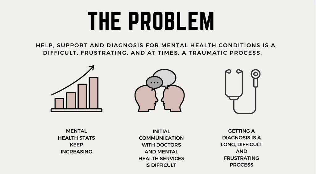
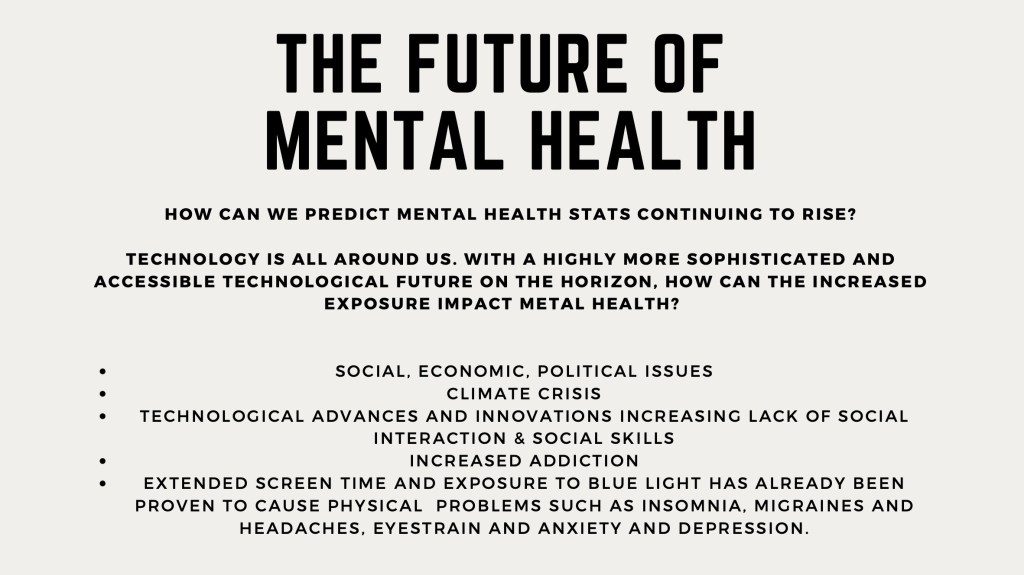
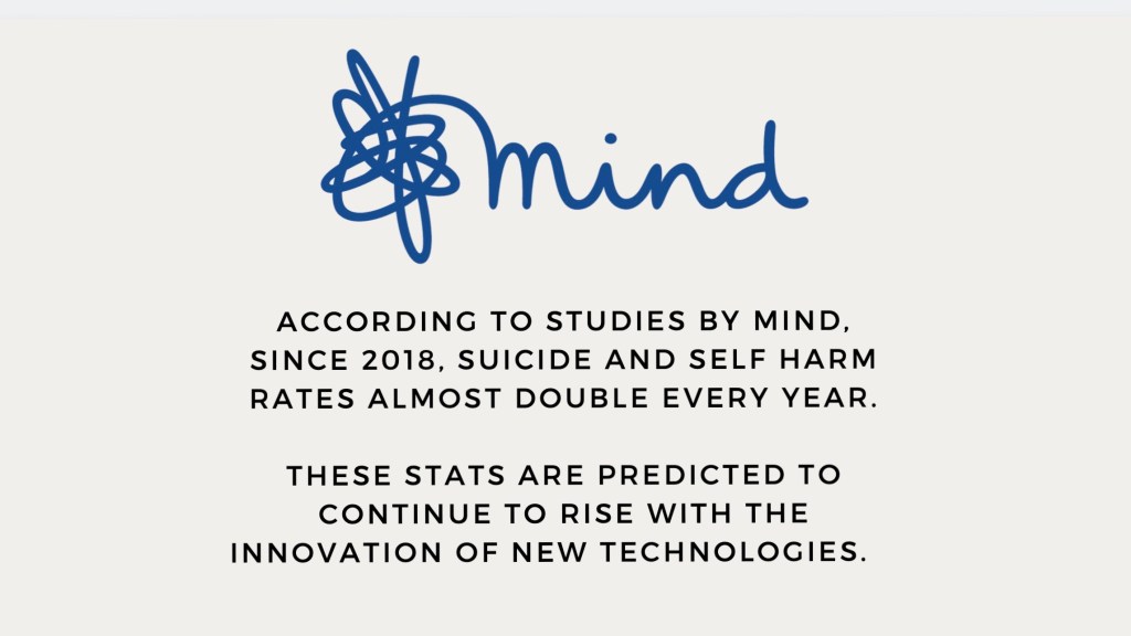
Mental health is becoming an increasingly explored topic in many areas, including design and technology. According to Mind, females aged between 16-25 are more likely to suffer from mental health problems. But why? My conclusion is that this age group spend more time of social media. With technologies advancing, we are spending more and more time online, and for this age group, that may be a bad thing.
The link between mental health and social media/technology has already been proven to have a negative affect on people’s mental and physical health. Extended screen time has been proven to cause anxiety and depression due to social isolation and the loss of effective social skills. As well as problems with sleep, migraines and eye strain.
The future is technological. We won’t stop innovating, so how can we use technology to help mental wellbeing?
Communication with doctors and mental health services is something I myself have and am struggling with. The diagnosis process is something I, like many others, find long, difficult and extremely frustrating.
Solution:
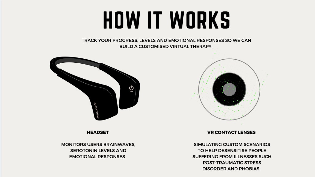
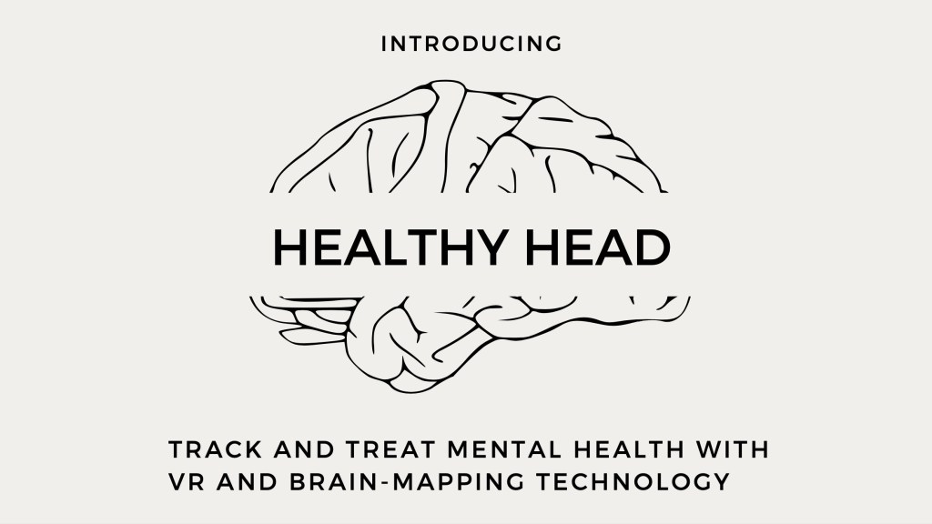
My answer is to use technology to help, support and diagnose mental health conditions from home. Essentially, I am designing a Headset that monitors brain waves, serotonin levels, and emotional responses. From this, a Virtual Reality contact lens simulates custom scenarios to help desensitise people to events/circumstances/situations which would trigger an intense emotional response. This kind of technology could not only be useful to people with mental health disorders, but could also help with the rehabilitation of criminals, addicts, and more.
Research
Introducing…
How it works
Outcome: 1 minute video (link below)
Reflection:
Before this brief, I had never heard of Speculative design, and felt extremely out of my depth. However, upon researching, I became fascinated with the concept, and would like to pursue this path/concept in other projects. The idea of predicting the future and creating something that may be extremely beneficial is not only fascinating, but fun.
I was inspired by my own struggles and frustrations with metal health to create Healthy Head. This is a product I believe could benefit many people now, and in the future. Mental health isn’t something that will just disappear in the future, it is something that statistics show is progressively getting worse.
Creating something that could diagnose and treat people in their own home is not only convenient, but it could actually decrease suicide rates, particularly in men. Men have the highest suicide rate, and this is widely believed to be the fault of toxic masculinity, gender stereotypes, and societies expectations of men. Men suffer in silence; a product like Healthy Head could take away the shame and embarrassment men feel about their mental health.
Overall I enjoyed this brief very much, and would improve in the future by creating a prototype of how this product would work. Perhaps even creating a mockup video of the Virtual Reality imagery the user would be able to view.
D&AD – XL Recording & Editor X
The Brief: Create a must-visit website experience for a classic XL Recordings album using new tools and technologies that weren’t available at the time of album release.
Initial inspiration to choose The Prodigy’s Fat Of The Land came from personal love for the band. They were one of the first bands my dad ever took to me see, and Fat Of The Land remains my favourite album by The Prodigy.
Audience: Appeal to existing fans , as well as those who don’t know they are fans yet. Ravers, alternative community (punk), Misfits, “Firestarters”, rebels.
UX & UI
Technology:
- VR
- Micro-interactions
Micro-interactions:
Simple and subtle animated interactions between user and website. For example, animated Facebook reactions, Text colour change on websites.
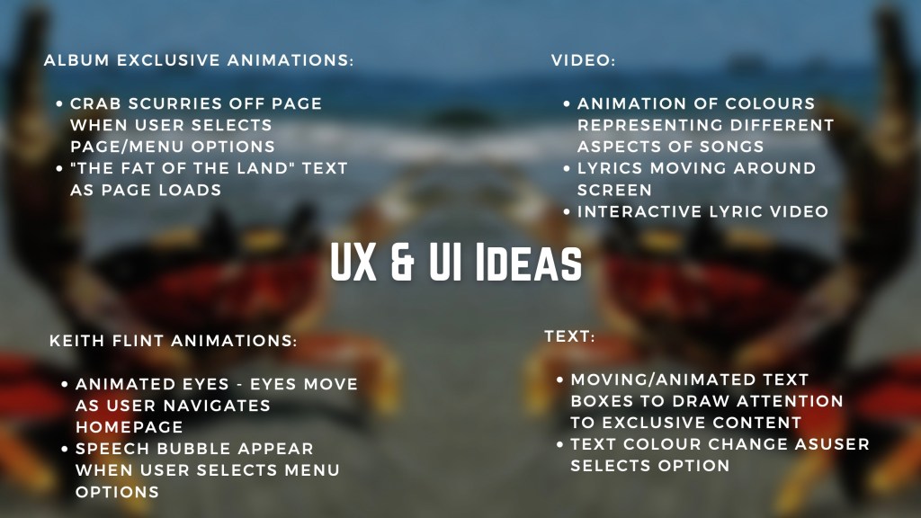
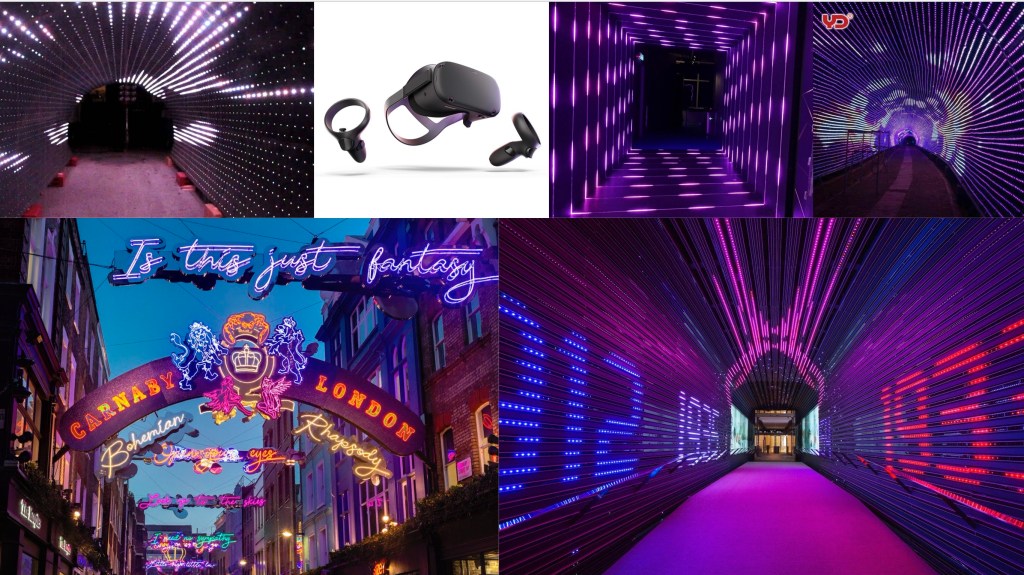
VR Idea:
A lyric video which can be used with or without VR headsets. VR is a good way for people to be immersed in another world. A VR lyric video for each song from the album will bring the song and album to life, where the user is surrounded by the colours of the lyrics, synthesis, bass, keyboard etc. As well as the lyrics of the song. They can literally walk through the album!
Inspiration:
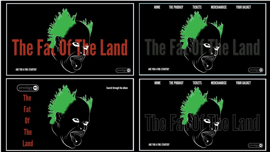
Home Page mockups and development:
The Problem:
Red text drew away focus from the illustration I made on Keith. As the illustration is the main focus (eyes moving), the text colour needed to be changed. Below is the process of experimenting with the text and possible layouts of the homepage
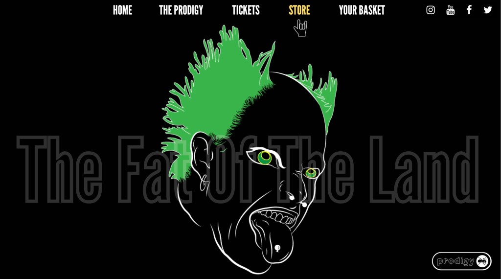
Final Home Page
The final home page is clear to navigate, with a simple, block white type for the main menu options and social media icons.
The Fat Of The Land remains visible, however does not draw focus away from the Micro-Interaction of Keiths eyes following the users cursor as they navigate the page.
On the illustration itself, I changed the eyes to green, simply to draw more focus to them. I also removed the thick eyeliner in order to make the eyes bigger, and more central to the page.
UX & UI: Keiths eyes follow the custom cursor as the user navigates the homepage. As the user selects a menu option, the text colour changes to highlight the option the user has selected.
Menu mockups and development:

Final Menu Mockups:
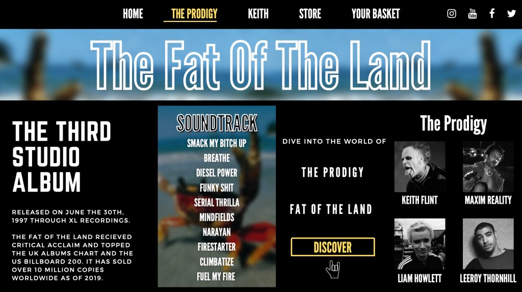
“The Prodigy” Menu option takes the user to a new page, where they can discover more about the album and the band, and can access the VR experience of Fat Of The Land
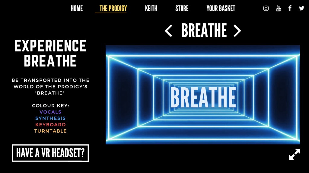
The VR Experience
The Virtual reality experience can be accessed with or without the use of VR headsets, in order to be accessible to everyone. The experience is essentially a lyric video, where the user enters a neon tunnel and is surrounded by the lyrics of the song they have selected.
Different coloured neon lights blink and pulsate according to the sound waves, and intensity. A colour key is shown in the mockup below.
The VR aspect gives the user the immersive experience of “walking through” the album, where they are surrounded by the lyrics of their favourite songs on the album.
Other Menu mockups:
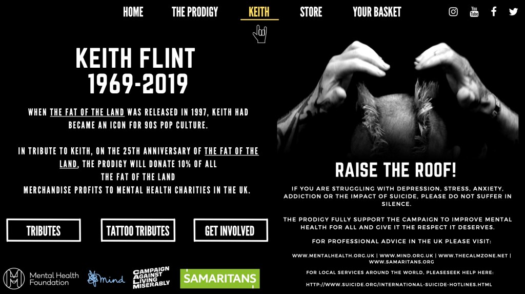
Tribute to Keith
I felt a tribute to Keith Flint was necessary, as a page for his memory and the Prodigy’s “Raise The Roof!” project appeared on their official website as I was researching.
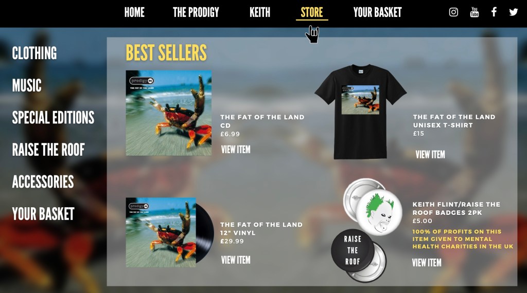
On this page, is information about Keith, as well as Information about the Raise The Roof Campaign and information about mental health. In addition, I created a hypothetical tribute to honour Keith and the 25th Anniversary of The Fat Of The Land, offering 10% of every Fat Of The Land merchandise sales to be given to mental health charities. This will particularly appeal to current, old and loyal fans, and gives customers a “Feel Good” feeling. In the Store mockup below, I also created official “Raise The Roof” merchandise.
Reflection:
Overall, I thoroughly enjoyed this brief, and feel confident that I have created a must-visit website experience with tools and technologies which weren’t available at the time of the album release. I am happy with how I have presented this project, and think I have done well in capturing the truth feel and aesthetic of not only the band, but the album too. The micro-interactions I have created, have created a good UX and UI, and is done to a good, overall standard.
I think I could improve this project by creating a functioning prototype of the VR Video Experience, and could possibly improve on the micro-interactions by making them more complex.
Advertise Yourself
Ebony Horse Club
Landmark Arts Trust
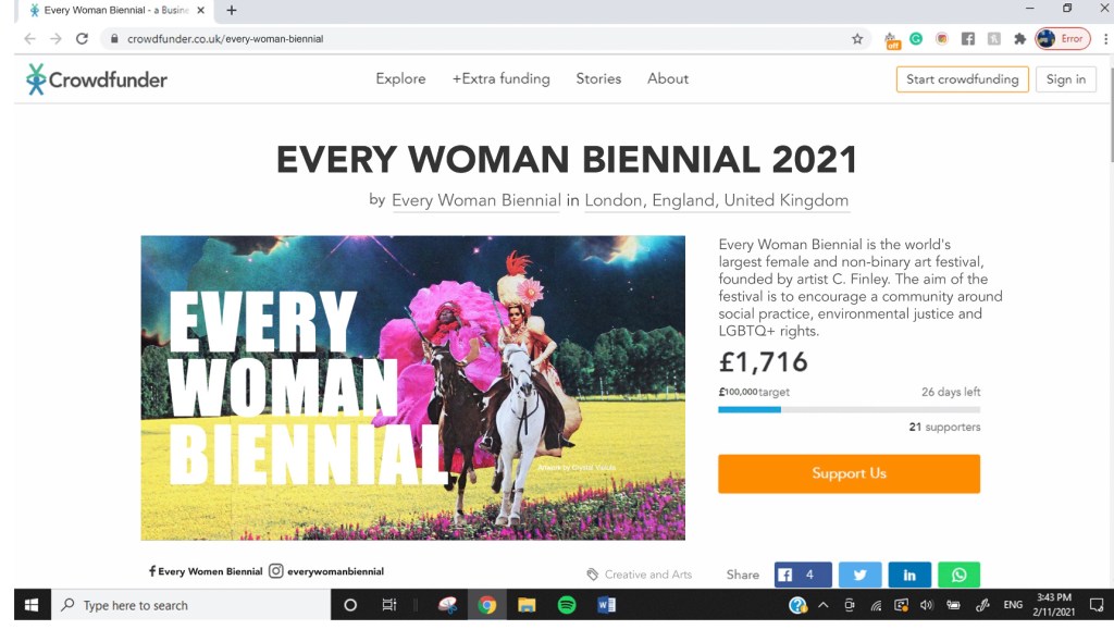
Every Woman Biennial
Amanda, Angelique and Nadya
Brief and challenge
Every Woman Biennial is the world’s largest female and non binary art festival, founded. by artist C. Finley. The aim of the festival is to encourage a community around social practice, environmental justice and LGBTQ+ rights.
Our creative challenge is to promote the Crowdfunder for Every Woman Biennial to amplify the reach and drive people to donate while thinking about concepts and designs. Our ultimate aim is to raise £100K.
Research
Possible Crowdfunding problems and challenges:
Covid-19 has caused many problems, which has created some new and vital charities and fundraisers. There is also a lack of disposable income for most people, so now is an unlikely time that people will have money to donate.
With Covid-19 causing so many social and economic issues, people are most likely to donate to:
- Local businesses/organisations who are in danger of permanent closure
- Foodbanks – For the first time in history, UNICEF has had to help starving children in the UK
- NHS Donations – Sir Captain Tom Moore as an example.
Solution for the above
Art offers hope during the Covid-19 pandemic.
In this time of crisis and isolation, art has become more ocentral to our lives. Whether we has taken it up as a new hobby, a creative outlet for a cluster of emotions, or simply something we consume. Art has helped many cope with their mental health during the Covid-19 pandemic and has become more central to our lives of isolation and confinement.
It’s time to celebrate the world’s largest female and non-binary art festival. Every Woman Biennial aims to encourage a community around social practice, environmental justice and LGBTQ+ rights. Now, more than ever, let’s celebrate the arts.
Brand Values
It is important for us to keep referring to the brand values of Every Woman Biennial while creating visuals.
We have identified the brand values and tone of voice as:
- Encourage and empower female and non-binary artists
- To encourage community around social practice, environmental justice and LGBTQ+ rights.
- Main themes: Identity, sexuality activism, the beauty of Mother Nature and the Devine feminine within us all
- Tone of voice: Bold, bright and beautiful!
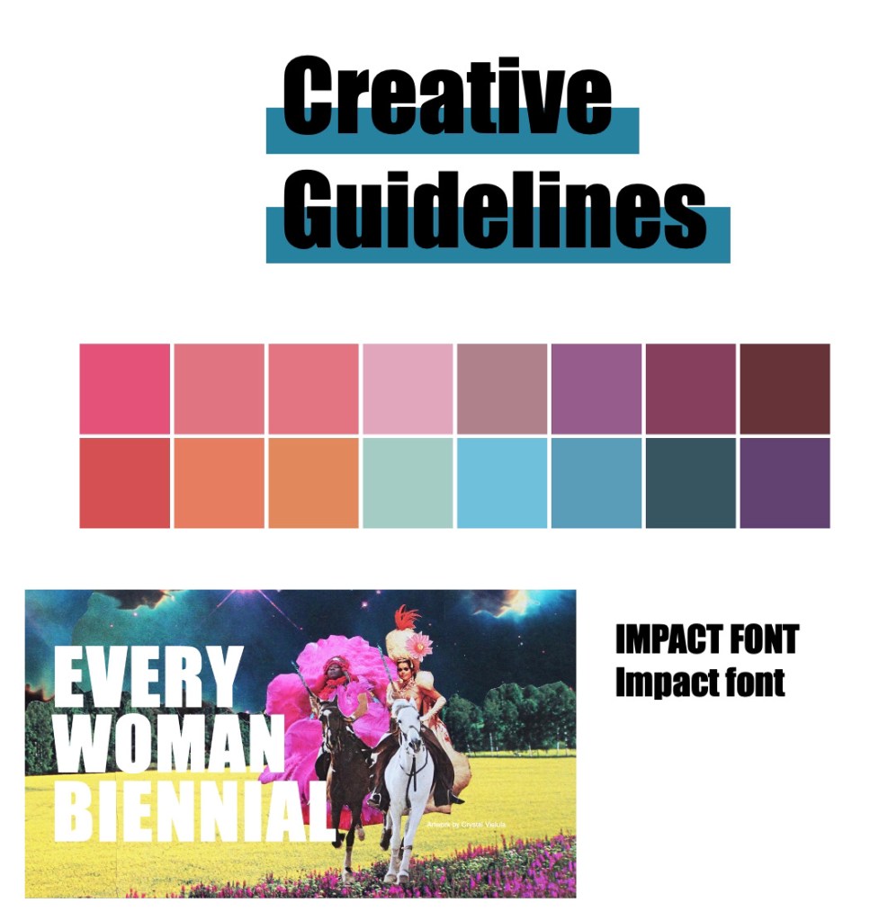
Brand Guidelines:
Due to EWB being an established brand, we needed to highlight the branding guidelines we needed to stick to. We identified this as the Impact font, the artwork shown below, and created a colour pallet to follow.
Audience and demographic
- Female and non-binary
- Gen Z – this generation are most involved with social justice campaigns and empowerment.
- Members and supporters of the LGBTQ+ community
- Artists and art enthusiasts.
- Female and non-binary people interested and passionate about social justice
Customer profile:
We have created a customer profile to better understand what our typical target audience likes, dislikes, and how to appeal to them.
Grace
About:
- 19 year old student studying Art History
- Vegan
- Lives in London
Online Behaviours:
- Active on Tik Tok and Instagram
- Follows social justice campaigns and hashtags on Instagram such as #BLM, #mybodymychoice #extinctionrebellion #LQBTQ+
Influences:
- Instagram accounts about social issues, justice and enpowerment
- Friends
- Powerful and inspiring female role models such as Malala Yousafzai, Greta Thunberg, Michelle Obama.
Visual Identity
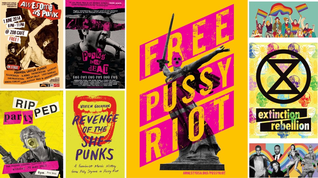
Personally, I felt that with the tone of voice of the brand, and taking into consideration our demographic, bright and bold, anarchist style visuals would be most effective. As I have explained previously, our audience members are passionate and involved in social justice, empowerment and positive change. Looking at movements like extinction Rebellion and Free Pussy Riot, bold colours and a punk feel seem to be quite effective, and, look awesome!
Due to all the above elements being done by myself, Angelique and Amanda were working on visuals and decided to take a different approach.
Myself: The above elements: Research, deck, written elements
Angelique: Crowdfunder mock up (shown below)
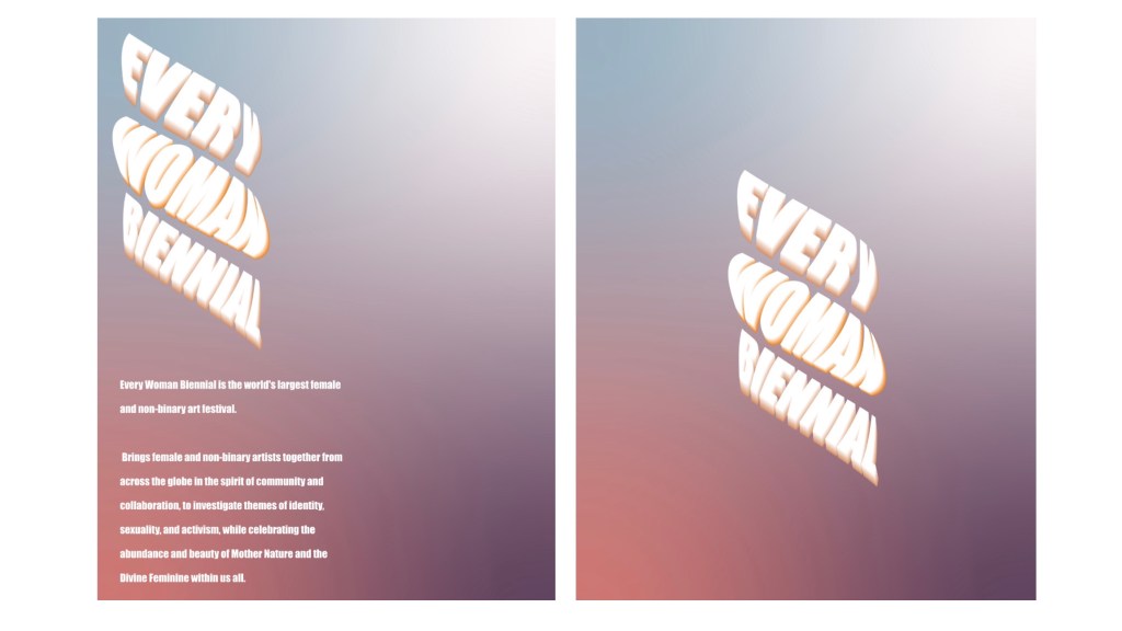
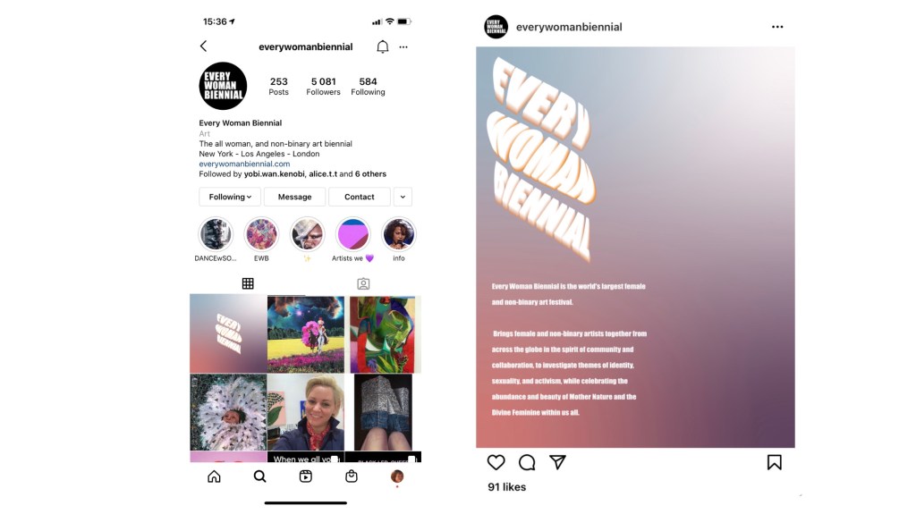
Amanda: Posters x2, Instagram mock ups (shown below)
Reflection:
Overall I believe Angelique, Amanda and I worked well together, and communicated well throughout the course of this project.
I would improve this project by making the deck look more appealing, with much less copy and more visuals. I also feel that more visuals were needed, along with a marketing campaign or stunt to bring more attention to Every Woman Biennial. The visuals done by Amanda, I feel, don’t project the tone of voice we set for the brand, “bright, bold and beautiful”. To improve on this in the future, I will be more honest about my thoughts to my team mates, and express my honest thoughts in a polite, but clear way.
Worlds Best Cricket Club/ Tiny Giant
Courtney Mehmet and Nadya Cheetham
Brief:
The brief is to double the 140+ subscription paying members as quickly as possible. Our creative challenge is to create a social-based creative campaign to attract, entice and encourage sign-ups to raise money for the PCT.
Our Response:
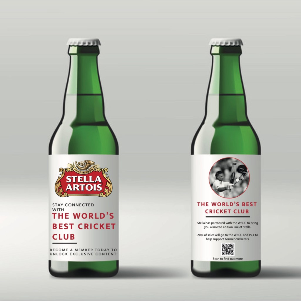
WBCC & Stella Artois
A Limited edition range of cricket inspired Stella Artois lager to encourage sign-ups, increase publicity of the WBCC and help raise money for the PCT, all while keeping current members happy through a social media campaign, and collectable memorabilia.
Why Beer?
Sports culture. Picture yourself, you are at home on your sofa, waiting for the big game to start. Crisps are in a bowl on the coffee table, and an ice cold beer in your hand. That is sports culture.
The majority of sports fans/supporters love a beer while watching the game. It’s a sport’s fan’s staple. So what could be better than merging sports and beer together?
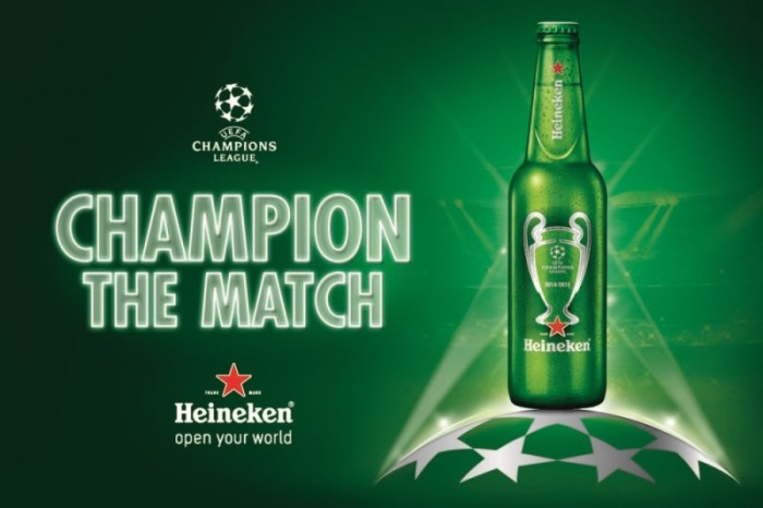
Heineken and the Champions League
The relationship Heineken has with the UEFA Champions League is well established, stretching back over 25 years. A prime example of beer and sports being a sports fans bread and butter.
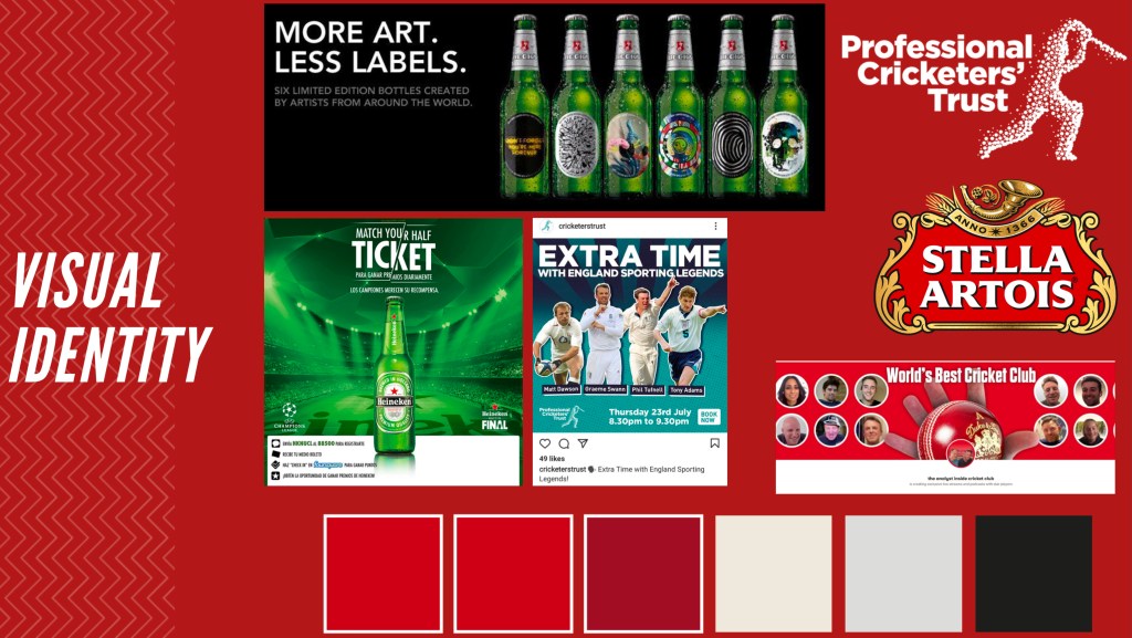
Visual Identity:
For our visual identity, we looked at the partnership between Heineken and the Champions League, BT sports and the PCT. Our main inspiration however, came from the current visual identity of the WBCC. The World’s Best Cricket Club uses red and white, and so does the visual identity of Stella Artois. From looking at the colours both companies use, we were able to develop our own colour pallet to use for our campaign.
How It Works
Limited edition bottles of Stella Artois to celebrate the WBCC. 20% of sales will be donated to the PCT.
Each bottle is topped with a collectable bottle cap, each featuring an image of a cricket player from top teams. The underside of each cap has a QR Code you can scan to download the WBCC App, and some will have the WBCC logo stuck to the bottom. Should your cap have the logo, you are the winner of a special, limited edition cricket bat to display your collectable WBCC+Stella Artois bottle caps. Examples for which are shown below.
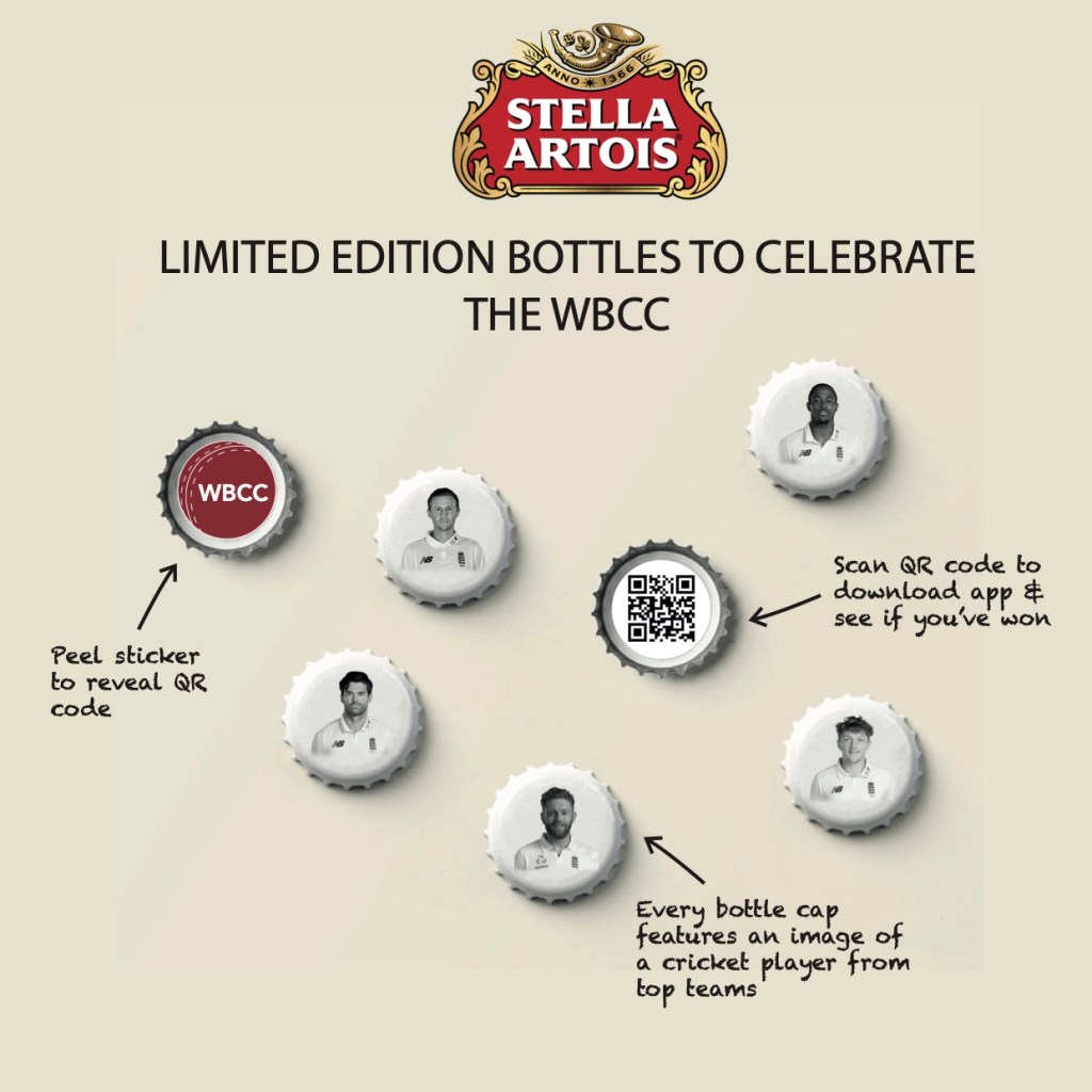
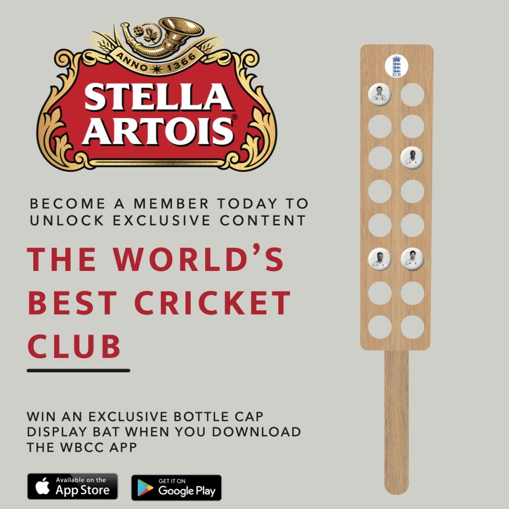
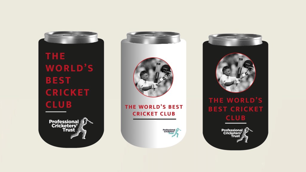
Collectables and Limited Edition Items
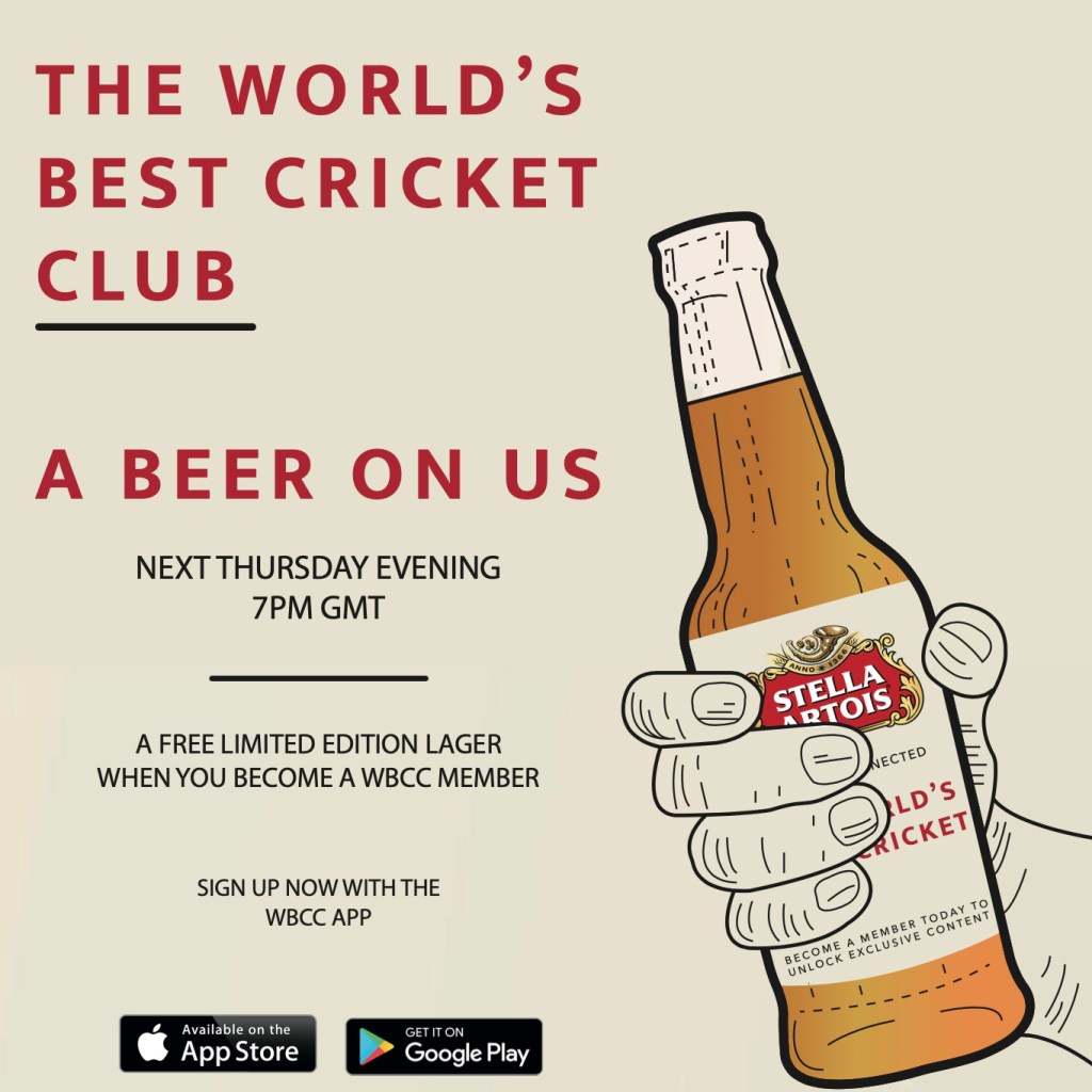
New Members: New members will be entered into a prize draw when they download the WBCC App.
Existing Members: It is important to keep current members happy, and make them feel that they are included in prize draws and benefits.
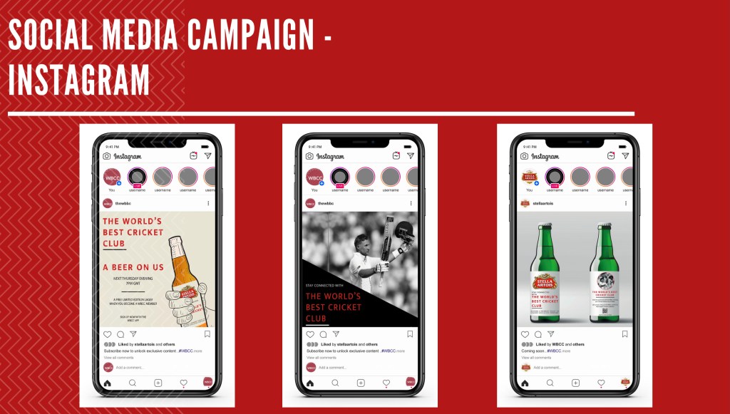
To appeal to both new and current members, we have created “A beer on us”. For current members, this feels like a nice gesture, for no commitment. For new members, this might encourage them to download the WBCC App and sign up as a member.
All sports fans want to enjoy a refreshing, cold beer while watching their favourite sporting club.
Members, current and new, will receive a free beer cooler when they recommend a friend to sign up.
The WBCC APP
I created the WBCC App to benefit both potential and current members.
Potential members:
For potential members, the WBCC APP offers “sneak peaks” or tasters, to show potential members what they are missing out on. The app, for non-members will provide general up to date coverage on Cricket news, as well as offers and promotions to encourage sign-ups.
For current members, the app is a home for all their favourite cricket news and upcoming events, plans and news on the WBCC, as well as competitions they can enter to win exclusive memorabilia. The app is personalised for each user, adding a sense of exclusivity and a VIP type experience.
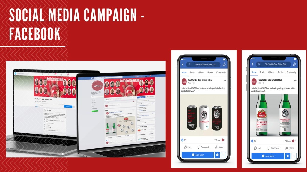
Social Media Campaign (by Courtney Mehmet)
Contributions:
Nadya: Research, visuals, App design and prototype, Deck
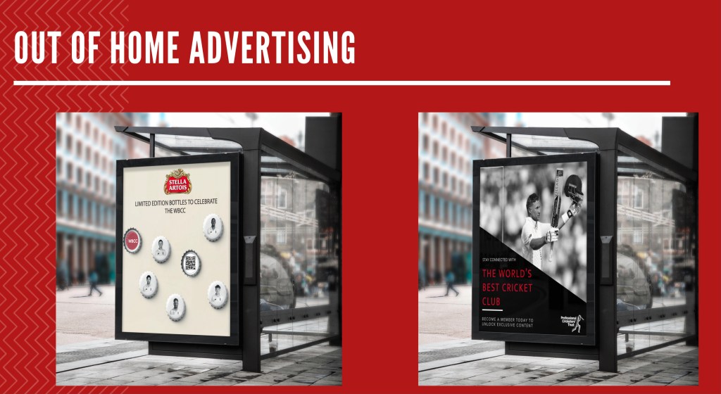
Courtney: Research, social media campaign and OOH advertising examples
Reflection
Overall, I thoroughly enjoyed this brief. At first, I felt out of my depth neither of us didn’t know much about cricket, and felt that there was a lot to do. Once me and Courtney did our research, things started to come together well. I felt that Courtney was a good team mate as we bounced ideas from each other, and gave each other honest feedback to make the idea better. At first, I was a little worried about working with someone I get along with, as I generally find it more difficult to stand my ground, however I feel that we both worked effectively together and I look forward to working with Courtney in the future.
Courtney was absent during our pitch, however she did let me know prior that she wouldn’t be able to attend. When pitching in the future, I will speak a little more slowly, as Renee pointed out that I went through the presentation rather quickly. I also aim to keep calm, and not seem on edge or nervous. I would achieve this by pitching to friends or family prior to the pitch with the client, and rehearsing to gain confidence.
