Brief:
Increase MEQ participation from 50% to 75%.
Outcomes:
Problem framing, idea and prototype:
- Reflections on your problem analysis. Your conclusions. Why are you doing what you are doing.
- User journey and touchpoints
- Design and prototype your solution. It can be an installation, or a new UX/UI
- Make a case study Video (1 min)
Why MEQ’s are important:
Data is crucial to design and evaluate any product or service, however gathering user data can sometimes be challenging, particularly when gathering feedback. Kingston University Module Evaluation Questionnaires to evaluate the teaching practice and student satisfaction.
The challenge:
Currently, the response rate is around 50% for some of CCI’s modules. That means that only half the students fill in the MEQ’s with their thoughts on the module. The data therefore does not reflect the real opinion of the cohort.
The challenge is to increase participation from 50% to 75%. More data means more quality information, and therefore, better understanding of the module’s dynamics. Although the students receive email reminders, and the tutors remind the students in class to fill the questionnaire, there is still a high percentage that do not engage with giving feedback.
Idea #1 – Nadya and Angela
Insight:
A visually appealing design with earned rewards and enhanced promotion will increase the response rate from 50% to 75%.
Reflections, Problem Analysis and Conclusions:
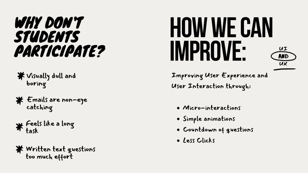
Why don’t students fill them in?
- Boring and visually dull.
The current MEQ’s look dull, boring and academic. Brighter colours and simple animations will make improve the user experience.
- Emails are not eye-catching
Emails are easily lost in the users inbox. They need to stick out and make the user want to open the email. Better subject titles will encourage students to read the email.
- 1-5 questions are easy and quick to fill out, but the written answer questions are too much effort. Students have to think of a response, and type it out.
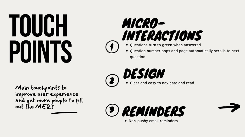
Touchpoints:
- Brighter colours and more visually appealing questionnaire
- Simple animations
- Email reminders: More attractive and interesting subject titles
- Rewards
Brainstorm and process:
Initial Ideas:
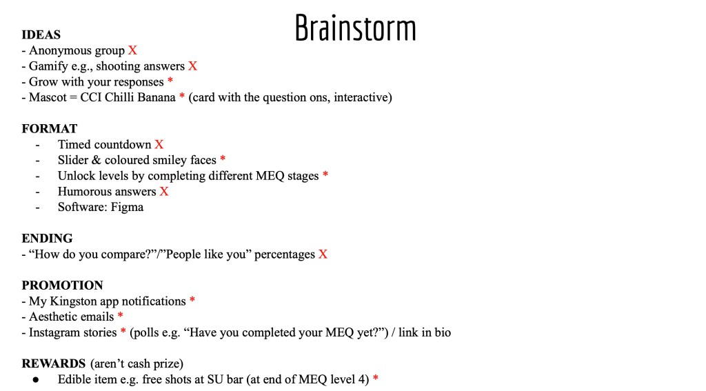
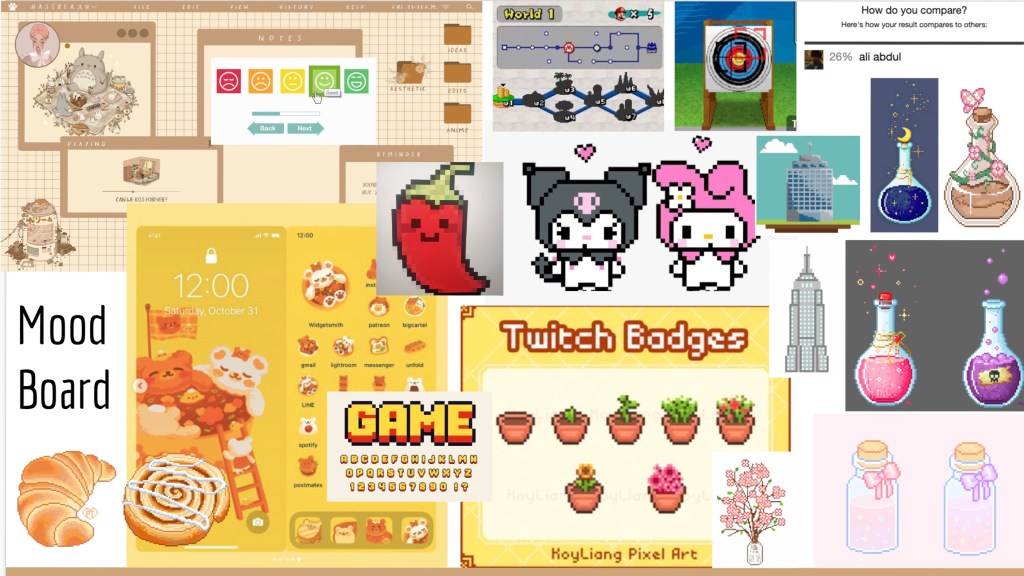
Visual Identity:
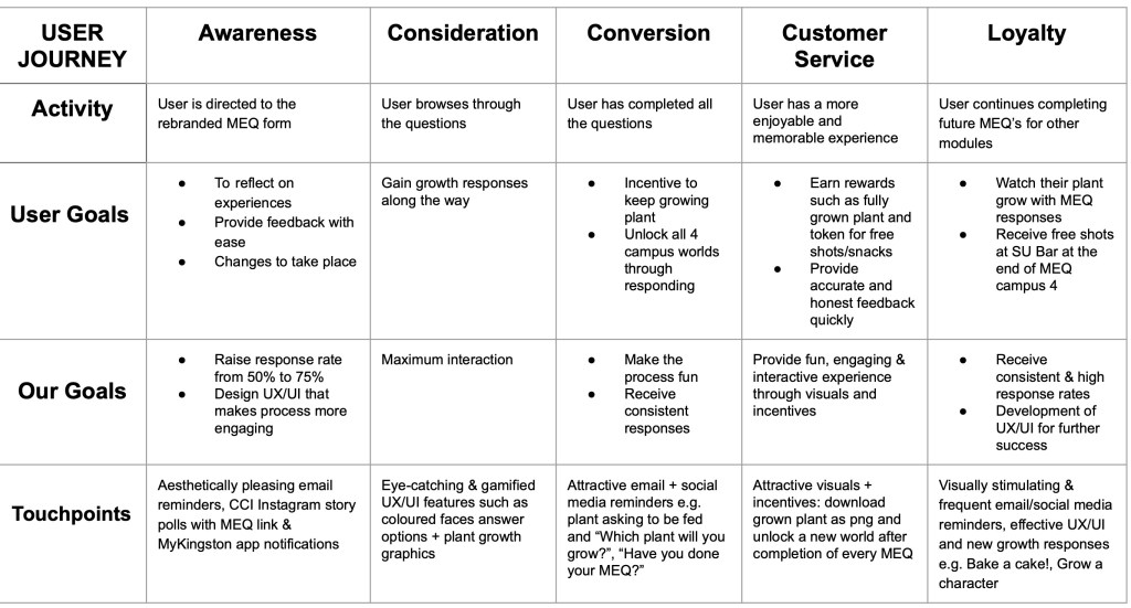
User Journey:
Mockups:
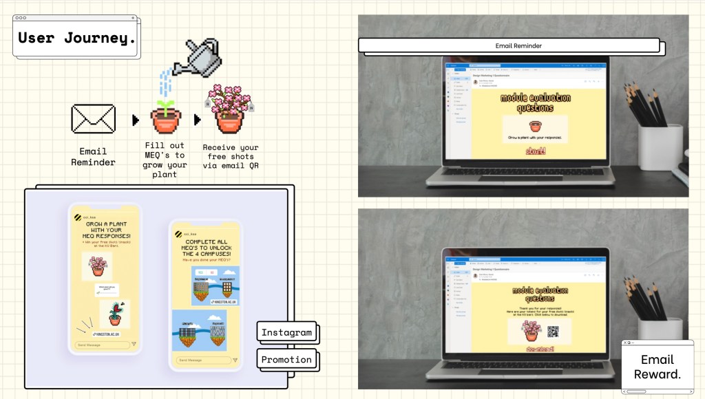
Essentially, our idea was for students to grow a plant through responding to the MEQ’s. With each MEQ, their plant would grow, and they would win a free shot at the KU Bar after completion.
Overall, I think our idea was fun, bright and eye-catching. The reward system we created, would definitely prompt more students to participate and give feedback. Our idea of growing a plant sounded good in theory, but looking back at our prototype, I feel that it doesn’t work well. As a whole, I feel that we had too many touchpoints and should have focused on one or two instead. Due to this reason, I decided to improve this brief further.
Case Study Video:
Individual Improvement:
After reflecting on our previous attempt, I decided to try the brief again, individually.
Design:
I kept the design simple and clear, after all, this is an MEQ, and there is no need to complicate it. The aim during the design process was to keep the MEQ simple to navigate, clear and practical. Students want to fill it in quickly, and move on with their day.
I used a hand written font style, to give a slight academic feel, while keeping the visuals fun. I also felt that bright colours were unnecessary, so kept the background and text monochrome, adding a pop of colour to the 1-5 questions.
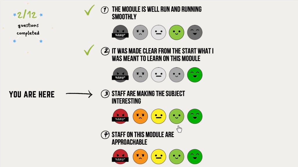
Instead of a numerical scale for the first 10 questions, I designed a a scale of emotion. The simple designs are a bit more fun than numbers, however don’t over complicate the process.
Interactions:
As the user navigates through the questions, they can check their progress in the top, left hand corner of the screen. This will encourage completion of the MEQ, as students can clearly see their progress and how much is left to complete. As the user completes a question, they receive a tick to signify completion, as well as a “You are here” arrow. Completed questions appear grey, with their answer highlighted with colour.
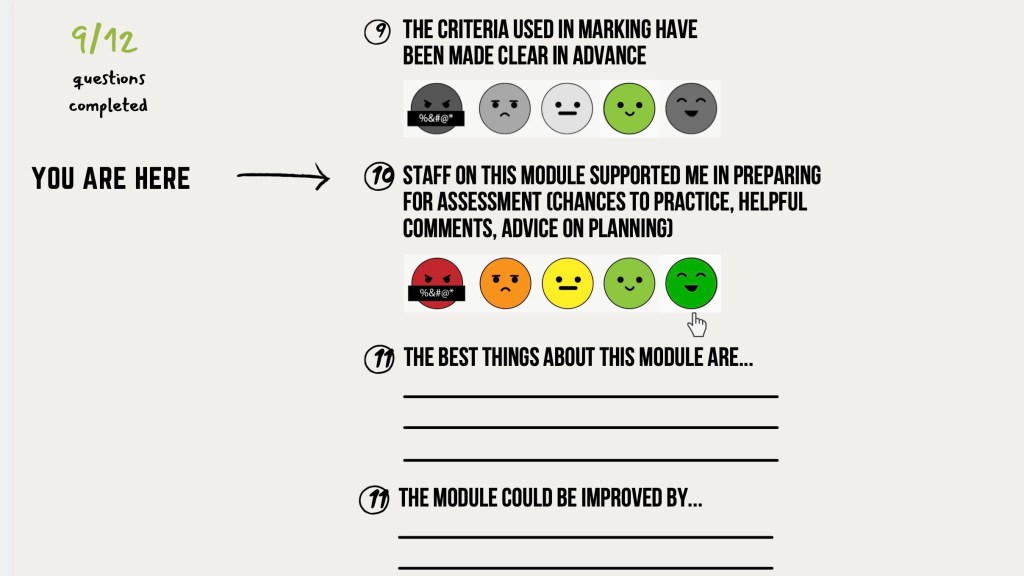
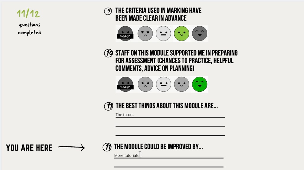
The MEQ works one a single page, with the user simply scrolling down. The action of scrolling is easier and more efficient than clicking “next” after completing a question.
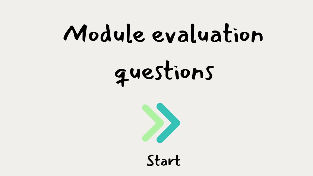
Prototype:
Reflection:
After providing two completely different outcomes, I believe simple was the better approach for this brief. This was my first attempt of creating a website prototype, and although I am pleased to have created two, I would like to improve. The prototypes could show the UX/UI clearer, and a better scrolling prototype would be beneficial in explaining my concept. I also believe more assets would help show the user journey. My prototype in future would show the user journey from the email reminder, to the end of the MEQ.
