Amanda, Angelique and Nadya
Brief and challenge
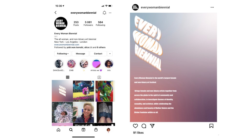
Every Woman Biennial is the world’s largest female and non binary art festival, founded. by artist C. Finley. The aim of the festival is to encourage a community around social practice, environmental justice and LGBTQ+ rights.
Our creative challenge is to promote the Crowdfunder for Every Woman Biennial to amplify the reach and drive people to donate while thinking about concepts and designs. Our ultimate aim is to raise £100K.
Research
Possible Crowdfunding problems and challenges:
Covid-19 has caused many problems, which has created some new and vital charities and fundraisers. There is also a lack of disposable income for most people, so now is an unlikely time that people will have money to donate.
With Covid-19 causing so many social and economic issues, people are most likely to donate to:
- Local businesses/organisations who are in danger of permanent closure
- Foodbanks – For the first time in history, UNICEF has had to help starving children in the UK
- NHS Donations – Sir Captain Tom Moore as an example.
Solution for the above
Art offers hope during the Covid-19 pandemic.
In this time of crisis and isolation, art has become more ocentral to our lives. Whether we has taken it up as a new hobby, a creative outlet for a cluster of emotions, or simply something we consume. Art has helped many cope with their mental health during the Covid-19 pandemic and has become more central to our lives of isolation and confinement.
It’s time to celebrate the world’s largest female and non-binary art festival. Every Woman Biennial aims to encourage a community around social practice, environmental justice and LGBTQ+ rights. Now, more than ever, let’s celebrate the arts.
Brand Values
It is important for us to keep referring to the brand values of Every Woman Biennial while creating visuals.
We have identified the brand values and tone of voice as:
- Encourage and empower female and non-binary artists
- To encourage community around social practice, environmental justice and LGBTQ+ rights.
- Main themes: Identity, sexuality activism, the beauty of Mother Nature and the Devine feminine within us all
- Tone of voice: Bold, bright and beautiful!
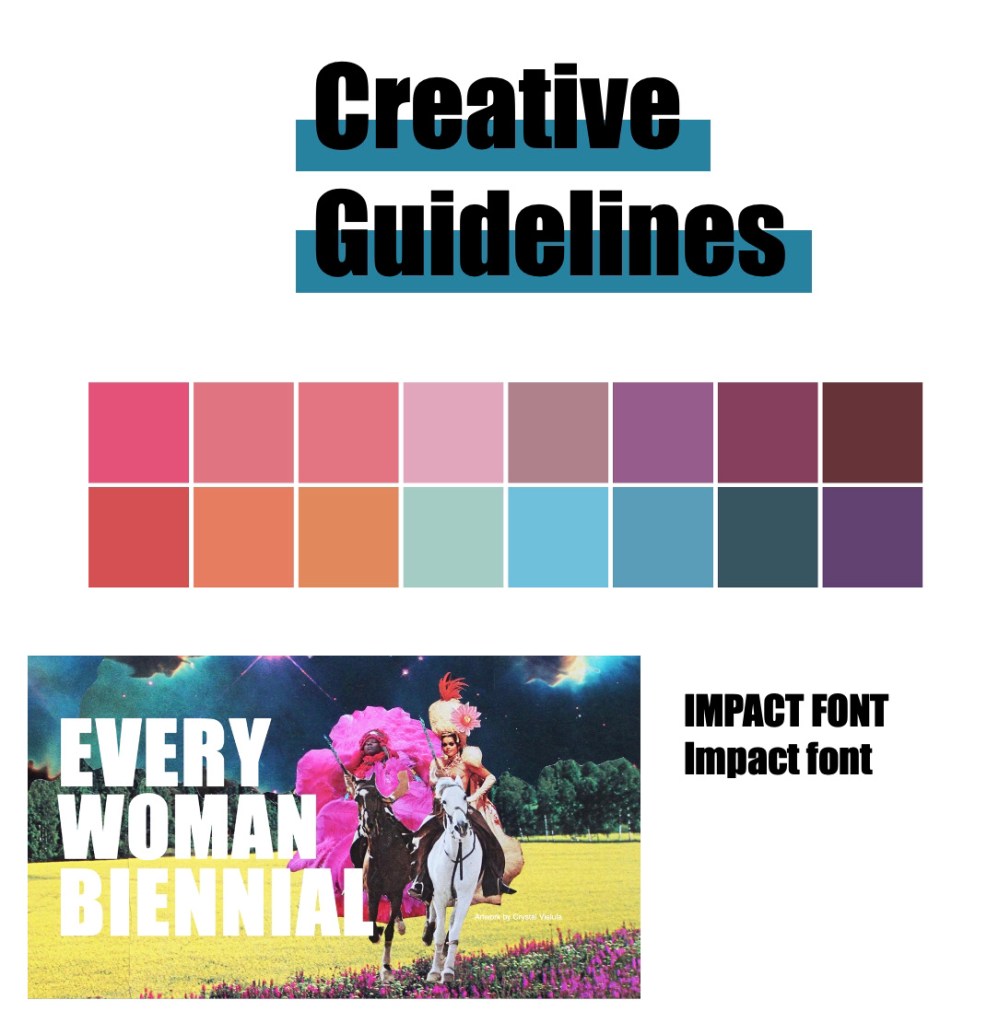
Brand Guidelines:
Due to EWB being an established brand, we needed to highlight the branding guidelines we needed to stick to. We identified this as the Impact font, the artwork shown below, and created a colour pallet to follow.
Audience and demographic
- Female and non-binary
- Gen Z – this generation are most involved with social justice campaigns and empowerment.
- Members and supporters of the LGBTQ+ community
- Artists and art enthusiasts.
- Female and non-binary people interested and passionate about social justice
Customer profile:
We have created a customer profile to better understand what our typical target audience likes, dislikes, and how to appeal to them.
Grace
About:
- 19 year old student studying Art History
- Vegan
- Lives in London
Online Behaviours:
- Active on Tik Tok and Instagram
- Follows social justice campaigns and hashtags on Instagram such as #BLM, #mybodymychoice #extinctionrebellion #LQBTQ+
Influences:
- Instagram accounts about social issues, justice and enpowerment
- Friends
- Powerful and inspiring female role models such as Malala Yousafzai, Greta Thunberg, Michelle Obama.
Visual Identity
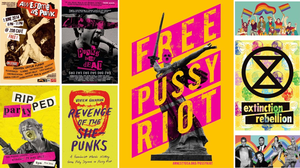
Personally, I felt that with the tone of voice of the brand, and taking into consideration our demographic, bright and bold, anarchist style visuals would be most effective. As I have explained previously, our audience members are passionate and involved in social justice, empowerment and positive change. Looking at movements like extinction Rebellion and Free Pussy Riot, bold colours and a punk feel seem to be quite effective, and, look awesome!
Due to all the above elements being done by myself, Angelique and Amanda were working on visuals and decided to take a different approach.
Myself: The above elements: Research, deck, written elements
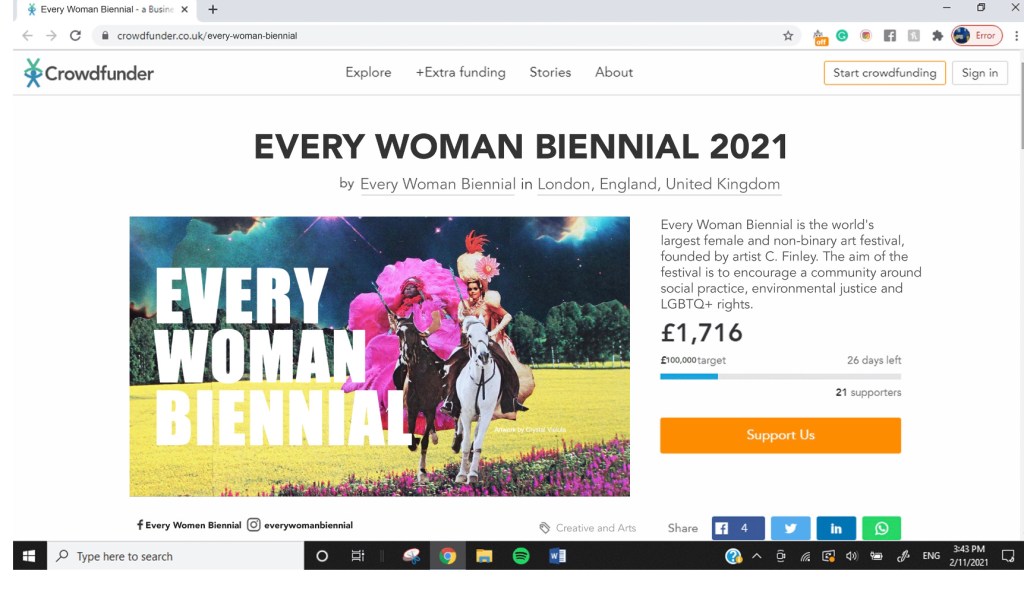
Angelique: Crowdfunder mock up (shown below)
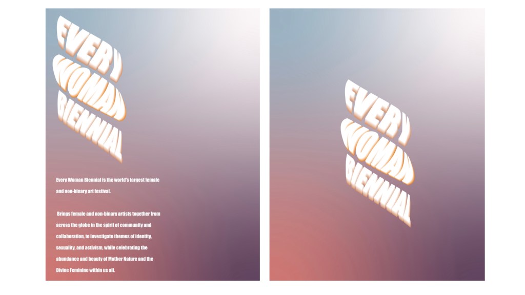
Amanda: Posters x2, Instagram mock ups (shown below)
Reflection:
Overall I believe Angelique, Amanda and I worked well together, and communicated well throughout the course of this project.
I would improve this project by making the deck look more appealing, with much less copy and more visuals. I also feel that more visuals were needed, along with a marketing campaign or stunt to bring more attention to Every Woman Biennial. The visuals done by Amanda, I feel, don’t project the tone of voice we set for the brand, “bright, bold and beautiful”. To improve on this in the future, I will be more honest about my thoughts to my team mates, and express my honest thoughts in a polite, but clear way.
