Task: Take two visual elements and remix them to create a new iconic image. Design an A2 poster by taking ideas from two artists. Copy, everything is a remix, connecting old ideas to create new ones.
First steps:
Chose two books from the library on two different artists that will be interesting to remix. For tomorrow, bring five ideas for your poster. You’ll discuss with the lecturer these ideas and the lecturer will decide which one you will do.
Artists I am looking at:
Clifford Webb – printmaker of nature landscapes and animals, as shown below.

José Guadalupe Posada – Mexican litographist whose printing consists mostly of skulls

Initial Ideas:
Idea one:
Initial Ideas:
Idea one:
Combining the idea of good (Clifford Webb animal lino prints) with evil (skull prints by José)
Image – A large Rabbit linocut in the style of Webb and skulls surrounding the border of the paper.
Idea two:
Combining the idea of nature (Clifford Webb) with the destruction of death (Skulls by José)
Image: a few rabbits linocut in the style of Webb in grey ink, some showing their skulls (also lino cut but in white or black).
A moment to reflect:
At this point, I do not feel that my artist choices are appropriate for this project. The artists are very similar in styles and their uses of colour, so I have gone back to the library and have came up with some much better ideas. I will now be focusing on David Kleinman who created the opening credits for the recent James Bond films. I will be focusing on his artwork for Casino Royale and Skyfall. I will continue to look at Clifford Webb.
Idea one:
Combining the idea of nature and printmaking, specifically linocut, with Daniel kleinman’s use of block colour.
Image: Large linocut hare central of the poster with coloured smaller hares in background.
Idea two:
Combining the idea of nature and printmaking, specifically linocut, with Daniel kleinman’s use of block colour and digital illustration.
Image: Large linocut hare central of the poster with digitally coloured blocks in background
Idea three:
Combining the idea of nature and printmaking, specifically linocut, with Daniel kleinman’s use of block colour.
Image: Large linocut hare central of the poster with digital block shadows of the hare in background.
Idea four:
Combining the idea of nature and printmaking, specifically linocut, with Daniel kleinman’s use of block colour.
Image: Large linocut hare central of the poster with lino block shadows of the hare in background.
Update:
Due to not being able to find any written work on Daniel Kleinman, I have decided to look at Saul Bass. Bass was an American graphic designer and filmmaker. He designed title sequences, film posters, and corporate logos. My ideas for my poster have not changed, as the aspects and design ideas that I have focused on are very similar as David Kleinman.
David Kleinmans’ work:
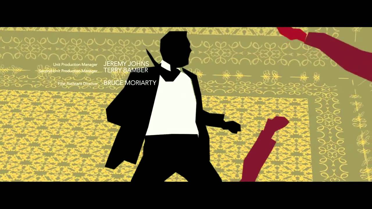
Saul Bass work:

| Idea | Pros | Cons |
| Idea one: Combining the idea of nature and linocut, with Saul Bass’ use of block colour. Image: Large linocut hare central of the poster with block colour smaller hares in background. | Combines two different artist techniques together well. If the larger hare is done in black, this may create a very bold poster | May look childlike. An A2 poster is big. Is it achievable and realistic to hand carve such a large carving in the time provided? |
| Idea two: Combining the idea of nature and linocut, with Saul Bass’ use of block colour and digital illustration. Image: Large linocut hare central of the poster with digitally coloured blocks in background | Combines two different artist techniques together well. | An A2 poster is big. Is it achievable and realistic to hand carve such a large carving in the time provided? Due to the time given, I would only be able to create the digital aspect in University hours as i do not have the appropriate softwares to use at home. Will digital look out of place with a raw looking linocut hare. |
| Idea three: Combining the idea of nature and linocut, with Saul Bass’ use of block colour. Image: Large linocut hare central of the poster with digital block shadows of the hare in background. | Combines two different artist techniques together well and can look quite sharp. | Is digital colour going to look out of place with a very raw linoprint? An A2 poster is big. Is it achievable and realistic to hand carve such a large carving in the time provided? |
| Idea four: Combining the idea of nature and linocut, with Saul Bass’use of block colour. Image: Large linocut hare central of the poster with lino block shadows of the hare in background. | Much more achievable in the time period given. Combines two different artist techniques together well and can look quite sharp. |
|
| Idea five: Image: Repeated pattern of rabbits with colour block lino shapes as background. | Much more achievable in the time period given. |
|
Outcomes and further planning based on pros and cons list:
After reviewing the pros and cons of all five ideas, I have decided to create a large linocut hare central of the poster with lino block shadows of the hare in background. I feel that this technique will compliment the ideas and style I am wanting to achieve and is realistic in terms of completion time and accessibility to all the materials needed. I will speak to my tutor and discuss the possibility of creating a smaller lino print, scanning it and enlarging it when ready to be printed. I will also create small mock ups of different style ideas.
Further considerations:
I will need to think about text. The text layout, size and font need to be readable and laid out in the right way, without compromising design. The poster will be printed so i need to consider the CMYK colour and 300 dpi. I will also consider the bleed, trim, safe area and crop lines when printing. This will ensure a professional and high quality finish.
The text needed to be included on the poster is as follows:

As shown above, the text increasingly gets smaller as you read on. I have organised the text carefully, thinking about the placement of information. I have made the first sentence the largest part of text on the poster as it explains what the poster is about.
First ideas and experiments:

My first idea (shown above) was to add block colour silhouettes in a random pattern and order. I felt that the colours were too bright and shifted focus from the main hare, and the random pattern looked careless. I also thought that text wouldn’t stand out enough on a background like this. From this, I then decided to use a less bold colour and place the hares in a more ordered style (shown below). Again, I wasn’t happy with this as I felt the end result looks unprofessional as it was difficult to line up the carvings perfectly.

Since this didn’t seem to be working out for me, I decided to re-carve the hare shadow but into a diamond shape, hoping that this would help with lining up. When I looked closely, I could see small gaps and overlapping with the diamonds which gave an unprofessional look. (shown below).

Next, I opted for a larger silhouette, combining two shades of gold for a more subtle background but still keeping the shadow effect. This seemed to be going more in the right direction as text would stand out, and I am incorporating all my intentions (shown below).

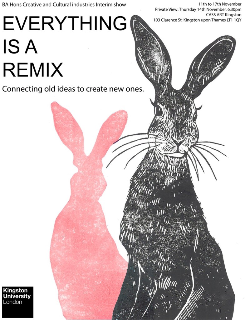
Lastly, I chose to stick with one silhouette, and re-carved the hare larger and in negative (shown below). I am very happy with this final composition. The negative hare is much more striking, and the single silhouette is subtle but still adds something to the overall image, even if not the main focus. There is plenty of room at the top of the page for the text. I will now re-do this idea neater, perfecting the fine details, then scan the image. Once the image is scanned, I will open it up in photoshop and add my text. Digitally applied text is the neatest option for my poster.

This brief was about being able to combine two ideas or concepts from two different artists to create a brand new image. It was about being able to steal ideas to create your own. I chose to look at Clifford Webb and Saul Bass as their work were so different in style. I felt that it would be interesting to combine two completely different aesthetics to create a fresh image. I do feel that I have managed to remix both artist styles, however if I was to improve this, I would create a bright coloured background.
My final design:

References:
- Personal Knowledge: David Kleinman
- Book: The Life and Art of Clifford Webb by Simon Brett
- Book: Saul Bass: A Life in Film & Design: A Life in Film & Design by Pat Kirkham
After presenting my poster with my peers, I received some constructive criticism and have improved my poster. I have changed the colour of the shadow to make it bolder and have moved the text to make more of a statement and better composition.