For this brief, we have been asked to create an Instagram campaign to promote the CCI course to potential students.
As I am unfamiliar with the software involved in this project, I have made myself a weekly plan to help me stay on track and manage my time efficiently.
Week 1 – Understanding and deconstructing the brief. Research and gathering possible references in terms of books and the theory aspect of the brief.
Week 2 – After week one, I will have understood what the brief is asking and will have a clear image of what is being asked. Using my resources collected, I will read through information and begin on the research and theoretical aspects. I will begin written work of my own to keep referencing back to and will begin initial ideas.
Week 3 – Refining initial ideas, further research if needed and begin to create physical forms and illustrations of ideas. Begin researching Figurative mark, typeface and strap-line. Written work on research will be done on research and ideas.
Week 4 – Review of ideas so far and making any adjustments and changes where necessary. Create mood board for each story as well as story boards and scripts. Begin animation process by watching tutorials as I am unfamiliar with the software involved and apply to own work. Written work will be done on research, ideas and development. Screen test will be done frequently to make sure all is going well and according to plan.
Week 5 – Refine aspects of ideas and fix anything that hasn’t gone to plan. Animations will be finished ready to begin post production such as audio and further refining next week.
Week 6 – Further refinement and written work. Audio will be recorded and applied to videos where necessary.
Week 7 – Videos should be complete at this stage and any small tweaks will be done. Written work will be finished off and referencing will be done as well as a written Rationale, overview and slideshow to be presented to peers, tutors and client.
To begin with, I need to know who the campaign is aimed towards. A target audience is a group of people who share similar needs or characteristics that the CCI course hopes to serve. The target audience will change how I will present the campaign and I will get a better feel of the course’s values. Identifying a target audience will also help me to develop effective marketing strategies.
Audience
The campaign’s will be aimed towards National and International students interested in Art and Design, mainly aged between 17 and 24. Most of these students like drawing and designing and have had some experience in these fields, but do not know all the possibilities of the creative industries. They are interested in making a living out of their passion for creativity and want to develop a creative career that is financially sustainable and industry focused. The audience has searched for information about different Universities and Art Schools in London and have perhaps been to open days to visit the facilities and talk to the course leaders. From this, they have short listed their favourite Universities and will apply soon to request an interview and be accepted by their favourite option.
Client
BA (Hons) Creative and Cultural Industries is formed by four pathways:
BA Art Direction
BA Design Marketing
BA Curation, Exhibition and Events
BA Fashion Promotion and Communications
The Creative and Cultural Industries Department at Kingston School of Art has three undergraduate BAs currently running – Art Direction, Design Marketing and Curation, Exhibition and Events, with a new BA launching in 2020 – Fashion Promotion and Communication.
The students work across visual communication, design, advertising, experiential, strategy, copywriting, content creation and explore emerging technologies. Our courses offer sector-facing and industry- focused creative education that challenges convention.
Semiotics
Semiotics is the study of signs and symbols. It explores how words and other signs make meaning. In semiotics, a sign is anything that hold meaning for something. In a semiotic sense, signs take the form of words, images, sounds, gestures and objects. As an example, the semiotics of England are telephone boxes, black cabs, football, tea fish and chips and lions.
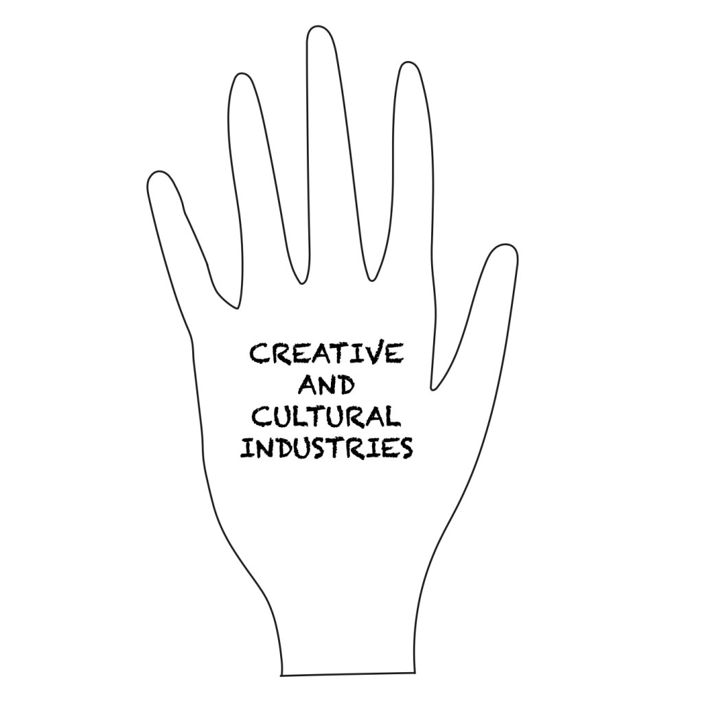
As a starting point, I feel that it is important for me to identify the semiotics of the CCI course, so I have created a mood board to help me with initial ideas.
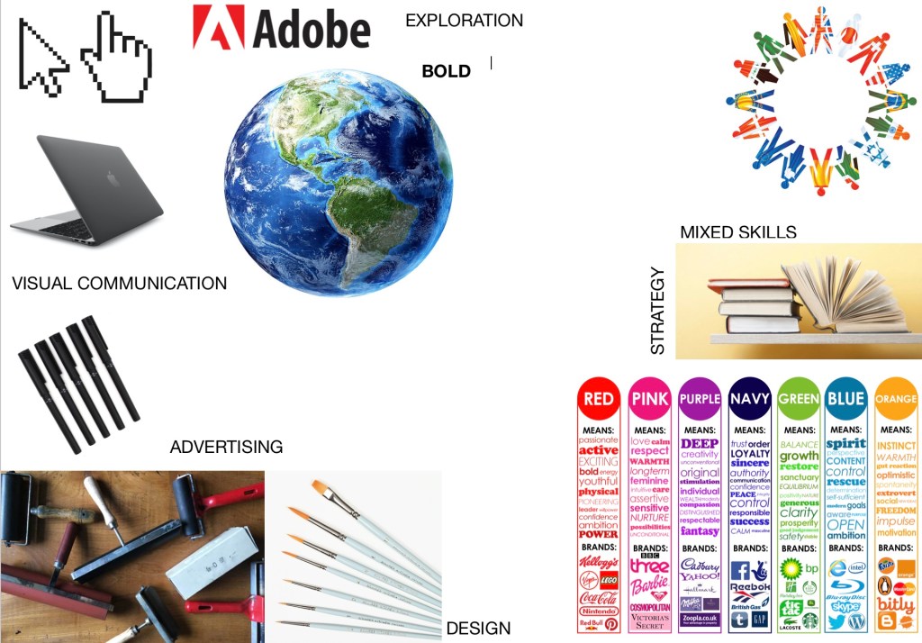
In the mood board above, I have identified the semiotics of the Creative and Cultural Industries. I have focused on what the course offers, such as a range of different creative skills, from digital to fine art. While reading the brief, I kept coming across the word “culture/cultural”. I think that these words harvest a lot of meaning, as not only does the courses students themselves come from a mixture of different races and cultures, but the course also explores different artistic cultural movements. I wanted to include these things in the mood board as I feel that they are the main and important aspects of the course itself.
Branding
Now that I have identified the target audience, I have broken down the core aspects of the CCI course that I will focus on to help me create the campaign. These core aspects are as follows:
- Brand values
- Tone of voice
- Visual identity and world
- Attitude
- Target
Brand values
Brand values are a set of principles that shape every aspect of the CCI course. They are there to dictate the courses message, look and personality. The brief explains that “Our aim is to provide the stimuli, culture and resources to enable our students to become distinctive creative industry practitioners who will change, and not simply join, the creative industries”. From this, I have understood that the courses values are as follows:
- Cultural
- Future focused (In terms of employment and the future of creative industries)
- Creative
- Fresh ideas and challenging the norms of the creative industries
Tone of Voice
The tone of voice is the way the course presents its values. The brief explains that the tone of voice should be brave, creative, bold, risky, experimental, future focused, surreal, fresh, disruptive, fun, curious, light-hearted, memorable, iconic.
Visual Identity
Visual identity is the visual aspect of branding and trying to evoke certain feelings in the consumer through visuals. The Visual Identity of the CCI course should be similar to the tone of voice, creative, bold, risky, experimental, future focused, surreal, fresh, disruptive, fun, curious, light-hearted, memorable, iconic. I will try to connect the tone of voice with the visual identity of the course.
Attitude
The attitude of CCI is similar to the tone of voice. The course is about pushing ideas and the norms of the creative industries. We take risks and experiment with bold ideas that may or may not work.
Target
The aim of the campaign is to get people to visit the CCI’s website and send an application.
Logo Design
Now that I have identified they key aspects of the Creative and Cultural Industries, I can now begin to generate several ideas for a logo and typeface.
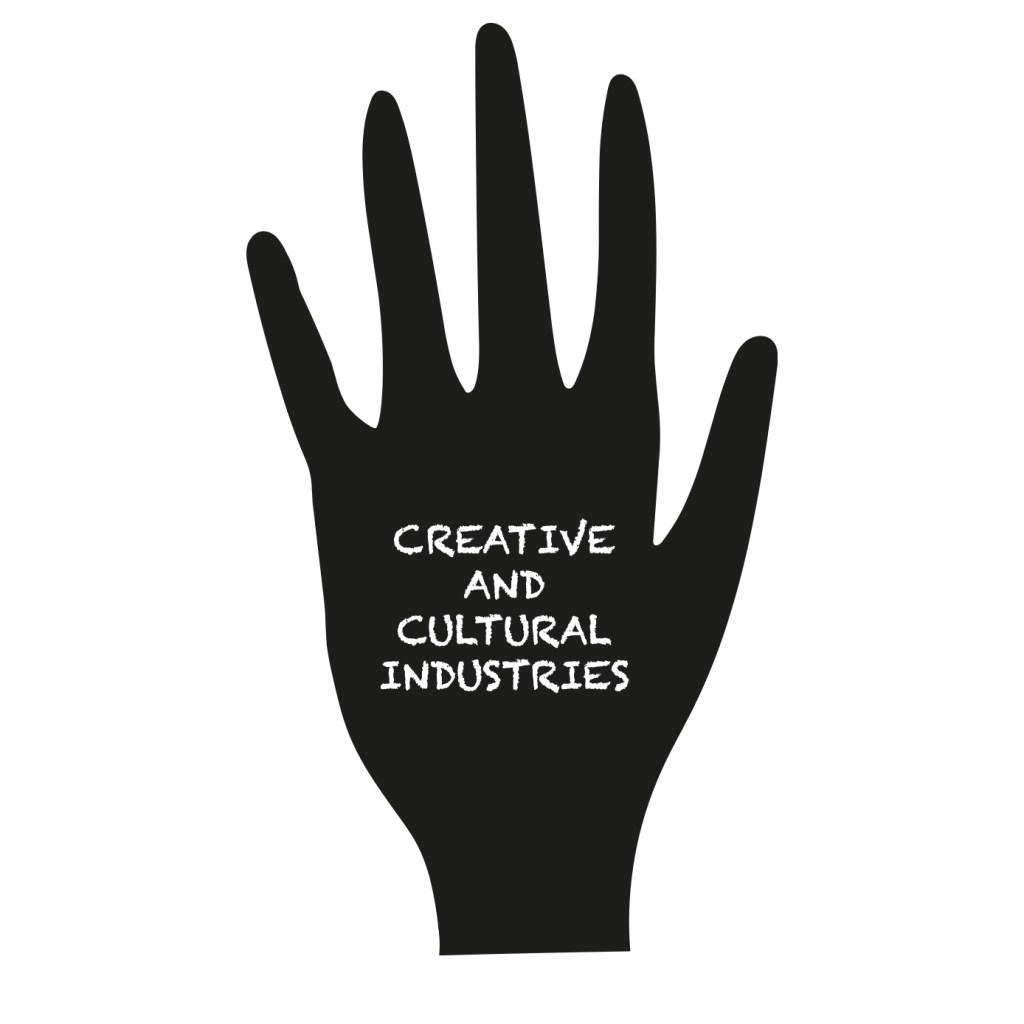
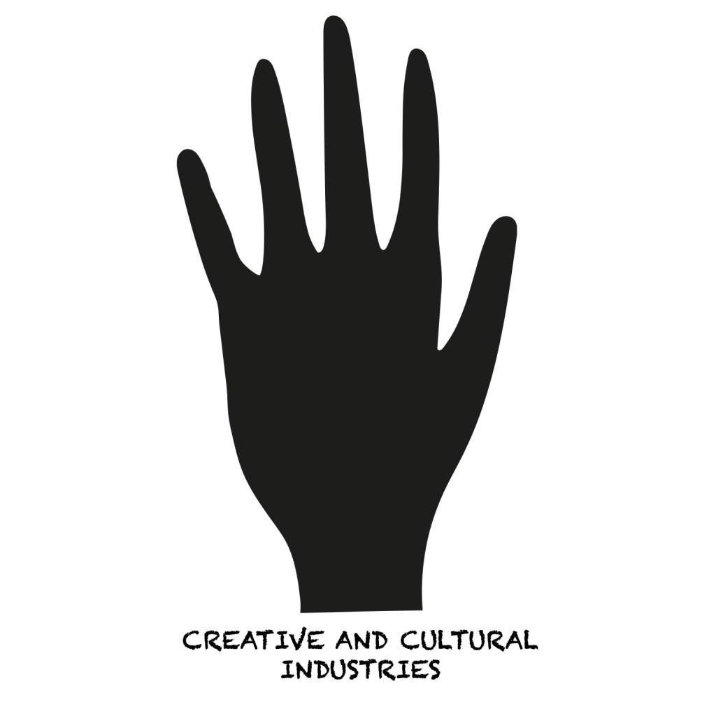
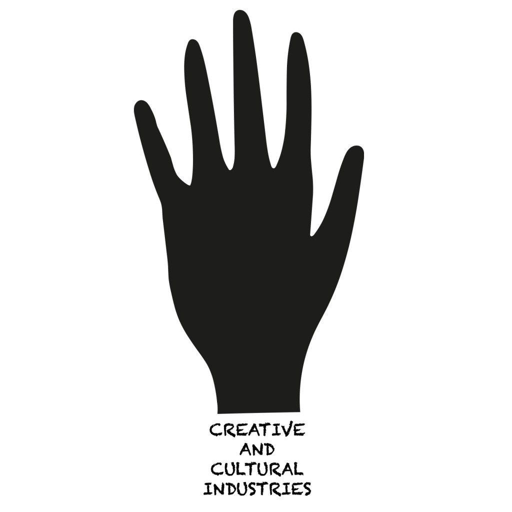


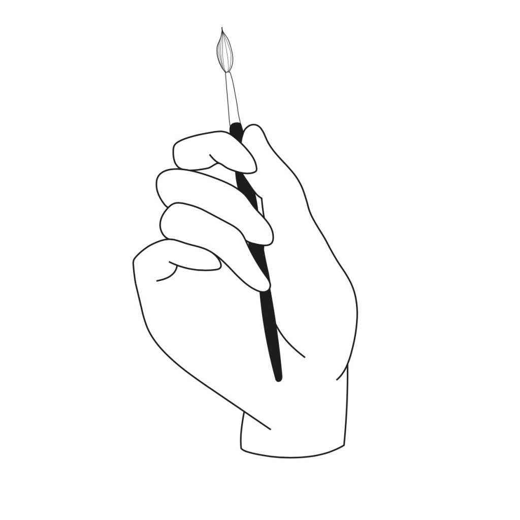
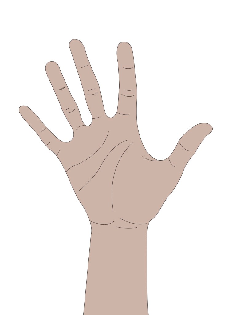
Shown above are my first few ideas. I wanted my first ideas to be quite simplistic in order to help me envision further development. I focused on using a hand as the symbol to represent how hands on the course is, and in creative terms, we use our hands a lot to create and design. I feel that these ideas are a good starting point however are quite dull and do not capture or communicate the values or characteristics of the course. I would also like to use more colour in my next design ideas to make the logo stand out more and grab the viewers attention. As for the typeface, I have chosen a chalk-like font as I feel it has a laidback and creative look to it, which I think I will stick with for my next ideas.
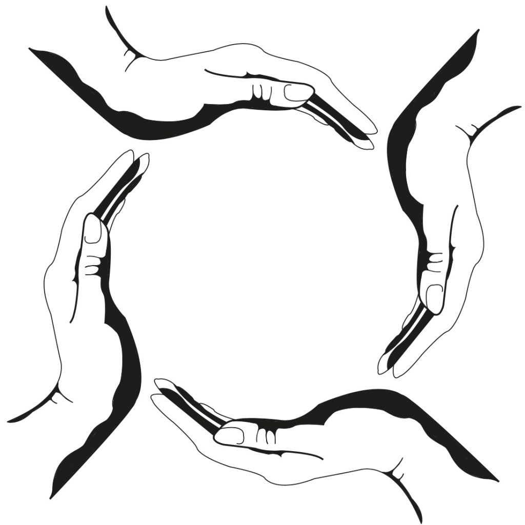
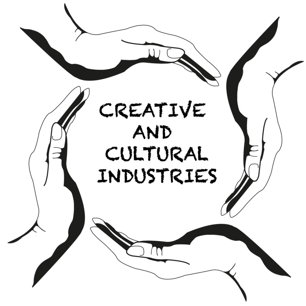
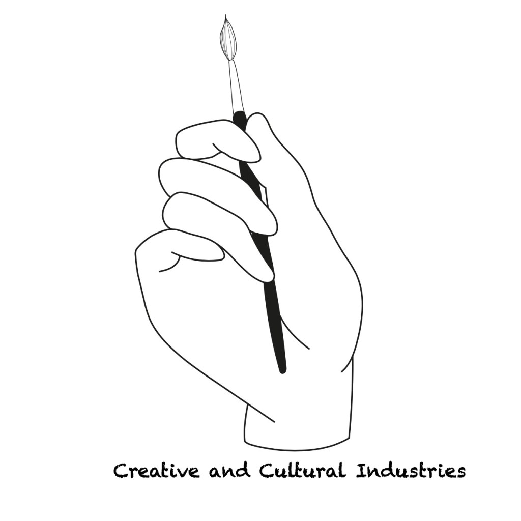
From my first ideas, I decided to think more about shape and revisited our previous “Most Wanted” brief where I looked at the psychology and connotations of different shapes in logo and symbol design. By doing this, I refreshed my knowledge on the subject of shape psychology and have decided that I would like to use a circular shape in my next logo ideas to represent a sense of teamwork and community in the CCI. As explained previously, I still like the initial idea of using hands to represent the creative and making aspect of the course. I am quite happy wit these designs, and will now begin to look at using colour in the next development stages.

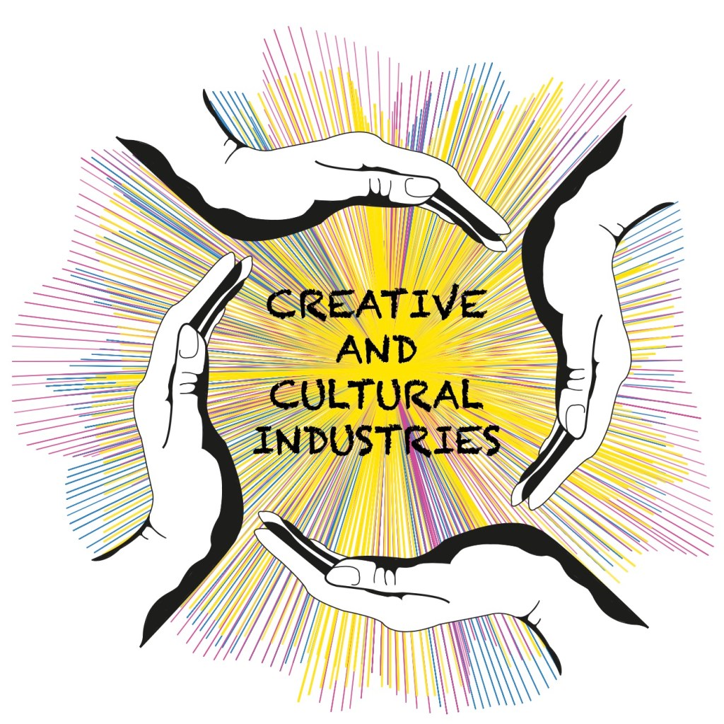
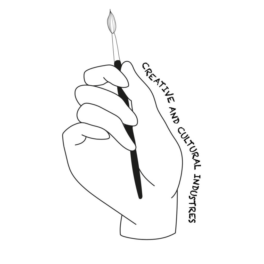
For my final design, I added colour to the logo. The use of colour makes the logo stand out more and get the viewers attention. I used yellow to signify creativity, imagination and fun. The pinky/red tones signify excitement, energy and passion and the blue signifies knowledge. I have used these colours to represent the course values and think I have achieved this aim. I am happy with the overall look of my logo and feel that I have done well considering the time-frame given with my limited digital skills. Given more time on this, I would have liked to perhaps fade the outer edges of the colour burst to make it less harsh and maybe frame the design in a thin black boxed outline. As for the typeface, I would have liked to use something a little bolder as I feel the lettering chosen does not stand out very much against the burst of different colours.
Strap-Line
Now that I have my logo, I am going to look at a strap-line. The strap-line has to sum up the CCI brand values and its personality. It should be simple and not over descriptive. A strap-line will be an instant memory hook for potential students and should differentiate the CCI course from other competitors.
As a starting point, I have looked at several brand strap-lines. From my findings, I have noticed that the best strap-lines are short and punchy:
Nike “Just Do It”
This strap-line is instantly recognisable to many people, not only to sports fans as you’d expect. It is short and powerful and has a sense of energy within the line. Being a sports brand, “Just Do It” also appeals to the less athletic, perhaps people who keep contemplating starting a new sport or go the the gym. It’s a push. The use of the word “Just” is almost an argument. Nike is saying don’t question it or think twice, Just Do It! It is powerful and motivational.
Heinz “Beanz Meanz Heinz”
This strap-line almost the opposite of Nike. The replacement of the S with a Z at the end of the words is playful and simple rather than powerful. It creates a flow throughout the line to match with Heinz and, although it is short and simple, it is memorable and fun.
Apple “Think Different”
While looking at several strap-lines, Apple has to be my favourite one. “Think Different” is a bold and aspirational phrase which appeals to everyone who wants to break social and creative norms. It is short and memorable, while also being able to hold a lot of meaning. This strap-line has the most in common with the CCI course, as it is empowering, creative and bold. Looking at this has given me several ideas and has pushed me in the right direction.
My Ideas
By looking at different examples, I have identified the main characteristics my strap-line will need to be successful. It will need to be short and memorable. A short strap-line is not only easier for people to remember but with the right words, can be very powerful. I have noticed that with strap-lines, less is usually more.
To begin with, I went through and re-read the brand values and visual identity of the Creative and Cultural Industries course and made a list of the most important and relative things I want to put forward in a strap-line:
- Creativity
- Different – risky, experimental, new. Be different and break social and creative norms
- Bold
- Future-focused – We are the new generation of creatives
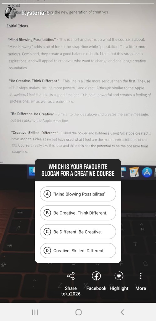
Initial Ideas
“Mind Blowing Possibilities” – This is short and sums up what the course is about. “Mind blowing” adds a bit of fun to the strap-line while “possibilities” is a little more serious. Combined, they create a good balance of both. I feel that this strap line is aspirational and will appeal to creatives who want to change and challenge creative boundaries.
“Be Creative. Think Different.” – This line is a little more serious than the first. The use of full stops makes the line more powerful and direct. Although similar to the Apple strap-line, I feel that this is a good first idea. It is bold, powerful and creates a feeling of professionalism as well as creativeness.
“Be Different. Be Creative” – Similar to the idea above and creates the same message, but less alike to the Apple strap-line.
“Creative. Skilled. Different.” – I liked the power and boldness using full stops created. I have used this idea again but have used what I feel are the main three attributes of the CCI Course. I really like this idea and think this has the potential to be the possible final strap-line.
To help me decide on which strap-line to use, I posted a story on my Instagram page asking people to vote for their favourite. After a few hours, I looked at the results from the poll.
The results of the Instagram poll showed “Mind Blowing Possibilities” as the winner with most votes. Although this strap-line had the most votes, after reflecting, I didn’t feel that it had a strong punch to it. After reading through the results and analysing my ideas, I came to the conclusion that my strongest strap-line was “Be Creative. Think Different.” due the direct and bold approach, which I feel suits the attitude of the course. This idea came second place in the poll and will be my chosen strap line.
Call To Action
In marketing, “Call To Action” is a piece of content intended to induce a viewer, reader, or listener to perform a specific act, typically taking the form of an instruction.
I want my CTA to be short and punchy. It should tell the viewer what they should do, and give them the motivation and push to do so. The CTA serves a similar purpose as a strap-line; to sell your product/service.
Examples:
Netflix – “Join Free for a Month”. This is a simple CTA, it tell you what to do and why to do it. They are telling you to join and use a free trial to motivate you to join.
Spotify – “Go Premium / Play Free”. This CTA is a bit different to Netflix. Spotify are not giving you a reason to subscribe but are giving you an option. When you open the Spotify app login page, “Go Premium” is in a green bubble and is placed above “Play Free”. Instead of using words to motivate you, they use colour and text placement.
Ugmonk – “Send me coupons / I’m not interested”. This is a popular CTA on subscription websites such as clothing stores, coupon websites and newsletters. It is straight to the point, you either want to or you don’t. They wording of this kind of CTA subtly implies that you are lazy or careless if you don’t sign up, subscribe or follow through with the act they are asking you to do.
Ideas
From looking at the examples above I have come up with several possible call to actions:
Apply now and create – This is quite simple but is straight to the point. It tells the viewer that if they want to create or be creative, they should apply.
Get in touch. Create. – Similar to the idea above but offered a more friendly and open approach. I like this idea however I feel the it is too similar to my chosen strap-line in terms of using full stops.
Apply now to turn ideas into reality – I quite like this idea but I don’t feel there is any punch to it. Maybe the use of full stops could add motivation.
Apply now. Turn your ideas into reality – This will be my final CTA. It is short and to the point. There is instruction and motivation which will appeal to students who embrace different ideas and approaches. I feel that this CTA reflects what the course is about and shows that the students in the Creative and Cultural Industries are bold and like to challenge creative norms.
Video
Initial ideas and planning
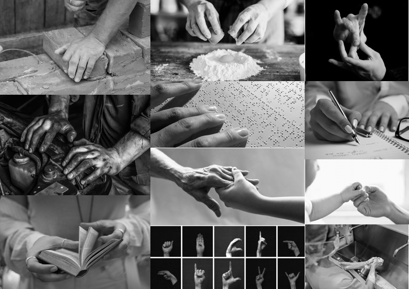
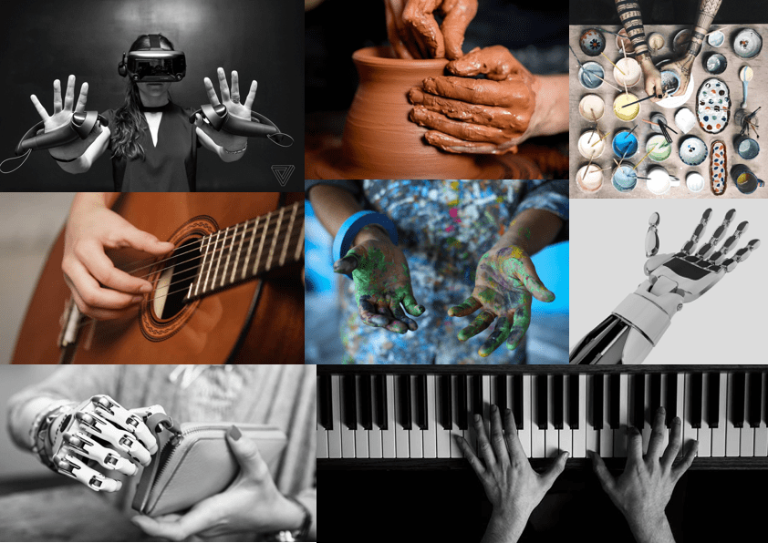
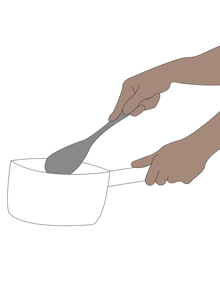
To kick start the ideas and plan of the videos, I have created a mood-board of different creative things we use our hands for. I wanted to stick with the idea of using hands to create, as I did with the logo.
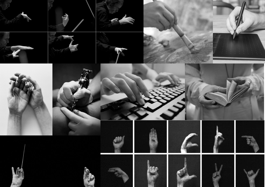
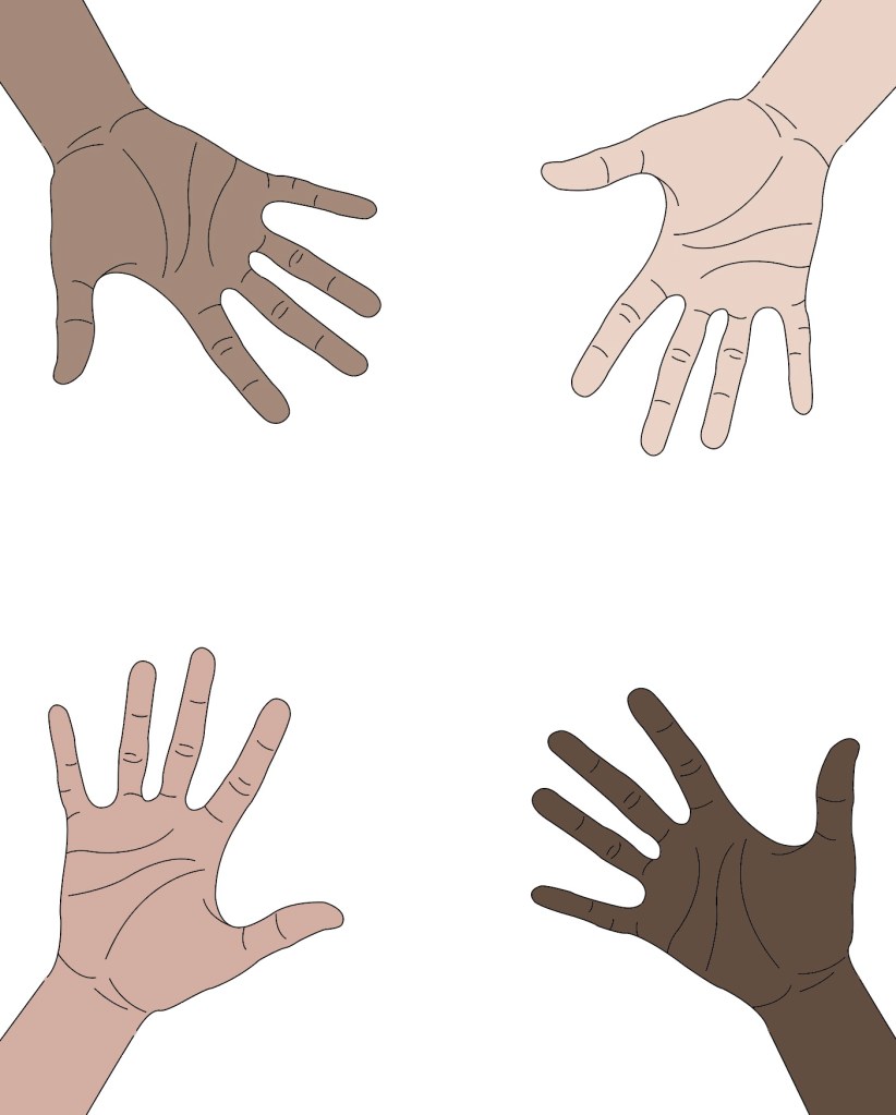
From the creation of the mood-board above, I have decided that I want my videos to focus on the creative things our hands do, as well as linking back to the idea that the course itself is very hands on. To get a better picture of what each video will entail, I have made some more mood-boards for each of the four videos, each being four seconds long.
The first video
For the first video, I want to focus on the incredible things we use our hands for, such as using them to communicate with people who have a hearing impairment, to fix things, to enable the blind to read, to build, to treat and to communicate in all kinds of ways. This video will be in black and white, to give a serious feel. The purpose of the black and white colour scheme is to add excitement to the other videos that will follow, which will be in colour.
The second video
For the second video, I will focus on the creative things our hands can do which relate to the course. The mood board consists of hands creating. Creating art, music, technology and more. This is what the CCI course focuses on and I feel that it is important to show what CCI students are capable of creating and achieving. The images on the mood board and both a mixture of black and colour. This is because I am thinking about maybe adding bursts of colour on the black and white film, to highlight the creativity being made.
As for the third and fourth video, I think I will do the same as the second. Maybe a transition from photography to simple animation or doodles. For my next steps, I will draw some rough story boards and possibly go on the refining them in the development stage.
Things to remember and consider:
- Each video is only 4 seconds long, so keep ideas simple!
- Due to the videos being so short, keep to the point and don’t add anything unnecessary. Everything should have a purpose and make an impact.
- Each video should use a different art direction and technique.
- Make use of colour to create excitement and intrigue.
- Each video will be in Portrait and 4:5 ratio – This is important as I will ned to plan out composition and camera angles if I decide to use live action.
Storyboards
First Video Storyboard
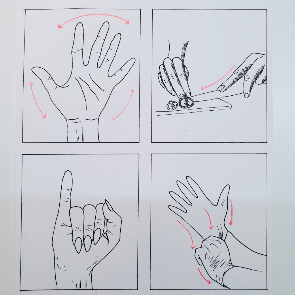
For my first video, I will stick to a black and white colour scheme as first planned. Each of the four videos are four seconds long, so each block in the story board represents one second. The arrows indicate the direction of movement.
The top left box shows a hand waving from left to right. This will be my opening scene. The waving hand is a friendly introduction to the video and makes the video feel personal to the viewer. This should engage the viewer and get their attention. The wave also signifies that we use our hands to communicate, a simple but important way we use our hands.
The next box is the top right, which is scene two. This scene shows someone cooking and preparing food, this is to show the basic but important things we use our hands for in everyday living.
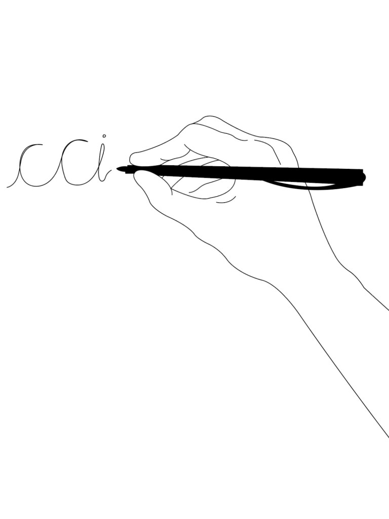
Scene three on the bottom left shows sign language, something more complex than cooking however just as important. I plan to spell “CCI” with sign language for this scene.
The last scene in this video is a nurse or doctor putting on surgical gloves, again, the idea behind this is to show how complex and vital using our hands are and what they are able to do.
Specifications:
I plan to animate this first video, first using Adobe Illustrator to get the general image, then taking each image into Adobe After Effects to add movement and create the animation.
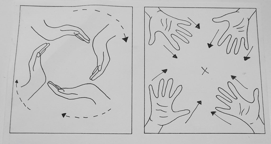
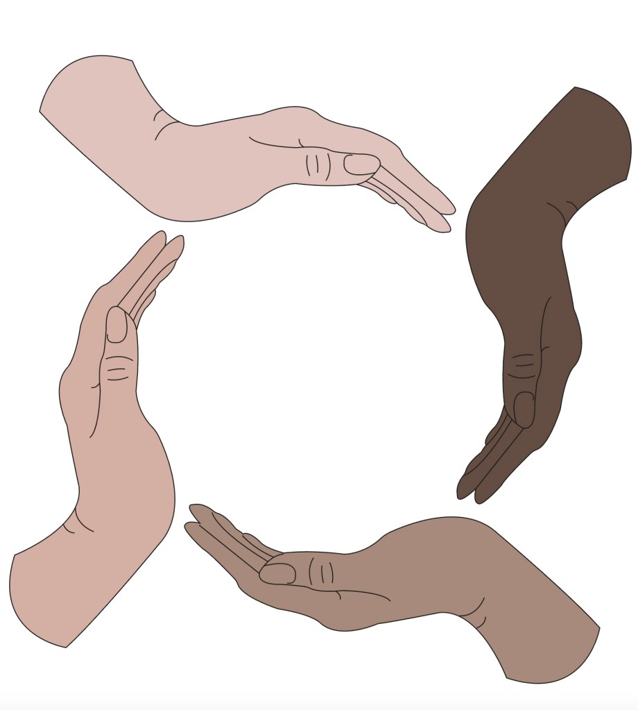
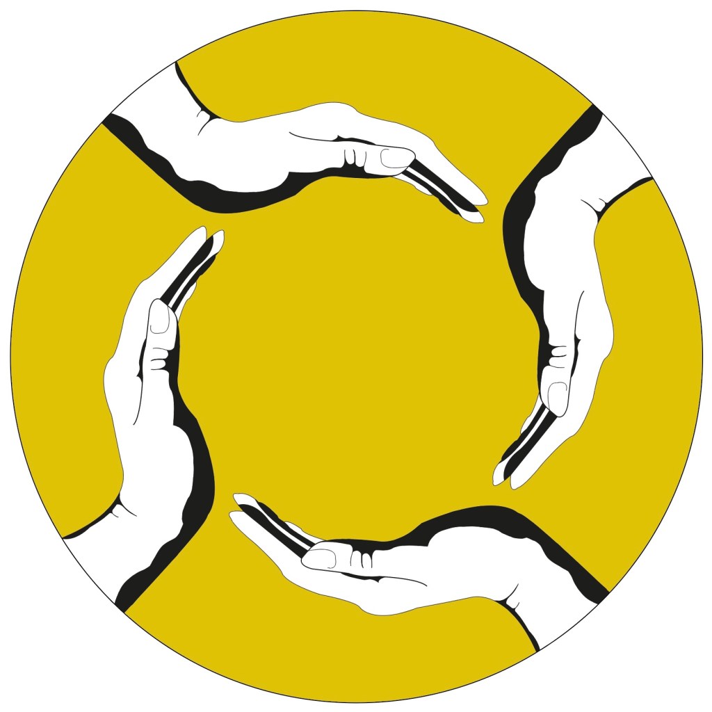
After trying to animate my first idea, I realised that the four second time limit on each video did not allow for my first idea. I had to rethink and so I have drawn a second story board (shown above). This new story board only consists of two different transitioning animations, both of which will be two seconds long. The box on the left will be the opening scene, an idea taken from my logo design. Each hand will be of different racial origins and will start small, and increase in size while rotating clockwise.
The second scene will be the same hands appearing on screen from each corner of the canvas and will drift to the centre. The meaning for this is to show teamwork and cultural diversity within the course.
This video will be made using Illustrator to draw a still image of each scene, Adobe Animate to add motion, and After Effects to refine and put things together .
Second Video Storyboard
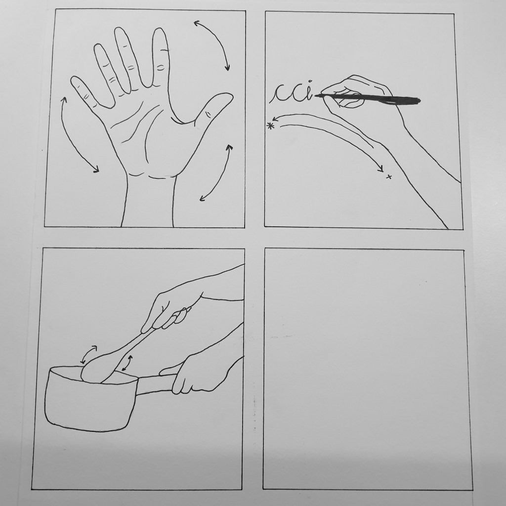
Similar to my original idea for my first video, this video will show the simple things our hands are used for in everyday life. The top left hand box shows a hand waving, which will be one second long.
The top right hand box shows a hand writing “CCI” and will be two seconds long due to one second not being a sufficient amount of time to create a steady animation.
The bottom left box shows a hand cooking, the illustration will be still and only the spoon will be animated in a stirring motion. As the first idea, I will use Illustrator, Adobe Animate and After Effects to create this video.
Third Video Storyboard
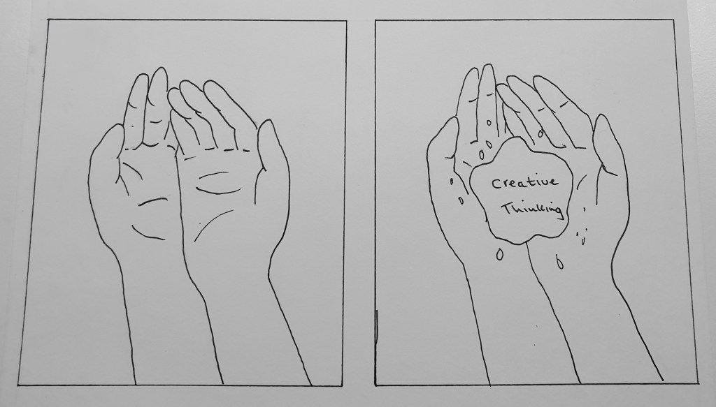
The third video will be a play on an animated collage. The hands will be in black and white and will be a live, still image. Using Illustrator, I will draw blue paint into the hands and add white text. Using Adobe After Effects, I will gradually show the paint appearing on the hands and the text will slowly rotate within the paint.
I will open the still photograph of the cupped hands into Illustrator to add the paint, and will then take the image into After Effects to animate.
Forth Video Storyboard
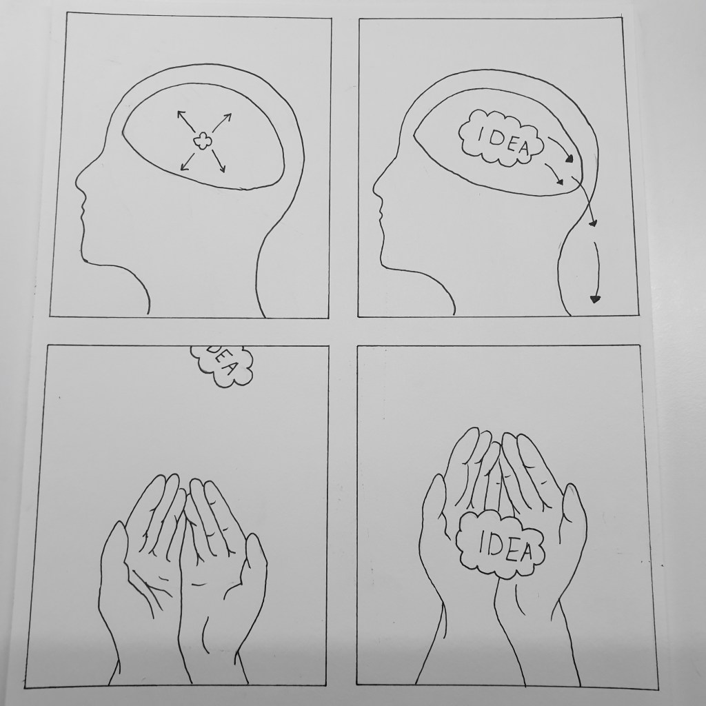
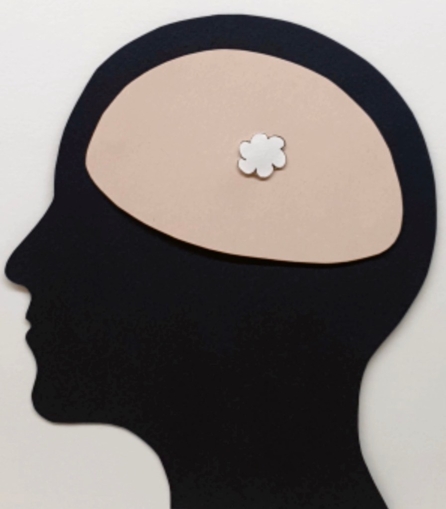
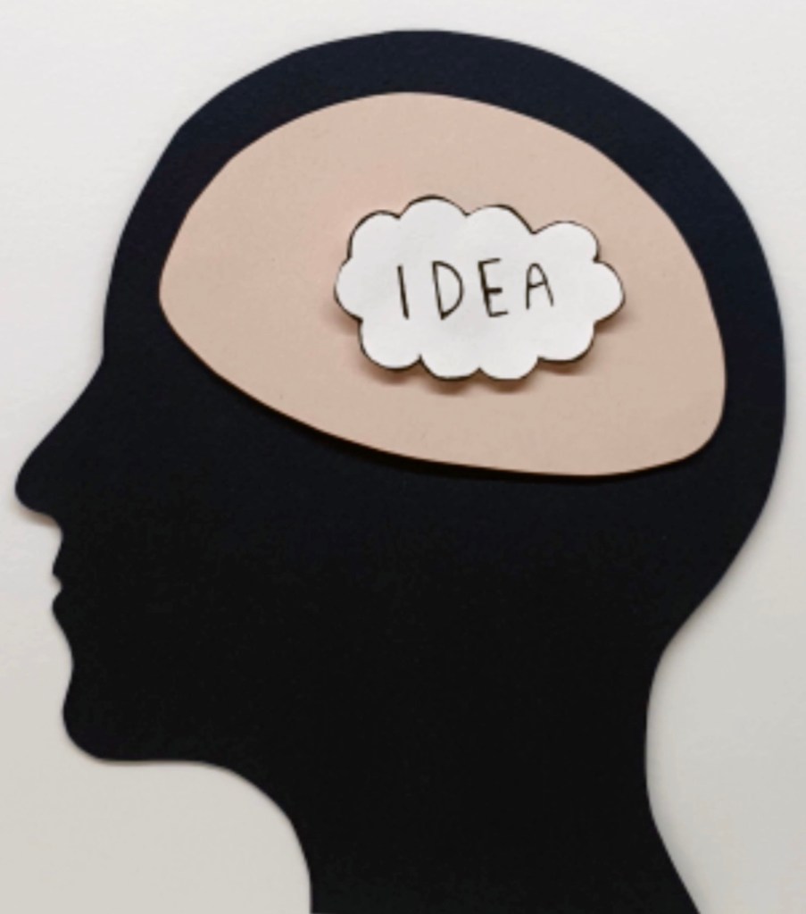
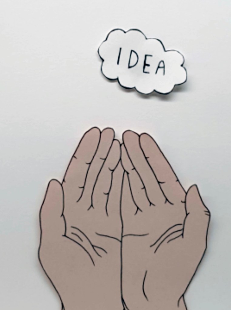
My fourth video will be made using paper cut, stop motion animation. The colours will be more vibrant than the previous videos to add a creative feel. The opening scene will start with a head with a thought bubble, which will gradually move around the brain and increase in size. When the thought bubble reaches full size, it will rotate and then fall out of the head into a pair of cupped hands.
To create the stop motion animation, I will use a paid app called Stop Motion Studio, then will export into After Effects for post production. To film, I will use my camera and tripod to ensure the video is of good quality and possible camera motion and shake is minimised.
Script
Overall, I need to keep the scrip very simple as four seconds per video isn’t very long to add narrative. Each word in the script need to have a purpose and be to the point. Keeping the script short will enhance the focus and meaning of what is said and keep the attention of the viewer, and get the point across successfully.
First Video – For the first video, the script will be very minimal as this video will be the opening sequence. As an introduction, the video will simply say “Hands”. This is extremely simple but will highlight the focus of the overall storyline.
Second Video – “We use them everyday for simple tasks”.
Third Video – “At KSA we use them to do more”.
Forth Video – “We turn ideas into reality”.
Each video, although separate, will play in sequence, to add a sense of depth and intrigue. Once the viewer sees to first video, it will not make sense on its own, which will create intrigue and hopefully make the viewer want to see more.
Creation of Videos/Stories
First Story
The two illustrations above were created using a graphics tablet and Adobe Illustrator. In order to add motion to the illustrations, each hand needed to be a separate layer, so they could be animated individually.
Next, I dragged both Illustrator files into Adobe Animate. I started with the above left hand image and slowly rotated the image clockwise. With every rotation I added a new keyframe. The brief has specified that each video needs to be 30 keyframes per second, so with each keyframe added, the image was rotated. As this video only has two animations, they were both two seconds long.
Using Adobe Audition, I recored my voice according to the script. I also created a simple drum beat using Garage Band as background music to add a bit of depth and excitement to the video. This drum beat will be added to all videos. Once all sounds were recored, I added them to the video using After Effects. I dimmed the sound of the drum beat to -5 and heightened the sound of the narrative to +7 to create a better overall sound. The narrative was heightened as that is the most important sound in the video.
Video
Second Story
As I created the first video, these illustrations above were created using a graphics tablet and Adobe Illustrator. The first scene was a hand waving, using Animate, however I was presented with a problem. While rotating the hand in each keyframe to create a waving effect, I noticed that the wrist moved with the hand. This, of course makes sense however was a problem which I happened to overlook. This need solving as when I played through the video, it looked very wrong that the wrist moved with the hand. To solve this issue, I opened up the Illustrator file and deleted the wrist layer. I was then left with just the hand, and this was worked much better when animated.
The next part of the video was the written “CCI”. As planned, this part of the video was made to be two seconds long to allow a better flow of the writing appearing. Lastly, was the soon stirring. Again, using Audition, I recored the voice over and added all narrative and background music on After Effects.
Video:
Third Story
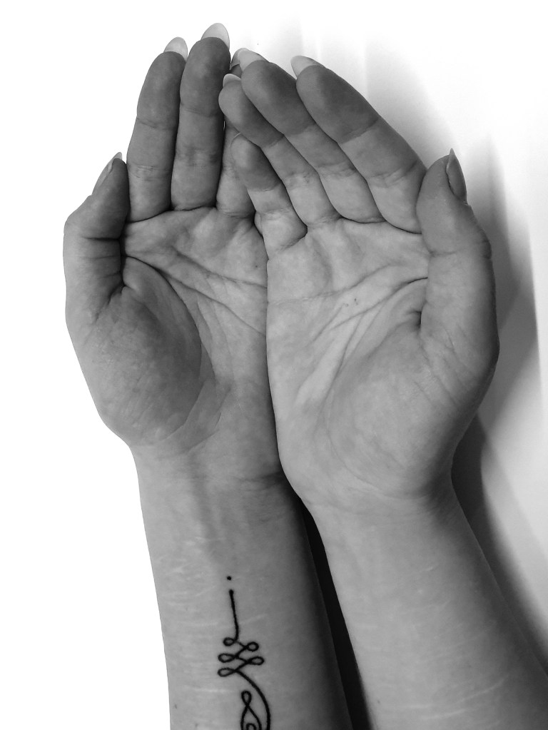
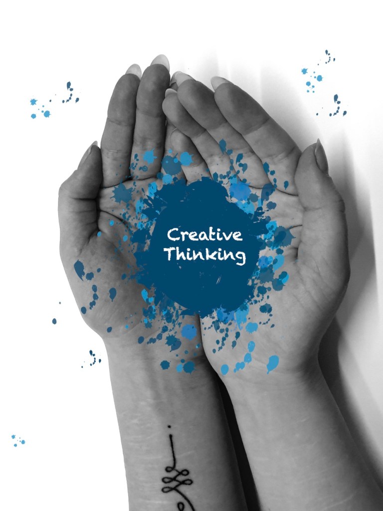
For the third story, I did as planned and took a photograph of cupped hands and added pain using Illustrator. Using Adobe Animate, I gradually added the paint into the hands. I added the music and voice over, again using Adobe Audition.
Video:
Fourth Story
For the fourth video, I used Stop Motion Studio to take a series of photographs to create a stop motion animation. For each photograph, an element was moved slightly to create a motion effect once put together, much like adding key frames in Adobe Animate. After all the photographs were taken, the app put it all together to create a video. This video was then exported and opened into After Effects to add the audio.
Video:
All stories sequenced:
Final steps of stories
Once all the stories were completed, I used After Effects to put them together in sequence. Although each video is separate, I felt that I would take a different approach and create each video in sequence. On their own, the videos wouldn’t make much sense, however when put together, they each lead up to the next, creating a nice flow.
I have re-read the brief and have noticed that during this process, I have done the amount of work required if you are working in groups of two. As I am working on my own, the brief requires only 2 micro stories to be made rather than 4. Because of this, I will create another two micro stories but submit both videos. I also feel unsure about the videos being sequenced, as they do not make sense singularly. In order for my first video to make sense, all stories need to play in sequence so I feel it would be best to create only 2 micro stories which are self explanatory on their own.
First Story
The first story is a combination of the first and third story from my previous campaign ideas. I wanted to keep with the hands rotating to show the cultural diversity within the course and liked the idea of adding the puddle of paint in the middle to signify that the hands revolve around creativity.
Second Story
For the second story, I kept the same video as previously. I did this as I felt happy with the stop motion animation style and felt that it is overall a strong video with clear purpose and intention.
Sequenced:
Finalisations and last refinements
Before creating the ending video and sound logo, I want to go through everything I have done so far to make sure I am happy with everything, if not, I will make necessary changes where applicable.
Logo
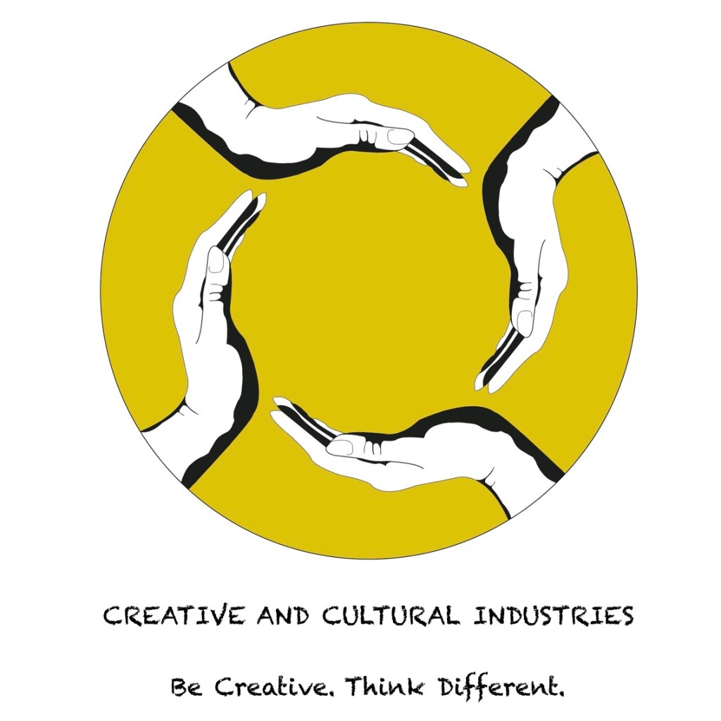
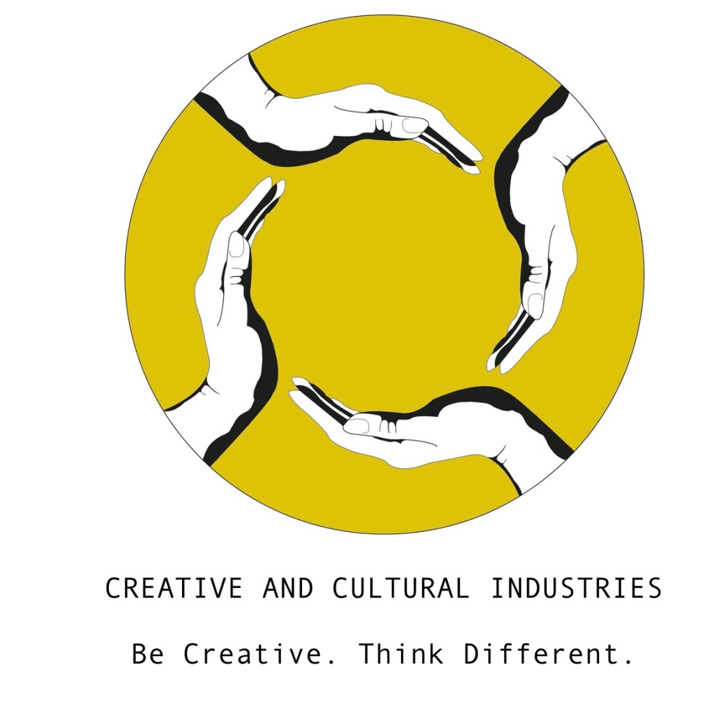
After looking at my final logo, I have come to the conclusion that it need to be simplified. Logos should be easy to reproduce, and I feel that my final design has too many intricate details. To solve this, I have changed certain aspects to simplify and make the logo more simplistic. Doing this has hopefully made the logo more recognisable and appealing. The image underneath on the left is my previous final logo and to the right is the improved version. I have kept the hands and have replaced the messy lines with a block yellow. As discussed previously, in colour psychology yellow signifies creativity, imagination and fun, which I felt was the perfect colour choice to represent the CCI Course. To give the design more of a professional and clean look, I have used a circle to frame the overall design. I am happy with these changes and will now use this design as my final logo/symbol for CCI.

Strap-line, call to action and video/story concept:
As written previously, I have chosen Be Creative. Think Different. as my chosen strap-line. I will make no changes to this idea as I feel this is short, powerful and direct, as well as creating a sense of professionalism and creativeness.
My chosen call to action is Apply now. Turn your ideas into reality. I feel that this will appeal to students who embrace different ideas and approaches and reflects what the course and its students is about.
The story concept is, of course, about the creative things that are achievable with our hands. Turning ideas into reality by using our hands to create.
Typeface
Originally, I decided on a “Chalkduster” typeface as I felt it added to the creative feel. Having looked back at the typeface beside my logo, I feel that it looks a bit cheap and tacky looking. Below are two of my chosen styles, the left image being the “Chalkduster” typeface and the right image “Andale Mono” typeface.
Seeing both of the typeface options beside my logo design, I have chosen to go ahead with the Andale Mono. It looks professional, clean and easy to read.
Sound logo – 1 second
Overall, I am happy with the sound logo. I think the audio is okay in consideration that I have never created anything with audio before. I am happy with the general aesthetic and feel that the video is done to a good standard.
Sound logo, Video concept and Call to action – 4 seconds
Final video – 20 seconds
Final Video – 12 seconds
Overview and reflection
Overall, I am happy with the outcome of the project and feel that I did well considering I had to learn how to use each program while working to a deadline. Due to the time spent on learning each program, my ideas were kept simple to ensure the best execution. Now that my knowledge on different creative softwares has been broadened, I feel that I am much more skilled with these programs than I was at the beginning of the brief. I have hit a few bumps and set backs during the course of this project but I managed to keep on track and I feel that I have achieved what has been asked. I have learnt a lot during this project and although it has been stressful at times, I have enjoyed it.
References
Books:
- Really Good Logos Explained By Margo Chase, Rian Hughes, Ron Miriello and Alex W. White
- Graphic Design Elements Optical Illusions By Wang Shaogiang
- Pattern Euphoria By Wang shaogiang
- Magical Geometry: Patterns In Graphic Design By SendPoints
- Graphic Design For Everyone By Cath Caldwell
Tutorials:
- https://www.youtube.com/watch?v=XLPchE7DPQE
- https://www.youtube.com/watch?v=MX7lW8t4Jxc
- https://www.youtube.com/watch?v=zYBVx6DD0HM
- https://www.youtube.com/watch?v=Ztwm0OTPqyI
- https://www.youtube.com/watch?v=s57n1jLjzwc
- https://www.youtube.com/watch?v=-ewe8aGGGFk
- https://www.youtube.com/watch?v=sYlzk7rfn0w
- https://www.youtube.com/watch?v=qFsEnKwa5-k
- https://www.youtube.com/watch?v=5WnaT1oFjt8
- https://www.youtube.com/watch?v=HXc6LyqS92o
Research:
- https://www.adobe.com/devnet/adobe-media-server/articles/h264_encoding.html
- https://helpx.adobe.com/uk/animate/using/frames-keyframes.html
- https://www.incredibleart.org/lessons/middle/color2.htm
- https://www.youtube.com/watch?v=fcuCp3hzprQ
- https://www.adobe.com/uk/products/media-encoder.html#
- https://www.schoolofmotion.com/blog/render-after-effects-media-encoder
Improvements
After we presented our campaigns in class and pitched our ideas to tutors and peers, I received some useful feedback and decided to make some minor changes and improvements.
I have revisited this project and made slight alterations to my sound logo (shown below), including changing the animation to a more simple transition and included more time to read the information. I have also changed the paint splashes to the same colour as the Kingston School of Art logo to stick to a consistent and fitting colour scheme.
